# Evaluating Models: Beyond Accuracy {#sec-model-evaluation}
## Introduction
You have built a model. It produces predictions. But how do you know if those predictions are any good? The answer is (often) not as simple as asking "how often is it right?" In clinical medicine, the consequences of different errors are rarely equal. Missing a serious diagnosis is not the same as raising a false alarm. The outcomes we care about are often rare. And the patients we apply a model to may look nothing like the patients we trained it on. This chapter introduces the core concepts and tools for evaluating classification models, with a focus on clinical prediction.
::: {.callout-note}
## Why a clinician should care
The metric you choose to judge a model decides which patients it will help and which it may harm. A model that looks excellent on paper can still miss the very patients it was built to find. Knowing how to read these metrics is as important as knowing how to read a lab result.
:::
## The Confusion Matrix
A **confusion matrix** is simply the scorecard for a classification model: a small table that counts how often the model's predictions matched the truth, and how often they did not. For a yes/no outcome, it is a 2x2 table that cross-classifies what the model predicted against what was actually true:
| | Actually Positive | Actually Negative |
|------------------------|------------------------|------------------------|
| **Predicted Positive** | True Positive (TP) | False Positive (FP) |
| **Predicted Negative** | False Negative (FN) | True Negative (TN) |
- The two diagonal cells (TP and TN) are the model's correct calls
- A **true positive** is a correct call: the model says "disease" and the patient is indeed ill.
- A **true negative** is also a correct call: the model says "no disease" and the patient is indeed well.
- The two off-diagonal cells are the model's mistakes
- A **false negative** is a missed case: the model says "no disease" but the patient is in fact ill (for example, a cancer screen that comes back clear when a tumour is present).
- A **false positive** is a false alarm: the model says "disease" but the patient is in fact well (a screen that flags a healthy person, leading to anxiety and further tests).
Every metric discussed in this chapter can be calculated from these four counts. The crucial insight is that a single model can produce **different** confusion matrices depending on the **threshold** you choose --- the cut-off probability above which you call a prediction "positive."
## The Accuracy Paradox
The simplest metric for evaluating a model is **accuracy**: the proportion of predictions that are correct. In "confusion matrix" terms, it is the sum of **true positives** and **true negatives** divided by the total number of predictions:
$$\text{Accuracy} = \frac{TP + TN}{TP + TN + FP + FN}$$
Despite its simplicity, accuracy can be misleading. Consider the following scenario: you are developing a model to predict a rare but serious condition (e.g., pancreatic cancer) in a primary care population. The prevalence is approximately 0.1%. You build a classifier and proudly report 99.9% accuracy. Your colleague, less impressed, points out that a model which simply predicts "no cancer" for every single patient would also achieve 99.9% accuracy. It would miss every true case, which is the entire point of the exercise, but its accuracy would be nearly perfect.
To see why, imagine 10,000 patients where 10 truly have cancer. The "predict everyone negative" model produces:
| | Actually Positive | Actually Negative |
|------------------------|-------------------|-------------------|
| **Predicted Positive** | 0 | 0 |
| **Predicted Negative** | 10 | 9,990 |
$$\text{Accuracy} = \frac{0 + 9{,}990}{0 + 9{,}990 + 10 + 0} = \frac{9{,}990}{10{,}000} = 99.9\%$$
Every cancer case is missed (10 false negatives), yet accuracy is nearly perfect: this is the **accuracy paradox**. The main underlying issue is that of **class imbalance**, that is, when one outcome is far more common than the other(s). In these settings, accuracy becomes meaningless because it is dominated by the common group (the "majority class"). In clinical medicine, outcomes are almost always imbalanced:
- Most people do not have the disease you are screening for
- Most surgical patients do not die within 30 days
- Most pregnancies do not result in pre-eclampsia
A metric that ignores *which* errors the model makes is not useful for clinical decision-making.
::: {.callout-note}
### Beyond two classes
Confusion matrices generalise to multi-class problems. For example, a model that classifies tumour stage (I, II, III) would produce a 3×3 matrix:
| | Actually I | Actually II | Actually III |
|---------------|------------|-------------|--------------|
| **Pred. I** | 40 | 5 | 1 |
| **Pred. II** | 3 | 35 | 7 |
| **Pred. III** | 0 | 4 | 30 |
Each row shows how the model's predictions break down against the true classes. The diagonal counts correct predictions; off-diagonal entries reveal which classes the model confuses. Here, accuracy = (40 + 35 + 30) / 125 = 84%. This chapter focuses on the binary (2×2) case, which is the most common in clinical prediction.
:::
We will therefore move beyond the seductive simplicity of "accuracy" and learn to ask better questions: Does the model separate sick from well? Are the predicted probabilities trustworthy? Would using this model actually help patients? And does it help all patients equally?
## Sensitivity and Specificity
The most useful first step is to split the model's behaviour into two groups: those who truly have the condition and those who do not.
**Sensitivity** (also called *recall* or *true positive rate* (TPR)) answers: among everyone who truly has the disease, what proportion did the model correctly identify? In plain terms, how good is the model at catching the sick? A model with low sensitivity misses many real cases.
$$\text{Sensitivity} = \frac{\text{TP}}{\text{TP} + \text{FN}} = \frac{\text{True Positives}}{\text{Actually Positive}}$$
In the example above, the sensitivity of the model is:
$$\text{Sensitivity} = \frac{0}{0 + 10} = 0\%$$
**Specificity** (the *true negative rate*) answers: among everyone who is truly disease-free, what proportion did the model correctly clear? In plain terms, how good is the model at leaving the well alone? A model with low specificity raises many false alarms.
$$\text{Specificity} = \frac{\text{TN}}{\text{TN} + \text{FP}} = \frac{\text{True Negatives}}{\text{Actually Negative}}$$
In the example above, the specificity of the model is:
$$\text{Specificity} = \frac{9{,}990}{9{,}990 + 0} = 100\%$$
These two numbers are properties of the **test itself**. They do not change with how common the disease is in the population. That makes them a clean way to describe how well a test separates the sick from the well.
### Clinical Context: Screening vs Confirmation
The relative importance of sensitivity and specificity depends on the clinical purpose:
- **Screening tests** (e.g., mammography for breast cancer, the PHQ-2 for depression) prioritise **high sensitivity**. The goal is to catch as many true cases as possible. We accept more false positives because the next step is a confirmatory test, not treatment. Missing a case (false negative) is the costly error.
- **Confirmatory tests** (e.g., biopsy for cancer, or the HIV-1/HIV-2 antibody differentiation immunoassay that has replaced the older Western blot in modern testing algorithms) prioritise **high specificity**. The goal is to be sure that a positive result is real, because a positive typically triggers treatment, which may carry risks. A false positive leading to unnecessary surgery or chemotherapy is the costly error.
::: {.callout-tip}
### Memory Aid
Sensitivity = True Positive Rate = How good is the test at catching the sick?
Specificity = True Negative Rate = How good is the test at leaving the well alone?
**Sn**N**out**: a test with high **S**e**n**sitivity, when **N**egative, rules **out** the disease.
**Sp**P**in**: a test with high **Sp**ecificity, when **P**ositive, rules **in** the disease.
:::
## Predictive Values: When Prevalence Matters
Sensitivity and specificity describe the test. But in clinic, the patient asks a different and more personal question: *given my result, how likely is it that I actually have the disease?* This is what predictive values answer, and it is usually what matters most at the bedside.
**Positive Predictive Value (PPV)** (also called *precision*): among everyone who tested positive, what proportion truly has the disease? In other words, if your test came back positive, how worried should you be?
$$\text{PPV} = \frac{\text{TP}}{\text{TP} + \text{FP}} = \frac{\text{True Positives}}{\text{Predicted Positive}}$$
**Negative Predictive Value (NPV)**: among everyone who tested negative, what proportion is truly disease-free? In other words, if your test came back negative, how reassured can you be?
$$\text{NPV} = \frac{\text{TN}}{\text{TN} + \text{FN}} = \frac{\text{True Negatives}}{\text{Predicted Negative}}$$
Critically, PPV and NPV depend on the **prevalence** of the disease --- that is, how common it is in the population being tested. A test with 95% sensitivity and 95% specificity will have very different PPVs depending on context:
| Prevalence | PPV | NPV |
|------------|-------|-------|
| 50% | 95.0% | 95.0% |
| 10% | 67.9% | 99.4% |
| 1% | 16.1% | 99.9% |
| 0.1% | 1.9% | 100% |
: PPV and NPV for a test with 95% sensitivity and 95% specificity at different prevalence levels. {#tbl-ppv-prevalence}
At 0.1% prevalence, even with an excellent test, fewer than 2% of positive results are true positives. This is why mass screening for rare diseases generates so many false alarms, and why testing should be targeted to higher-risk populations whenever possible.
::: {.callout-note}
### How to calculate PPV and NPV from prevalence
PPV and NPV can be derived from sensitivity, specificity, and prevalence:
$$\text{PPV} = \frac{\text{Sens} \times \text{Prev}}{\text{Sens} \times \text{Prev} + (1 - \text{Spec}) \times (1 - \text{Prev})}$$
$$\text{NPV} = \frac{\text{Spec} \times (1 - \text{Prev})}{\text{Spec} \times (1 - \text{Prev}) + (1 - \text{Sens}) \times \text{Prev}}$$
To see why, start from PPV = TP / (TP + FP) and note that in a population of size $N$: TP = Sens $\times$ Prev $\times N$ and FP = (1 $-$ Spec) $\times$ (1 $-$ Prev) $\times N$. The $N$ cancels, giving the formula above. The same logic applies to NPV.
:::
## Confusion matrices at different thresholds
::: {.panel-tabset}
#### R
```{r}
#| label: confusion-matrix-r
#| eval: false
library(caret)

# Simulate predicted probabilities and true outcomes
set.seed(42)
n <- 1000
true_outcome <- rbinom(n, 1, 0.15) # 15% prevalence
# Simulate a moderately good model
pred_prob <- plogis(rnorm(n, mean = -1 + 2 * true_outcome, sd = 1.2))

# Confusion matrix at threshold = 0.5
pred_class_50 <- ifelse(pred_prob >= 0.5, 1, 0)
cm_50 <- confusionMatrix(
  factor(pred_class_50),
  factor(true_outcome),
  positive = "1"
)
print(cm_50)

# Confusion matrix at threshold = 0.2 (more sensitive)
pred_class_20 <- ifelse(pred_prob >= 0.2, 1, 0)
cm_20 <- confusionMatrix(
  factor(pred_class_20),
  factor(true_outcome),
  positive = "1"
)
print(cm_20)

cat("\nAt threshold 0.5:\n")
cat("  Sensitivity:", round(cm_50$byClass["Sensitivity"], 3), "\n")
cat("  Specificity:", round(cm_50$byClass["Specificity"], 3), "\n")

cat("\nAt threshold 0.2:\n")
cat("  Sensitivity:", round(cm_20$byClass["Sensitivity"], 3), "\n")
cat("  Specificity:", round(cm_20$byClass["Specificity"], 3), "\n")
```
#### Python
```{python}
#| label: confusion-matrix-py
#| eval: false
import numpy as np
from sklearn.metrics import confusion_matrix, classification_report
from scipy.special import expit

np.random.seed(42)
n = 1000
true_outcome = np.random.binomial(1, 0.15, n)  # 15% prevalence
# Simulate a moderately good model
pred_prob = expit(np.random.normal(-1 + 2 * true_outcome, 1.2))

# Confusion matrix at threshold = 0.5
pred_class_50 = (pred_prob >= 0.5).astype(int)
print("=== Threshold = 0.5 ===")
print(confusion_matrix(true_outcome, pred_class_50))
print(classification_report(true_outcome, pred_class_50, target_names=["Negative", "Positive"]))

# Confusion matrix at threshold = 0.2 (more sensitive)
pred_class_20 = (pred_prob >= 0.2).astype(int)
print("=== Threshold = 0.2 ===")
print(confusion_matrix(true_outcome, pred_class_20))
print(classification_report(true_outcome, pred_class_20, target_names=["Negative", "Positive"]))
```
:::
**What the code is showing.** Here, we simulate a dataset of 1,000 patients with a 15% prevalence of disease and a moderately good model for predicting disease status. We then build two confusion matrices from the same predicted probabilities: one using a threshold of 0.5 (the default) and another using a lower threshold of 0.2. At the strict 0.5 threshold the model is cautious, so specificity is high but it misses many true cases (low sensitivity). At the lower 0.2 threshold, the model catches far more true cases (sensitivity rises) at the cost of more false alarms (specificity falls). The printed tables and the sensitivity/specificity lines tell the story. This demonstrates that there is no single "right" confusion matrix, as it changes when you move the threshold, even though the model itself never changes. The choice of threshold should be guided by the clinical context and the relative costs of false negatives versus false positives.
## Receiver Operating Characteristic (ROC) Curves
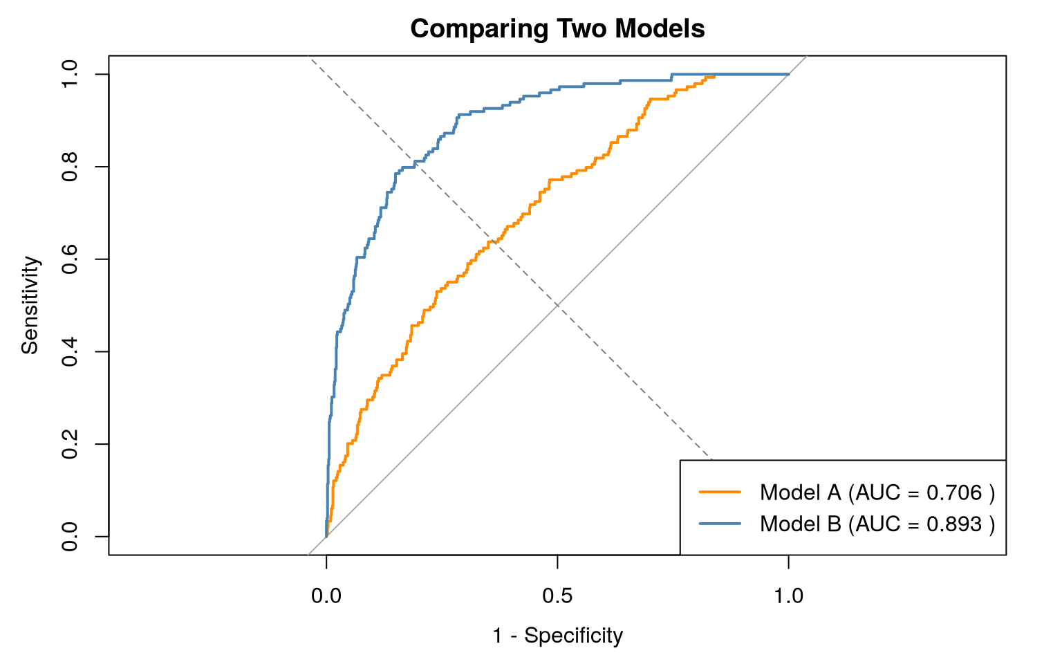
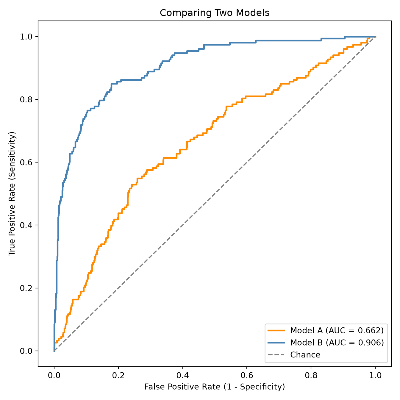
**Receiver Operating Characteristic (ROC) curves** are widely used graphical tools for evaluating classification models. For every possible threshold, ROC curves plot sensitivity on the y-axis against 1 minus specificity (the false positive rate) on the x-axis, sweeping the threshold from strict to lenient. In other words, they depict the trade-off between catching the sick (sensitivity) and falsely alarming the well (1 - specificity).
### How to Read a ROC Curve
- The two axes each run from 0 to 1. Reading the corners in plain terms: the bottom-left point **(0, 0)** is a model so cautious it never flags anyone as positive (no false alarms, but it misses every case); the top-right point **(1, 1)** is a model so lenient it flags everyone (it catches every case, but every healthy person is a false alarm). A real model traces a curve between these two extremes as the threshold is swept.
- The **diagonal line** joining those two corners represents a model with no ability to tell sick from well --- no better than flipping a coin.
- A curve that bows toward the **upper-left corner** is good. It means the model achieves high sensitivity without raising too many false alarms.
- From ROC curves, two metrics are often reported:
- The **Area Under the ROC Curve (AUC, also called AUROC, AUC-ROC or the C-statistic)** measures the integral of the ROC curve, i.e., the area of the region between the curve and the x-axis. It has an intuitive probabilistic meaning: pick one patient with the disease and one without, at random; the AUC is the probability the model gives the *sick* patient a higher risk score.
- An AUC of 0.5 represents chance (the diagonal)
- An AUC of 1.0 represents perfect (the curve hugs the top-left corner, covering the entire square).
- An AUC *below* 0.5 means the model's predictions are inverted (it ranks the well above the sick) which usually signals poor fitting (or an implementation error).
- **Youden's J statistic** (also called Youden's index) identifies the point on the ROC curve that is farthest from the diagonal: $J = \text{Sensitivity} + \text{Specificity} - 1$. The threshold at which $J$ is maximised is often reported as the "optimal" threshold. However, this implicitly assumes that a false positive and a false negative are equally costly --- an assumption that is rarely true in medicine. Use Youden's index as a starting point, but always adjust based on clinical reasoning (see @sec-choosing-threshold below).
| AUC Range | Interpretation |
|-------------|-------------------------|
| 0.90--1.00 | Excellent discrimination |
| 0.80--0.90 | Good discrimination |
| 0.70--0.80 | Acceptable |
| 0.60--0.70 | Poor |
| 0.50--0.60 | Fail (near chance) |
: Rough guide to AUC interpretation. **Note that these benchmarks are extremely context-dependent**. {#tbl-auc-benchmarks}
::: {.callout-warning}
### When the AUC Is Not Enough
A model can have a high AUC but still produce poorly **calibrated** probabilities. Calibration asks whether the numbers can be taken at face value: when the model says "20% risk," do about 20 in 100 such patients actually have the event? A model can rank patients perfectly (high AUC) yet systematically over- or under-state the risk, which would mislead any decision based on the actual percentage. AUC tells you about ranking (discrimination), not about whether the predicted probabilities are truthful. Examining *model calibration* can provide useful supplementary information to AUC-ROC measurements (see @sec-performance-validation).
:::
### Plotting ROC Curves
::: {.panel-tabset}
#### R
```{r}
#| label: roc-curve-r
#| eval: true
#| fig-cap: "ROC curves for two simulated models on the same data. Model B (stronger signal) bows further toward the top-left corner and has the higher AUC; Model A sits closer to the chance diagonal."
library(pROC)

set.seed(42)
n <- 1000
true_outcome <- rbinom(n, 1, 0.15)

# Model A: low signal
pred_a <- plogis(rnorm(n, mean = -1 + 0.8 * true_outcome, sd = 1.2))
# Model B: stronger signal
pred_b <- plogis(rnorm(n, mean = -1 + 2 * true_outcome, sd = 1.2))

roc_a <- roc(true_outcome, pred_a, quiet = TRUE)
roc_b <- roc(true_outcome, pred_b, quiet = TRUE)

# Plot both ROC curves
plot(
  roc_a,
  col = "darkorange",
  lwd = 2,
  legacy.axes = TRUE,
  main = "Comparing Two Models"
)
plot(roc_b, col = "steelblue", lwd = 2, add = TRUE)
abline(0, 1, lty = 2, col = "grey50")
legend(
  "bottomright",
  legend = c(
    paste("Model A (AUC =", round(auc(roc_a), 3), ")"),
    paste("Model B (AUC =", round(auc(roc_b), 3), ")")
  ),
  col = c("darkorange", "steelblue"),
  lwd = 2
)
# Youden-optimal threshold for the strong model
coords_best <- coords(
  roc_b,
  "best",
  ret = c("threshold", "sensitivity", "specificity")
)
cat(
  "Model B — optimal threshold (Youden):",
  round(coords_best$threshold, 3),
  "\n"
)
cat("Sensitivity:", round(coords_best$sensitivity, 3), "\n")
cat("Specificity:", round(coords_best$specificity, 3), "\n")
```
#### Python
```{python}
#| label: roc-curve-py
#| eval: true
#| fig-cap: "ROC curves for two simulated models on the same data. Model B (stronger signal) bows further toward the top-left corner and has the higher AUC; Model A sits closer to the chance diagonal."
from sklearn.metrics import roc_curve, roc_auc_score
import matplotlib.pyplot as plt
import numpy as np
from scipy.special import expit

np.random.seed(42)
n = 1000
true_outcome = np.random.binomial(1, 0.15, n)

# Model A: low signal
pred_a = expit(np.random.normal(-1 + 0.8 * true_outcome, 1.2))
# Model B: stronger signal
pred_b = expit(np.random.normal(-1 + 2 * true_outcome, 1.2))

fpr_a, tpr_a, _ = roc_curve(true_outcome, pred_a)
auc_a = roc_auc_score(true_outcome, pred_a)

fpr_b, tpr_b, thresholds_b = roc_curve(true_outcome, pred_b)
auc_b = roc_auc_score(true_outcome, pred_b)

plt.figure(figsize=(7, 7))
plt.plot(fpr_a, tpr_a, color="darkorange", lw=2,
         label=f"Model A (AUC = {auc_a:.3f})")
plt.plot(fpr_b, tpr_b, color="steelblue", lw=2,
         label=f"Model B (AUC = {auc_b:.3f})")
plt.plot([0, 1], [0, 1], color="grey", linestyle="--", label="Chance")
plt.xlabel("False Positive Rate (1 - Specificity)")
plt.ylabel("True Positive Rate (Sensitivity)")
plt.title("Comparing Two Models")
plt.legend(loc="lower right")
plt.tight_layout()
plt.show()

# Youden-optimal threshold for the strong model
j_scores = tpr_b - fpr_b
best_idx = np.argmax(j_scores)
print(f"Model B — optimal threshold (Youden): {thresholds_b[best_idx]:.3f}")
print(f"Sensitivity: {tpr_b[best_idx]:.3f}")
print(f"Specificity: {1 - fpr_b[best_idx]:.3f}")
```
:::
**What the code is showing.** The snippets simulate two models on the same data and overlay their ROC curves. Model B's curve bows further toward the top-left corner, producing a higher AUC; Model A's curve stays closer to the diagonal (chance). Plotting both on the same axes makes the difference in discriminative ability immediately visible: at any given false-positive rate, Model B catches more true cases. The code also finds the threshold that maximises Youden's J for Model B, reporting the sensitivity and specificity there. Treat that "optimal" threshold as a *statistical* suggestion only: it assumes a false negative and a false positive cost the same, which is rarely true in medicine (see @sec-choosing-threshold).
## Precision-Recall Curves
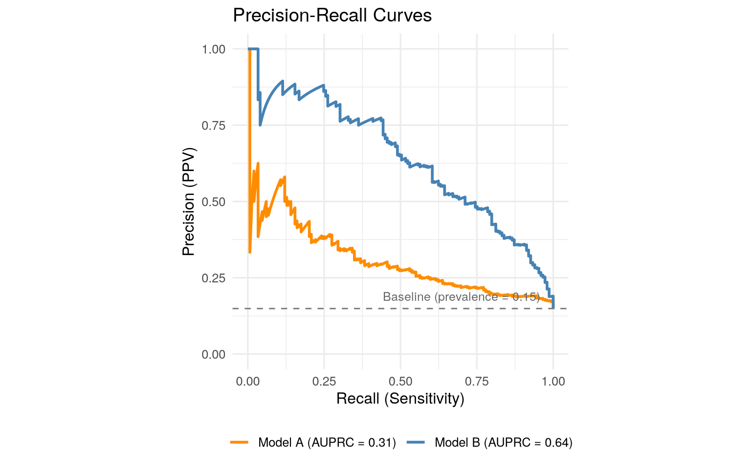
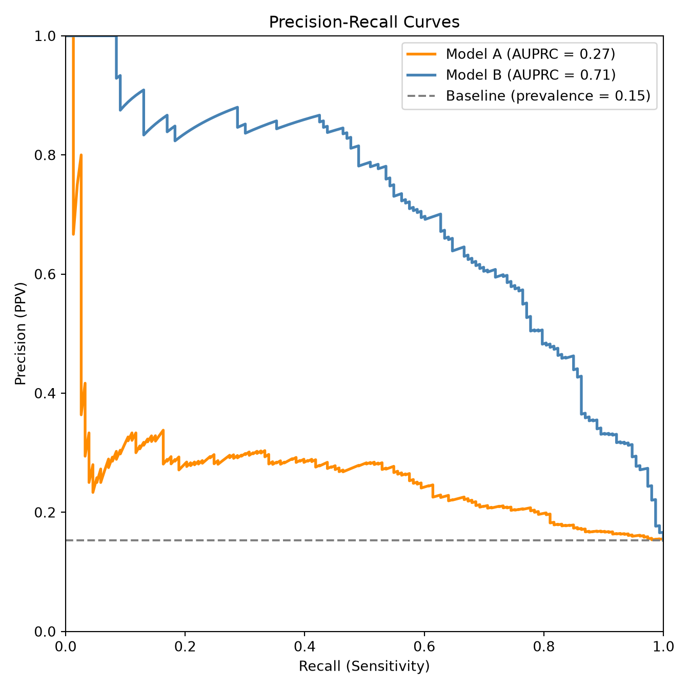
The **precision-recall (PR) curve** offers a different view of model performance by ignoring the true negatives entirely and focusing on the patients the model flags as positive. It plots two familiar metrics under different names:
- **Precision** is the same as PPV: of all the patients the model flagged, how many really had the disease? (How trustworthy is a positive flag?)
- **Recall** is the same as sensitivity: of all the patients who really had the disease, how many did the model catch?
### How to Read a PR Curve
- The PR curve plots precision (y-axis) against recall (x-axis). A good model keeps precision high even as recall rises --- it catches real cases without drowning in false alarms.
- The **baseline** is a flat line at the prevalence (not the diagonal used for ROC). A model that flags patients at random would sit on this line.
- The **Area Under the Precision-Recall Curve (AUPRC)** summarises the curve in one number. Unlike AUROC, there is no universal scale --- the baseline is the prevalence itself, so an AUPRC of 0.20 may be excellent for a disease with 1% prevalence but poor for one with 15%.
### Plotting a Precision-Recall Curve
The code below draws PR curves for the **same two simulated models used in the ROC example above**, so you can see the identical models through a second lens. Model B (the stronger model) keeps precision high as recall increases --- that is what a *good* PR curve looks like. The dashed line marks the baseline (the prevalence): a useless model that flags patients at random would sit on it, so the vertical gap between a model's curve and that line is what the model actually buys you.
::: {.panel-tabset}
#### R
```{r}
#| label: pr-curve-r
#| eval: true
#| fig-cap: "Precision-recall curves for the same two models as the ROC example. Model B keeps precision high as recall rises (a good AUPRC); the dashed line is the prevalence baseline a random model would achieve."
library(yardstick)
library(dplyr)
library(ggplot2)

set.seed(42)
n <- 1000
true_outcome <- rbinom(n, 1, 0.15)
pred_a <- plogis(rnorm(n, mean = -1 + 0.8 * true_outcome, sd = 1.2)) # weaker model
pred_b <- plogis(rnorm(n, mean = -1 + 2 * true_outcome, sd = 1.2)) # stronger model

eval_df <- tibble(
  truth = factor(
    ifelse(true_outcome == 1, "Yes", "No"),
    levels = c("Yes", "No")
  ),
  `Model A` = pred_a,
  `Model B` = pred_b
)
prevalence <- mean(true_outcome)

pr_a <- pr_curve(eval_df, truth, `Model A`) |> mutate(model = "Model A")
pr_b <- pr_curve(eval_df, truth, `Model B`) |> mutate(model = "Model B")
auprc_a <- pr_auc(eval_df, truth, `Model A`)$.estimate
auprc_b <- pr_auc(eval_df, truth, `Model B`)$.estimate

bind_rows(pr_a, pr_b) |>
  ggplot(aes(recall, precision, colour = model)) +
  geom_path(linewidth = 1) +
  geom_hline(yintercept = prevalence, linetype = "dashed", colour = "grey50") +
  annotate(
    "text",
    x = 0.7,
    y = prevalence + 0.04,
    label = paste0("Baseline (prevalence = ", round(prevalence, 2), ")"),
    colour = "grey40",
    size = 3.3
  ) +
  scale_colour_manual(
    values = c("Model A" = "darkorange", "Model B" = "steelblue"),
    labels = c(
      paste0("Model A (AUPRC = ", round(auprc_a, 2), ")"),
      paste0("Model B (AUPRC = ", round(auprc_b, 2), ")")
    )
  ) +
  coord_equal(xlim = c(0, 1), ylim = c(0, 1)) +
  labs(
    x = "Recall (Sensitivity)",
    y = "Precision (PPV)",
    colour = NULL,
    title = "Precision-Recall Curves"
  ) +
  theme_minimal(base_size = 12) +
  theme(legend.position = "bottom")
```
#### Python
```{python}
#| label: pr-curve-py
#| eval: true
#| fig-cap: "Precision-recall curves for the same two models as the ROC example. Model B keeps precision high as recall rises (a good AUPRC); the dashed line is the prevalence baseline a random model would achieve."
import numpy as np
import matplotlib.pyplot as plt
from sklearn.metrics import precision_recall_curve, average_precision_score
from scipy.special import expit

np.random.seed(42)
n = 1000
true_outcome = np.random.binomial(1, 0.15, n)
pred_a = expit(np.random.normal(-1 + 0.8 * true_outcome, 1.2))  # weaker model
pred_b = expit(np.random.normal(-1 + 2 * true_outcome, 1.2))    # stronger model

prevalence = true_outcome.mean()
prec_a, rec_a, _ = precision_recall_curve(true_outcome, pred_a)
prec_b, rec_b, _ = precision_recall_curve(true_outcome, pred_b)
ap_a = average_precision_score(true_outcome, pred_a)
ap_b = average_precision_score(true_outcome, pred_b)

plt.figure(figsize=(7, 7))
plt.plot(rec_a, prec_a, color="darkorange", lw=2, label=f"Model A (AUPRC = {ap_a:.2f})")
plt.plot(rec_b, prec_b, color="steelblue", lw=2, label=f"Model B (AUPRC = {ap_b:.2f})")
plt.axhline(prevalence, color="grey", linestyle="--",
            label=f"Baseline (prevalence = {prevalence:.2f})")
plt.xlabel("Recall (Sensitivity)")
plt.ylabel("Precision (PPV)")
plt.title("Precision-Recall Curves")
plt.xlim(0, 1)
plt.ylim(0, 1)
plt.legend(loc="upper right")
plt.tight_layout()
plt.show()
```
:::
### AUROC vs AUPRC: When to Use Which
A widespread claim in machine learning is that AUPRC is a superior metric to AUROC whenever class imbalance is present. Recent work has shown this is an oversimplification [@mcdermott2024auroc]. The key difference between the two metrics is not about imbalance but about *which ranking mistakes they prioritise*:
- **AUROC** treats all ranking mistakes equally. Correcting a misranked pair improves the AUC by the same amount regardless of where it occurs in the score distribution.
- **AUPRC** prioritises mistakes among high-scoring samples. It is more sensitive to whether the model's top-ranked predictions are correct.
This distinction has practical consequences:
- **For general model comparison** (no specific deployment threshold in mind): AUROC is often more appropriate because it does not favour one region of the score distribution over another.
- **For screening** (where missing a case is the costly error): AUROC is preferable because the most important mistakes to fix are low-scoring positives that would be missed --- exactly the region AUPRC de-emphasises.
- **When false positives are expensive** (e.g., selecting drug candidates for costly lab validation): AUPRC is more appropriate because it focuses on precision at the top of the ranked list.
- **For fairness across subgroups**: AUPRC can favour higher-prevalence subpopulations, potentially widening disparities. In multi-population settings, AUROC provides a more equitable assessment.
::: {.callout-warning}
### AUPRC is not universally better for imbalanced data
It is common to read that "precision-recall curves should replace ROC curves when outcomes are rare." @mcdermott2024auroc demonstrated that this blanket recommendation is not well-founded: the choice between AUROC and AUPRC should depend on the *use case* (which errors matter most), not simply on whether the outcome is common or rare. Furthermore, optimising for AUPRC can amplify algorithmic biases by favouring improvements in higher-prevalence subgroups at the expense of lower-prevalence ones.
:::
## Choosing the Threshold: A Clinical Decision {#sec-choosing-threshold}
A prediction model typically outputs a probability, such as "this patient has a 12% risk." To turn that into an action (treat or don't treat, refer or don't refer), you must pick a **threshold** --- the risk level above which you act. This is fundamentally a **clinical** decision, not a statistical one, because it depends on what each kind of mistake costs the patient.
```{mermaid}
%%| echo: false
%%| eval: true
%%| label: fig-threshold-tradeoff
%%| fig-cap: "Moving the threshold trades one kind of error for the other. There is no universally correct setting --- it depends on which mistake is worse for the patient."
flowchart LR
    L["LOW threshold<br/>act on small risk"] --> LS["Catches more cases<br/>(high sensitivity)"]
    L --> LF["More false alarms<br/>(low specificity)"]
    H["HIGH threshold<br/>act only on strong evidence"] --> HS["Fewer false alarms<br/>(high specificity)"]
    H --> HF["Misses more cases<br/>(low sensitivity)"]
    style LS fill:#d4edda,stroke:#28a745
    style HS fill:#d4edda,stroke:#28a745
    style LF fill:#f8d7da,stroke:#dc3545
    style HF fill:#f8d7da,stroke:#dc3545
```
Consider a model predicting 30-day mortality after surgery:
- If the intervention for high-risk patients is simply closer monitoring (low cost, minimal harm), you might choose a **low threshold** (e.g., 5%), accepting many false positives to catch as many at-risk patients as possible.
- If the intervention is a risky re-operation, you might choose a **high threshold** (e.g., 30%), requiring strong evidence before acting.
The optimal threshold depends on the **relative costs** of false positives and false negatives, which are determined by the clinical context, not by the data.
### The Threshold-Performance Trade-off
::: {.panel-tabset}
#### R
```{r}
#| label: threshold-tradeoff-r
#| eval: true
#| fig-cap: "Sensitivity and specificity as the classification threshold is swept. They move in opposite directions; the clinically right operating point depends on the relative cost of a missed case versus a false alarm."
library(pROC)

set.seed(42)
n <- 1000
true_outcome <- rbinom(n, 1, 0.15)
pred_prob <- plogis(rnorm(n, mean = -1 + 2 * true_outcome, sd = 1.2))

roc_obj <- roc(true_outcome, pred_prob)

# Extract sensitivity and specificity at various thresholds
thresholds <- seq(0.05, 0.95, by = 0.05)
results <- data.frame(
  threshold = thresholds,
  sensitivity = sapply(thresholds, function(t) {
    coords(roc_obj, t, input = "threshold", ret = "sensitivity")$sensitivity
  }),
  specificity = sapply(thresholds, function(t) {
    coords(roc_obj, t, input = "threshold", ret = "specificity")$specificity
  })
)

# Plot the trade-off
plot(
  results$threshold,
  results$sensitivity,
  type = "l",
  lwd = 2,
  col = "red",
  xlab = "Classification Threshold",
  ylab = "Metric Value",
  main = "Sensitivity-Specificity Trade-off Across Thresholds",
  ylim = c(0, 1),
  las = 1
)
lines(results$threshold, results$specificity, lwd = 2, col = "blue")
legend(
  "right",
  legend = c("Sensitivity", "Specificity"),
  col = c("red", "blue"),
  lwd = 2
)
```
#### Python
```{python}
#| label: threshold-tradeoff-py
#| eval: true
#| fig-cap: "Sensitivity and specificity as the classification threshold is swept. They move in opposite directions; the clinically right operating point depends on the relative cost of a missed case versus a false alarm."
import numpy as np
import matplotlib.pyplot as plt
from sklearn.metrics import roc_curve
from scipy.special import expit

np.random.seed(42)
n = 1000
true_outcome = np.random.binomial(1, 0.15, n)
pred_prob = expit(np.random.normal(-1 + 2 * true_outcome, 1.2))

fpr, tpr, thresholds = roc_curve(true_outcome, pred_prob)
specificity = 1 - fpr

plt.figure(figsize=(8, 5))
plt.plot(thresholds, tpr[:-1] if len(tpr) > len(thresholds) else tpr,
         color="red", lw=2, label="Sensitivity")
plt.plot(thresholds, specificity[:-1] if len(specificity) > len(thresholds) else specificity,
         color="blue", lw=2, label="Specificity")
plt.xlabel("Classification Threshold")
plt.ylabel("Metric Value")
plt.title("Sensitivity-Specificity Trade-off Across Thresholds")
plt.legend()
plt.xlim(0, 1)
plt.ylim(0, 1)
plt.tight_layout()
plt.show()
```
:::
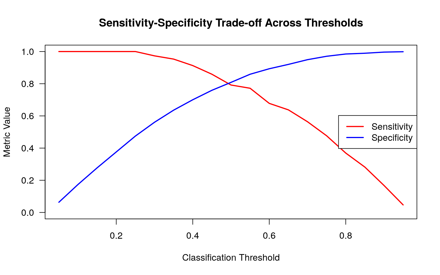
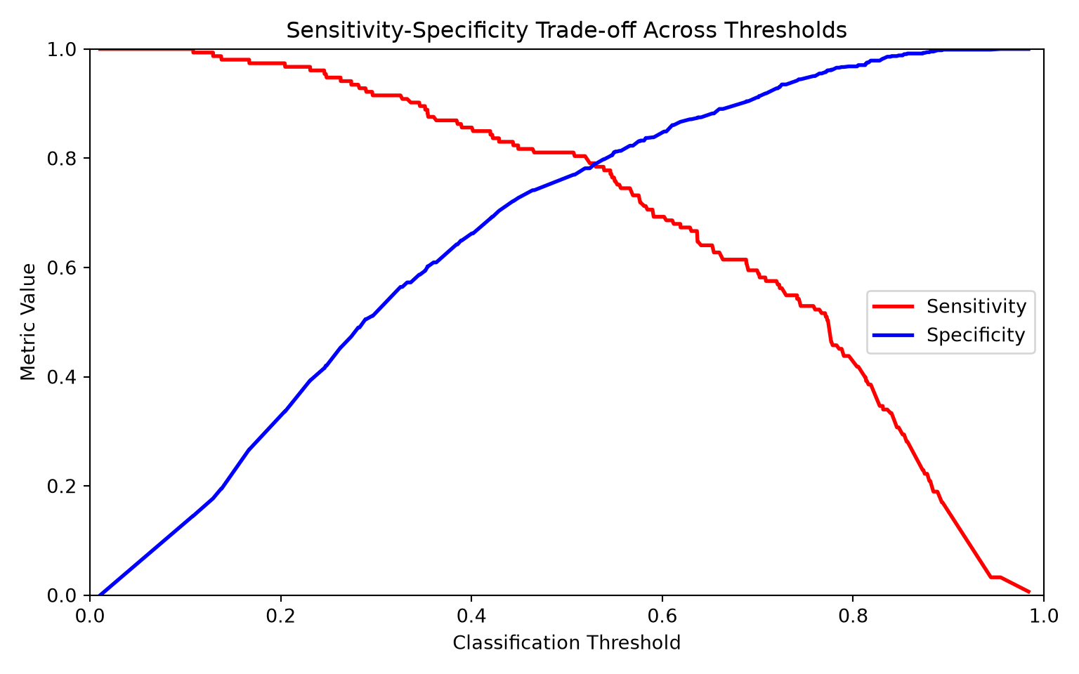
**What the code is showing.** This makes the threshold trade-off visible as a single picture. We step the classification threshold across its range and, at each value, record the model's sensitivity and specificity, then plot both as lines on the same axes. The two curves move in opposite directions: as you raise the threshold (demand stronger evidence before calling a patient positive), sensitivity falls while specificity rises; lower it, and the reverse happens. Where the lines cross is the threshold that balances the two, but --- as the surrounding text stresses --- the *right* operating point is wherever the clinical costs of a missed case and a false alarm balance, which may be far from the crossing point. Reading this plot lets you pick a threshold deliberately rather than defaulting to 0.5.
## Fairness: Does the Model Work for Everyone?
A model that looks good *on average* can perform very differently from one subgroup to another --- across age, sex, race, ethnicity, or socioeconomic status. An overall AUC can hide a model that quietly works well for one group and poorly for another. This is not a theoretical worry; it has been documented repeatedly in clinical prediction models, and it matters because a model that underperforms for a subgroup can widen existing health inequalities rather than narrow them.
A well-known example is the pulse oximeter, which systematically overestimates blood oxygen saturation in patients with darker skin pigmentation --- meaning dangerously low oxygen can be missed. Likewise, prediction models trained mostly on White populations may have lower sensitivity (catch fewer true cases) in Black or Hispanic patients.
### Key Fairness Concepts
- **Equal performance**: Does the model have similar sensitivity and specificity across demographic groups?
- **Calibration fairness**: Are predicted probabilities equally well-calibrated in each group? A model might predict 20% risk for two groups, but if the actual event rate is 20% in one group and 30% in another, the model is miscalibrated for the latter.
- **Demographic parity**: Are positive predictions made at similar rates across groups? (Note: this may conflict with calibration if true prevalence differs.)
## Putting It All Together: A Complete Evaluation
When evaluating a clinical prediction model, no single metric tells the whole story. The following checklist summarises what you should report:
1. **Sample description**: How many patients? How many events? What is the prevalence?
2. **Discrimination**: AUC-ROC with confidence interval. Consider AUPRC when false positives are costly, but be aware it can favour higher-prevalence subgroups.
3. **Calibration**: Are predicted probabilities accurate? (Covered in detail in @sec-performance-validation.)
4. **Confusion matrix**: At a clinically relevant threshold, not just the default 0.5.
5. **Sensitivity, specificity, PPV, NPV**: At the chosen threshold.
6. **Subgroup performance**: Does the model perform equitably across key demographic groups?
7. **Clinical utility**: Would using this model lead to better decisions than the alternatives? (Covered in @sec-performance-validation.)
::: {.callout-important}
## Remember
A model is not good or bad in isolation. It is good or bad **for a specific purpose, in a specific population, at a specific threshold**. Always evaluate with the intended clinical use in mind.
:::
## Exercises
::: {.callout-tip title="Exercise 1: Bayes' Theorem in Practice (PPV and NPV)"}
An HIV rapid test has a sensitivity of 99.7% and a specificity of 99.5%. Using the Bayes' theorem formulas for PPV and NPV:
1. Write functions to calculate PPV and NPV from sensitivity, specificity, and prevalence.
2. Calculate PPV and NPV in three populations: general population (prevalence 0.4%), STI clinic (prevalence 5%), and known exposure (prevalence 30%).
3. Plot both PPV and NPV across prevalences from 0.1% to 50%. What pattern do you see?
::: {.panel-tabset}
## R
```{r}
#| label: ex-ppv-npv-r
#| eval: false
# 1. PPV function
calculate_ppv <- function(sensitivity, specificity, prevalence) {
  # YOUR CODE HERE
}

# 1. NPV function
calculate_npv <- function(sensitivity, specificity, prevalence) {
  # YOUR CODE HERE
}

# 2. Calculate PPV and NPV for three populations
# HIV rapid test: sensitivity = 99.7%, specificity = 99.5%

# General population (prevalence ~ 0.4%)
ppv_general <- # YOUR CODE HERE
npv_general <- # YOUR CODE HERE
cat("General population (prevalence 0.4%):\n")
cat("  PPV:", round(ppv_general * 100, 1), "%\n")
cat("  NPV:", round(npv_general * 100, 1), "%\n")

# STI clinic (prevalence ~ 5%)
# YOUR CODE HERE

# Known exposure (prevalence ~ 30%)
# YOUR CODE HERE

# 3. Plot PPV and NPV across a range of prevalences
prevalences <- seq(0.001, 0.5, by = 0.001)
ppvs <- # YOUR CODE HERE (hint: use sapply)
npvs <- # YOUR CODE HERE

# YOUR PLOT CODE HERE
```
## Python
```{python}
#| label: ex-ppv-npv-py
#| eval: false
import numpy as np
import matplotlib.pyplot as plt

# 1. PPV function
def calculate_ppv(sensitivity, specificity, prevalence):
    # YOUR CODE HERE
    pass

# 1. NPV function
def calculate_npv(sensitivity, specificity, prevalence):
    # YOUR CODE HERE
    pass

# 2. Calculate PPV and NPV for three populations
# HIV rapid test: sensitivity = 99.7%, specificity = 99.5%

# General population (prevalence ~ 0.4%)
ppv_general = # YOUR CODE HERE
npv_general = # YOUR CODE HERE
print(f"General population (prevalence 0.4%):")
print(f"  PPV: {ppv_general*100:.1f}%")
print(f"  NPV: {npv_general*100:.1f}%")

# STI clinic (prevalence ~ 5%)
# YOUR CODE HERE

# Known exposure (prevalence ~ 30%)
# YOUR CODE HERE

# 3. Plot PPV and NPV across a range of prevalences
prevalences = np.linspace(0.001, 0.5, 500)
ppvs = # YOUR CODE HERE
npvs = # YOUR CODE HERE

# YOUR PLOT CODE HERE
```
:::
::: {.callout-note collapse="true" title="Solution"}
::: {.panel-tabset}
#### R
```{r}
#| eval: false
#| file: ../solutions/R/model_evaluation_ex1.R
```
#### Python
```{python}
#| eval: false
#| file: ../solutions/python/model_evaluation_ex1.py
```
:::
:::
:::
::: {.callout-tip title="Exercise 2: Comparing ROC and Precision-Recall Curves"}
Simulate an imbalanced dataset with 2% prevalence (n = 5,000) and a moderately good model. Then:
1. Plot the ROC curve and the precision-recall curve side by side. Report the AUROC and AUPRC.
2. Find the optimal classification threshold using Youden's J statistic. What are the sensitivity and specificity at this threshold?
3. Calculate the PPV at the optimal threshold. Is it clinically useful?
4. In a few sentences, discuss what AUROC and AUPRC reveal differently about this model. In what clinical scenario would you prefer one over the other?
::: {.panel-tabset}
## R
```{r}
#| label: ex-roc-pr-r
#| eval: false
library(pROC)
library(PRROC)

# Simulate an imbalanced dataset (2% prevalence)
set.seed(123)
n <- 5000
true_outcome <- rbinom(n, 1, 0.02)
pred_prob <- plogis(rnorm(n, mean = -2 + 3 * true_outcome, sd = 1.5))

# 1. ROC curve
roc_obj <- # YOUR CODE HERE (hint: use roc())
  auroc <- # YOUR CODE HERE
    # 1. PR curve
    pr_obj <- # YOUR CODE HERE (hint: use pr.curve())
      auprc <- # YOUR CODE HERE
        # Plot both (hint: use par(mfrow = c(1, 2)) for side-by-side)
        # YOUR PLOT CODE HERE

        cat("AUROC:", round(auroc, 3), "\n")
cat("AUPRC:", round(auprc, 3), "\n")

# 2. Find optimal threshold (Youden's J)
coords_best <- # YOUR CODE HERE (hint: use coords())
  cat("Optimal threshold:", round(coords_best$threshold, 3), "\n")

# 3. PPV at optimal threshold
pred_class <- ifelse(pred_prob >= coords_best$threshold, 1, 0)
tp <- # YOUR CODE HERE
  fp <- # YOUR CODE HERE
    ppv <- # YOUR CODE HERE
      cat("PPV at optimal threshold:", round(ppv, 3), "\n")
```
## Python
```{python}
#| label: ex-roc-pr-py
#| eval: false
import numpy as np
import matplotlib.pyplot as plt
from sklearn.metrics import (roc_curve, roc_auc_score,
                              precision_recall_curve, average_precision_score)
from scipy.special import expit

# Simulate an imbalanced dataset (2% prevalence)
np.random.seed(123)
n = 5000
true_outcome = np.random.binomial(1, 0.02, n)
pred_prob = expit(np.random.normal(-2 + 3 * true_outcome, 1.5))

# 1. ROC curve
fpr, tpr, roc_thresholds = # YOUR CODE HERE
auroc = # YOUR CODE HERE

# 1. PR curve
precision, recall, pr_thresholds = # YOUR CODE HERE
auprc = # YOUR CODE HERE

# Plot both side by side
# YOUR PLOT CODE HERE

print(f"AUROC: {auroc:.3f}")
print(f"AUPRC: {auprc:.3f}")

# 2. Find optimal threshold (Youden's J = max(TPR - FPR))
j_scores = # YOUR CODE HERE
best_idx = # YOUR CODE HERE
optimal_threshold = roc_thresholds[best_idx]
print(f"Optimal threshold: {optimal_threshold:.3f}")

# 3. PPV at optimal threshold
pred_class = (pred_prob >= optimal_threshold).astype(int)
tp = # YOUR CODE HERE
fp = # YOUR CODE HERE
ppv = # YOUR CODE HERE
print(f"PPV at optimal threshold: {ppv:.3f}")
```
:::
::: {.callout-note collapse="true" title="Solution"}
::: {.panel-tabset}
#### R
```{r}
#| eval: false
#| file: ../solutions/R/model_evaluation_ex2.R
```
#### Python
```{python}
#| eval: false
#| file: ../solutions/python/model_evaluation_ex2.py
```
:::
:::
:::
::: {.callout-tip title="Exercise 3: Evaluating Fairness"}
Simulate a prediction model applied to two demographic groups (A and B) where group B has a higher disease prevalence (15% vs 10%) and the model discriminates slightly worse for group B.
1. Calculate and compare the AUC for each group separately. Does the overall AUC hide a disparity?
2. At a fixed threshold of 0.3, compare sensitivity, specificity, and PPV across groups.
3. Calculate the positive prediction rate for each group at the same threshold. Is there demographic parity?
4. Plot overlaid ROC curves for both groups.
::: {.panel-tabset}
## R
```{r}
#| label: ex-fairness-r
#| eval: false
library(pROC)

# Simulate data with two demographic groups
set.seed(42)
n <- 2000

group <- sample(c("A", "B"), n, replace = TRUE)
true_outcome <- ifelse(group == "A", rbinom(n, 1, 0.10), rbinom(n, 1, 0.15))
pred_prob <- ifelse(
  group == "A",
  plogis(rnorm(n, -1.5 + 2.5 * true_outcome, 1.0)),
  plogis(rnorm(n, -1.5 + 1.8 * true_outcome, 1.2))
)

# 1. Calculate AUC by group
for (g in c("A", "B")) {
  idx <- group == g
  roc_g <- # YOUR CODE HERE
  cat(sprintf("Group %s: AUC = %.3f, Prevalence = %.1f%%\n",
              g, # YOUR CODE HERE, mean(true_outcome[idx]) * 100))
}

# 2. Sensitivity, specificity, and PPV at threshold = 0.3
threshold <- 0.3
for (g in c("A", "B")) {
  idx <- group == g
  pred_class <- ifelse(pred_prob[idx] >= threshold, 1, 0)
  # YOUR CODE HERE: calculate tp, fn, tn, fp, then sens, spec, ppv
}

# 3. Positive prediction rate per group
# YOUR CODE HERE

# 4. Plot overlaid ROC curves
# YOUR CODE HERE
```
## Python
```{python}
#| label: ex-fairness-py
#| eval: false
import numpy as np
import matplotlib.pyplot as plt
from sklearn.metrics import roc_auc_score, roc_curve
from scipy.special import expit

# Simulate data with two demographic groups
np.random.seed(42)
n = 2000

group = np.random.choice(["A", "B"], n)
true_outcome = np.where(group == "A",
                        np.random.binomial(1, 0.10, n),
                        np.random.binomial(1, 0.15, n))
pred_prob = np.where(group == "A",
                     expit(np.random.normal(-1.5 + 2.5 * true_outcome, 1.0)),
                     expit(np.random.normal(-1.5 + 1.8 * true_outcome, 1.2)))

# 1. Calculate AUC by group
for g in ["A", "B"]:
    mask = group == g
    auc = # YOUR CODE HERE
    prev = # YOUR CODE HERE
    print(f"Group {g}: AUC = {auc:.3f}, Prevalence = {prev*100:.1f}%")

# 2. Sensitivity, specificity, and PPV at threshold = 0.3
threshold = 0.3
for g in ["A", "B"]:
    mask = group == g
    pred_class = (pred_prob[mask] >= threshold).astype(int)
    # YOUR CODE HERE: calculate tp, fn, tn, fp, then sens, spec, ppv

# 3. Positive prediction rate per group
# YOUR CODE HERE

# 4. Plot overlaid ROC curves
# YOUR CODE HERE
```
:::
::: {.callout-note collapse="true" title="Solution"}
::: {.panel-tabset}
#### R
```{r}
#| eval: false
#| file: ../solutions/R/model_evaluation_ex3.R
```
#### Python
```{python}
#| eval: false
#| file: ../solutions/python/model_evaluation_ex3.py
```
:::
:::
:::
## Summary
- **Accuracy** is misleading for imbalanced outcomes; decompose errors into sensitivity and specificity.
- **Sensitivity** matters most for screening; **specificity** matters most for confirmation.
- **PPV and NPV** depend on prevalence, so a test's clinical usefulness changes with the population.
- **ROC curves** display the sensitivity-specificity trade-off across all thresholds; **AUC** summarises discriminative ability.
- **Precision-recall curves** complement ROC curves by focusing on the positive predictions; the choice between AUROC and AUPRC depends on the use case, not simply on class imbalance.
- The **classification threshold** should be chosen based on clinical consequences, not statistical optimality.
- **Fairness** requires checking that model performance is consistent across demographic groups.
## References and Further Reading
- For model performance assessment, see @vancalster2025performance (lots on calibration measures and their interpretation).
- For more on ROC and precision-recall analysis, see @pepe2003statistical, @saito2015prcurve, and @mcdermott2024auroc (a rigorous theoretical and empirical study on the usage of AUROC and AUPRC).
- For decision curves, see @vickers2006decision.
- For algorithmic fairness, see the @obermeyer2019racial (A landmark paper demonstrating racial bias in a widely used healthcare algorithm. Required reading for anyone working in clinical prediction).
::: {.sectionrefs}
:::