flowchart TD
    M["Trained black-box model<br/>(random forest, XGBoost)"] --> G["GLOBAL<br/>what drives the model overall?"]
    M --> L["LOCAL<br/>why THIS patient's prediction?"]
    G --> PFI["Permutation<br/>feature importance"]
    G --> PDP["Partial dependence<br/>and ALE plots"]
    G --> SHAPG["Shapley value summary<br/>(beeswarm) plot"]
    L --> SHAPL["Shapley values for one patient<br/>(waterfall / force)"]
    L --> LIME["LIME<br/>(local linear fit)"]
    SHAPG -.same method.- SHAPL
    style M fill:#eef3fb,stroke:#33558b
    style G fill:#eef3fb,stroke:#33558b
    style L fill:#eef3fb,stroke:#33558b
    style PFI fill:#eef3fb,stroke:#33558b
    style PDP fill:#eef3fb,stroke:#33558b
    style SHAPG fill:#eef3fb,stroke:#33558b
    style SHAPL fill:#eef3fb,stroke:#33558b
    style LIME fill:#eef3fb,stroke:#33558b
16 Explainable AI & Interpretability for Tabular Clinical Data
A key challenge (and criticism) of complex machine learning models is their lack of interpretability. A deep neural network reading chest X-rays can match a radiologist’s accuracy, but it is difficult to understand why it made a prediction. Thus, deep learning systems have often been referred to as black boxes: data goes in, numbers come out, and the neural layers that produced them are far too tangled to read by eye.
In tabular clinical data, the same problem arises to some extent. A random forest or XGBoost model is built from a familiar, readable component: the decision tree. So why can’t we just read the trees? As shown in Chapter 8, such ensemble methods typically contain hundreds of trees, each trained on a different bootstrap sample or a different set of features, and the final prediction is their combined output. Thus, the answer to why did the model make this prediction? is spread across all of them, making these models rather opaque. However, we will show in this chapter that several statistical methods can be added to our toolkit to interrogate these models after training and get better insight into what they learned and why they made a particular prediction.
16.1 Motivation
In the previous chapters you built tree ensembles that capture non-linear effects and interactions automatically, and you learned how to measure whether their predictions are any good. But a model that predicts well is not the same as a model you can trust. Consider why a clinician should care about explaining a model, not just scoring it:
- Trust and adoption. A clinician will not act on a risk score they cannot reconcile with their own reasoning. If the model flags a patient as high risk, the natural next question is “on what grounds?”, and “the algorithm said so” is not an acceptable answer at the bedside. The case that explainability is a precondition for clinicians to accept AI tools, and the practical forms it can take, is set out for a medical audience by Reddy (Reddy 2022).
- Catching the model relying on the wrong thing. Models latch onto whatever predicts the outcome in the training data, even when it is clinically nonsensical. A well-known class of failures: a model appears to predict pneumonia severity brilliantly, but it has really learned to read which hospital scanner took the X-ray (sicker patients went to a particular machine), or it keys on a code that is a proxy for access to care rather than for the disease itself. The model is right for the wrong reason, and it will fail the moment it meets a new hospital.
- Fairness. Explanations help reveal whether a model leans on variables (or proxies for them) that would make it perform unequally across groups of patients.
- Regulation and reporting. The TRIPOD+AI reporting guideline (Collins et al. 2024), published in 2024, now expects authors of clinical prediction models to describe how the model can be interpreted. Explainability has moved from a nice-to-have to an expectation.
NoteWhy a clinician should care
An accurate prediction you cannot explain is a clinical liability, not an asset. The first time a black-box model confidently makes an indefensible recommendation, and you cannot say why, trust in the whole tool collapses. Explainability is how you find the model’s blindspots before a patient does.
Model explanations can generally be divided into two categories:
- Global explanations answer: “What drives the model overall, across all patients?” These tell you which variables the model relies on most and in which direction, summarising the model’s general behaviour.
- Local explanations answer: “Why did the model give this patient this prediction?” These break a single prediction down into the contribution of each of that patient’s characteristics.
Figure 16.1 lays out the methods we will cover and where each one sits.
One warning before we start, which we will return to in force at the end: every method in this chapter explains the associations the model learned, not the biology of disease. An explanation tells you how the model is behaving. It does not tell you that the model is correct, and it certainly does not establish cause and effect.
16.1.1 Running example: readmission data and random forest
Throughout, we will use a single running scenario: a model predicting the risk of an unplanned hospital readmission within 30 days of discharge, built from routine variables (age, length of stay, number of comorbidities, prior admissions, a few discharge labs). The code below creates this simulated dataset and fits a random forest that the rest of this chapter will interrogate. The true risk is driven mainly by prior admissions and number of comorbidities, with a small age effect and near-zero contribution from discharge labs. Knowing the ground truth lets us check whether the explanation tools recover it.
Code
library(ranger)
library(dplyr)
library(ggplot2)
library(pROC)

set.seed(42)
n <- 1500
dat <- tibble(
  age = rnorm(n, 68, 12),
  length_of_stay = rpois(n, 5) + 1,
  num_comorbidities = rpois(n, 3),
  prior_admissions = rpois(n, 1),
  discharge_hb = rnorm(n, 11, 2),
  discharge_creat = rlnorm(n, 0.2, 0.5)
)
lin <- -3 +
  0.45 * dat$prior_admissions +
  0.20 * dat$num_comorbidities +
  0.015 * (dat$age - 68) -
  0.05 * dat$discharge_hb
dat$readmit <- factor(rbinom(n, 1, plogis(lin)), labels = c("No", "Yes"))

write.csv(dat, "../data/readmit_sim.csv", row.names = FALSE)

rf <- ranger(
  readmit ~ .,
  data = dat,
  probability = TRUE,
  num.trees = 500,
  seed = 42
)
Code
import numpy as np
import pandas as pd
from sklearn.ensemble import RandomForestClassifier
import matplotlib.pyplot as plt

dat = pd.read_csv("../data/readmit_sim.csv")
X = dat.drop(columns="readmit").astype(float)
y = (dat["readmit"] == "Yes").astype(int)

rf = RandomForestClassifier(n_estimators=500, random_state=42, n_jobs=-1)
rf.fit(X, y)
RandomForestClassifier(n_estimators=500, n_jobs=-1, random_state=42)In a Jupyter environment, please rerun this cell to show the HTML representation or trust the notebook.
On GitHub, the HTML representation is unable to render, please try loading this page with nbviewer.org.
Parameters
Fitted attributes
16.2 Permutation Feature Importance (Global)
The simplest global question is: which variables drive the model’s predictions? And a simple way to answer that question is to ask: if I destroy the information in this variable, how much worse does the model get? This is the idea behind permutation feature importance. Pick a variable (e.g., prior admissions in our example), shuffle (i.e., permute) its values randomly across patients, and re-evaluate the model’s performance (e.g., AUROC in this example) on the data with the scramble feature. A performance drop indicates that the model was relying on that variable. If it barely changes, the model was not really using it. A performance increase would show that the variable was detrimental to the model’s predictions, which can happen if the variable is noisy or misleading.
By repeating this process a few times for each variable, we can rank them by how much the model’s performance suffers when they are permuted. This gives us a clear picture of which features are most important to the model’s predictions.
Despite its apparent simplicity, this method is recommended as it works for any model and asks the right question how much does model performance depend on this variable?. It is more honest than the built-in “impurity” importance you met in the trees chapter, which can be biased toward variables with many distinct values.
Code
library(tidyverse)   # ggplot2 / dplyr / tibble

auc_for <- function(prob) {
  as.numeric(pROC::auc(
    dat$readmit,
    prob,
    levels = c("No", "Yes"),
    direction = "<"
  ))
}
baseline_auc <- auc_for(predict(rf, dat)$predictions[, "Yes"])

predictors <- setdiff(names(dat), "readmit")
set.seed(1)
importance <- sapply(predictors, function(v) {
  drops <- replicate(10, {
    shuffled <- dat
    shuffled[[v]] <- sample(shuffled[[v]]) # break this variable only
    baseline_auc - auc_for(predict(rf, shuffled)$predictions[, "Yes"])
  })
  mean(drops)
})

imp_df <- tibble(Variable = predictors, Importance = importance) |>
  arrange(desc(Importance))

ggplot(imp_df, aes(x = reorder(Variable, Importance), y = Importance)) +
  geom_col(fill = "#2E86AB") +
  coord_flip() +
  labs(
    x = NULL,
    y = "Drop in AUC when shuffled",
    title = "Permutation importance: drop in AUC when each variable is shuffled"
  ) +
  theme_minimal(base_size = 13)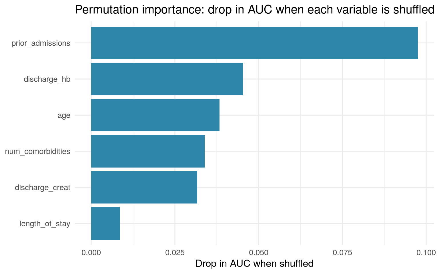
Code
from sklearn.inspection import permutation_importance

result = permutation_importance(rf, X, y, scoring="roc_auc",
                                n_repeats=10, random_state=1)
order = result.importances_mean.argsort()

fig, ax = plt.subplots(figsize=(6, 4))
ax.barh(X.columns[order], result.importances_mean[order], color="#2E86AB")
ax.set_xlabel("Drop in AUC when shuffled")
ax.set_title("Permutation importance: drop in AUC when each variable is shuffled")
ax.spines[["top", "right"]].set_visible(False)
plt.tight_layout()
plt.show()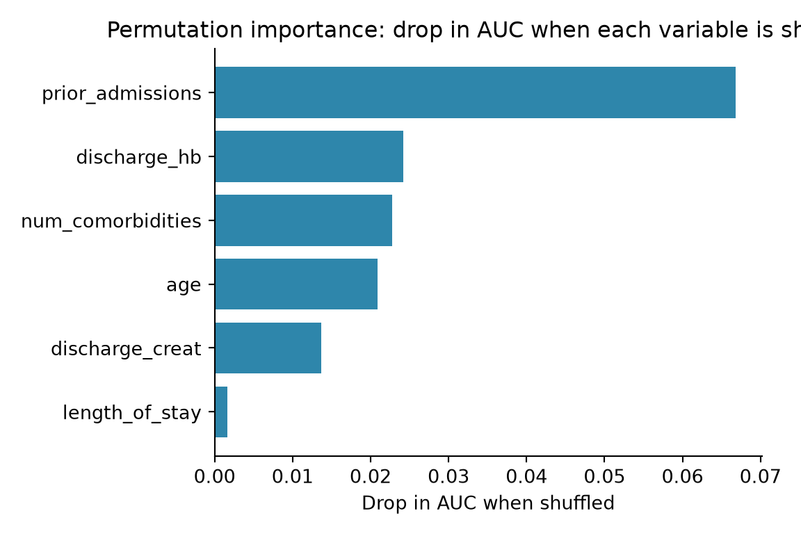
What the output shows. Each bar is the drop in AUC when that variable is shuffled: longer bars mean the model relies on that variable more. As expected, prior admissions dominates, with age and comorbidities contributing modestly and discharge labs contributing almost nothing. If the top bar had instead been something clinically irrelevant (a patient ID, an admission timestamp), that would be a red flag that the model learned a data-collection artefact rather than the disease process. Note: the R and Python tabs use the same data but different random forest implementations (ranger vs scikit-learn), so the exact bar lengths and middle-of-the-pack ordering may differ slightly. The overall story should be the same.
16.3 Partial Dependence Plots (Global)
Knowing that age matters does not tell you how it matters: does risk climb steadily with age, jump only after 75, or even fall again in the very old? A way to answer this is to look at the model’s predictions as you sweep one variable across its range, holding all other variables fixed. For example, take your whole dataset and ask the model to predict risk for every patient, but set everybody’s age to 50. Then set everybody’s age to 51, and so on. The average predicted risk at each age gives you a curve that shows how the model’s predictions depend on age. The resulting plot is called a partial dependence plot (PDP). Typical patterns include:
- Flat: the model’s predictions do not change with this variable.
- Steadily rising or falling: the model’s predictions increase or decrease monotonically with this variable.
- Curved: the model’s predictions accelerate or decelerate past a certain threshold.
WarningWhen predictors are correlated, prefer accumulated local effects (ALE)
When predictors are correlated (as clinical variables usually are), forcing one to an extreme while holding the others fixed creates impossible patients. For example, setting everybody’s age to 90 while keeping their original bloodwork produces 90-year-olds with the lab values of a 40-year-old, combinations that never occur in practice. The model is asked to predict for these unrealistic profiles, which can distort the curve.
Accumulated Local Effects (ALE) plots fix this. Instead of forcing unrealistic values on everyone, ALE looks at how the prediction changes over small, realistic windows of the variable and accumulates those local changes. The result reads almost exactly like a PDP (prediction on the y-axis, variable on the x-axis) but it stays more honest in the presence of correlation. When in doubt with correlated clinical predictors, plot the ALE. In R, iml and DALEX both compute ALE; in Python, the PyALE package does.
Code
library(tidyverse)   # ggplot2 / dplyr / tibble
library(pdp)

pred_fun <- function(object, newdata) {
  predict(object, newdata)$predictions[, "Yes"]
}

pd <- partial(
  rf,
  pred.var = "prior_admissions",
  pred.fun = pred_fun,
  train = dat
)

pd_avg <- pd |>
  group_by(prior_admissions) |>
  summarise(yhat = mean(yhat), .groups = "drop")

ggplot(pd_avg, aes(x = prior_admissions, y = yhat)) +
  geom_line(linewidth = 1.2, colour = "#2E86AB") +
  geom_point(size = 2, colour = "#2E86AB") +
  labs(
    x = "Prior admissions",
    y = "Average predicted risk",
    title = "Partial dependence: prior admissions"
  ) +
  theme_minimal(base_size = 13)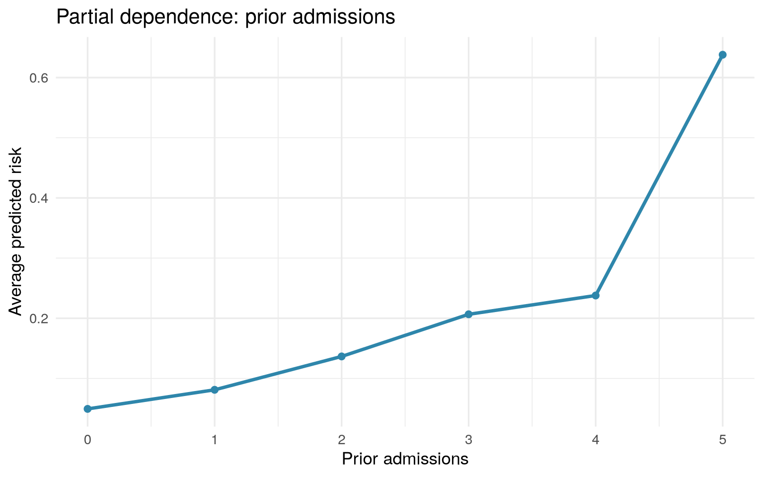
Code
from sklearn.inspection import partial_dependence

pd_result = partial_dependence(rf, X, features=["prior_admissions"], kind="average")
grid_values = pd_result["grid_values"][0]
avg_pred = pd_result["average"][0]

fig, ax = plt.subplots(figsize=(6, 4))
ax.plot(grid_values, avg_pred, linewidth=1.5, color="#2E86AB", marker="o", markersize=4)
ax.set_xlabel("Prior admissions")
ax.set_ylabel("Average predicted risk")
ax.set_title("Partial dependence: prior admissions")
ax.spines[["top", "right"]].set_visible(False)
plt.tight_layout()
plt.show()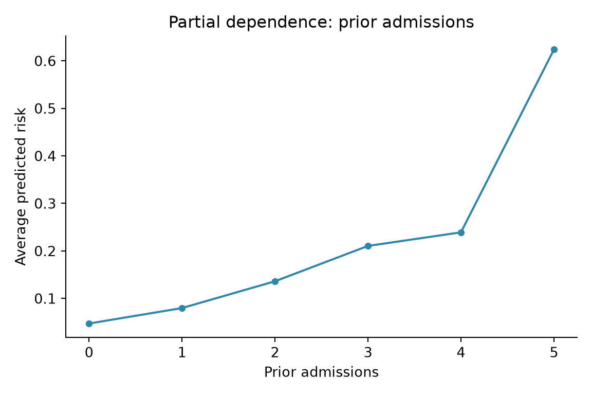
What the output shows. The x-axis is prior admissions; the y-axis is the model’s average predicted risk at each value. The line climbs from left to right: more prior admissions means higher predicted risk, exactly as a clinician would expect. When reading any PDP, ask: does the direction make clinical sense, and is the shape linear or does it bend at a threshold? A curve that slopes the “wrong” way (e.g., predicted risk falling as comorbidities rise) is a red flag worth investigating.
16.4 Shapley Values (Local and Global)
In 1953, the mathematician Lloyd Shapley posed a deceptively simple question: if a team of players jointly earns a payout, how should the credit be fairly divided among them (Shapley 1953)? His answer, the Shapley value, considers every possible order in which players could join the team and averages each player’s marginal contribution.
From game theory to ML. SHAP (SHapley Additive exPlanations) (Lundberg and Lee 2017) applies this idea to model predictions. The “players” are a patient’s variables (age, prior admissions, and so on), and the “payout” is the model’s predicted risk for that patient. Each variable’s Shapley value tells you how much this patient’s value of that variable pushed the prediction up or down, compared with the average patient. SHAP has become the modern standard for explaining tabular models, and we will spend the most time on it.
The payoff of all that theory is a property that makes SHAP uniquely useful: the SHAP values for one patient add up. Start from the model’s average prediction across everyone (the “baseline”), add each variable’s SHAP value for this patient, and you arrive exactly at this patient’s prediction. So SHAP gives you a complete, additive accounting of every individual prediction, and nothing is left unexplained. Because each explanation is exact and additive, you can also average the magnitudes of SHAP values across many patients to get a trustworthy global importance ranking. This is why SHAP bridges the local and global worlds (recall Figure 16.1).
For tree ensembles there is a fast, exact algorithm called TreeSHAP, so computing SHAP for a random forest or XGBoost model on a clinical dataset is quick.
Every SHAP figure below is drawn from the same fitted model and one set of SHAP values, so we set that up once and then read the plots one at a time. We reuse the readmission data from the running example above but fit an XGBoost model (instead of the random forest) so that we can use the fast, exact TreeSHAP algorithm. The resulting SHAP values are stored in sv (R) / shap_values (Python); each figure that follows simply reuses that object.
Code
library(xgboost)
library(shapviz)

X <- dat %>% select(-readmit) %>% as.matrix()
y <- as.integer(dat$readmit == "Yes")

xgb <- xgb.train(
  params = list(
    objective = "binary:logistic",
    max_depth = 4,
    learning_rate = 0.1
  ),
  data = xgb.DMatrix(X, label = y),
  nrounds = 100,
  verbose = 0
)

sv <- shapviz(xgb, X_pred = X, X = as.data.frame(X))

# Human-readable variable labels, reused to tidy up the figures below
nice_labels <- c(
  age = "Age (years)",
  length_of_stay = "Length of stay (days)",
  num_comorbidities = "Number of comorbidities",
  prior_admissions = "Prior admissions (count)",
  discharge_hb = "Discharge haemoglobin (g/dL)",
  discharge_creat = "Discharge creatinine (mg/dL)"
)
Code
XGBClassifier(base_score=None, booster=None, callbacks=None,
              colsample_bylevel=None, colsample_bynode=None,
              colsample_bytree=None, device=None, early_stopping_rounds=None,
              enable_categorical=True, eval_metric='logloss',
              feature_types=None, feature_weights=None, gamma=None,
              grow_policy=None, importance_type=None,
              interaction_constraints=None, learning_rate=0.1, max_bin=None,
              max_cat_threshold=None, max_cat_to_onehot=None,
              max_delta_step=None, max_depth=4, max_leaves=None,
              min_child_weight=None, missing=nan, monotone_constraints=None,
              multi_strategy=None, n_estimators=100, n_jobs=None,
              num_parallel_tree=None, ...)
In a Jupyter environment, please rerun this cell to show the HTML representation or trust the notebook. On GitHub, the HTML representation is unable to render, please try loading this page with nbviewer.org.
Parameters
Fitted attributes
| Name | Type | Value |
|---|---|---|
| classes_ | ndarray[int64](2,) | [0,1] |
| feature_importances_ | ndarray[float32](6,) | [0.12,0.11,0.17,0.34,0.12,0.12] |
| feature_names_in_ | ndarray[<U17](6,) | ['age','length_of_stay','num_comorbidities','prior_admissions', 'discharge_hb','discharge_creat'] |
| intercept_ | ndarray[float32](1,) | [0.09] |
| n_classes_ | int | 2 |
| n_features_in_ | int | 6 |
16.4.1 The SHAP summary (beeswarm) plot: global
The single most informative SHAP figure is the beeswarm summary plot, and it repays careful reading. Picture this: each variable gets one horizontal row, and the rows are stacked with the most important variable at the top. Within a row, there is one dot per patient. The dot’s horizontal position is that patient’s SHAP value for that variable: to the right means this variable pushed that patient’s predicted risk up, to the left means it pushed it down, and the further from the centre, the bigger the push. The dot’s colour encodes the variable’s value for that patient: typically red/high to blue/low.
So a single beeswarm row tells you both how important a variable is (how spread out the dots are) and which direction it acts (do high values, in red, sit on the right or the left?). For prior admissions, you would expect to see red dots (many prior admissions) clustered on the right (pushing risk up) and blue dots (few prior admissions) on the left (pushing risk down), a clean, clinically sensible gradient. If a variable’s colours were scrambled with no clear left-right pattern, the model is using it in a complicated, non-monotonic way worth investigating.
Code
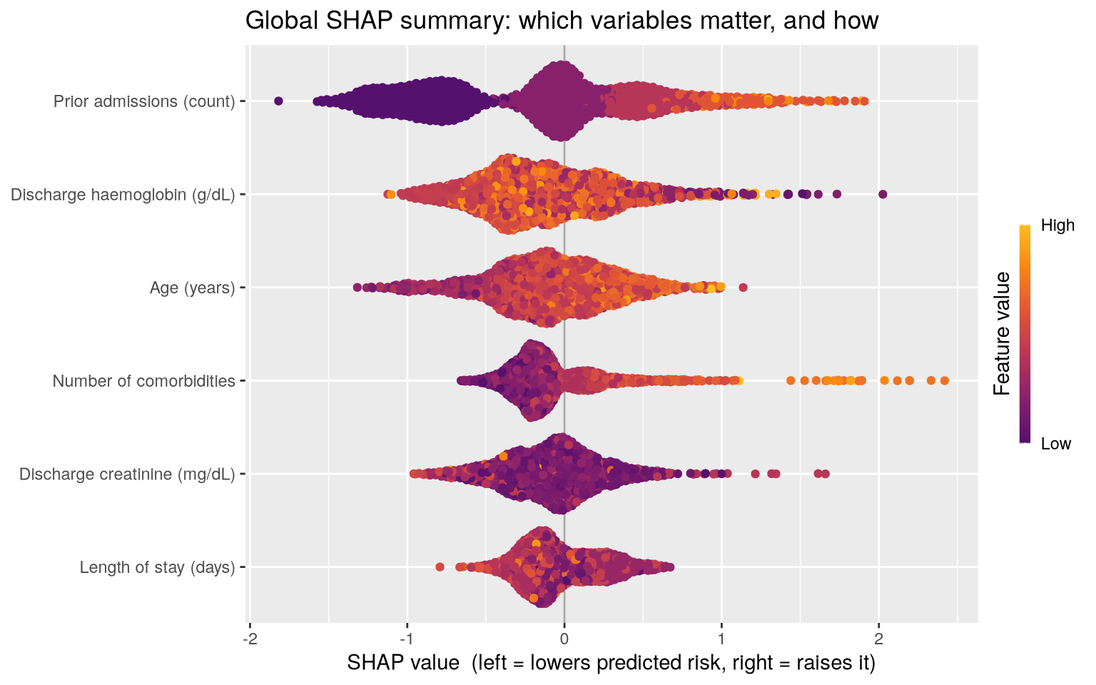
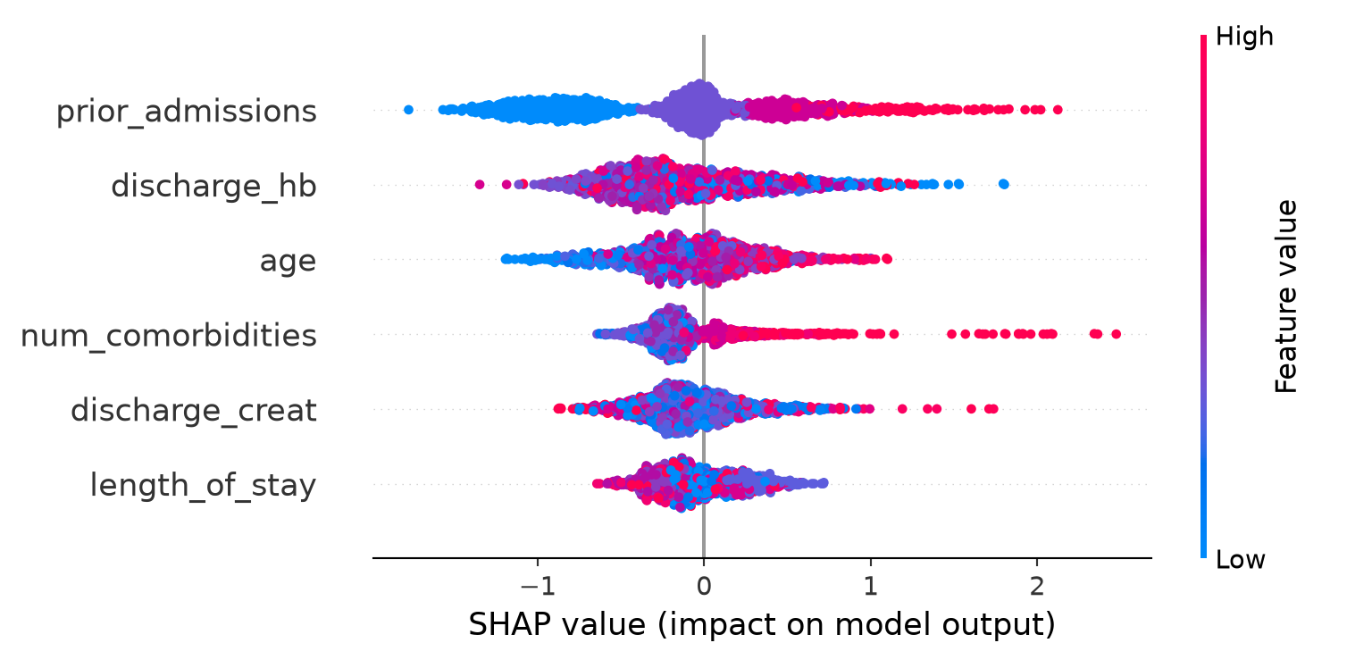
What the output shows. Variables are ranked top-to-bottom by importance. Each dot is one patient: position right of centre means the variable pushed that patient’s risk up, left means down. Dot colour encodes the variable’s value (red = high, blue = low). As expected, prior admissions and number of comorbidities dominate, with red dots on the right confirming a risk-increasing effect. If a row’s colours show no clear left-right gradient, the model is using that variable non-monotonically.
16.4.2 SHAP dependence (scatter) plots: global
A SHAP dependence plot zooms into one variable. It plots, for every patient, the variable’s value on the x-axis against its SHAP value on the y-axis. This is like a PDP but built from the exact per-patient contributions, and it reveals the shape of the variable’s effect plus the spread caused by interactions with other variables (vertical scatter at a given x-value means the variable’s effect depends on something else).
Code
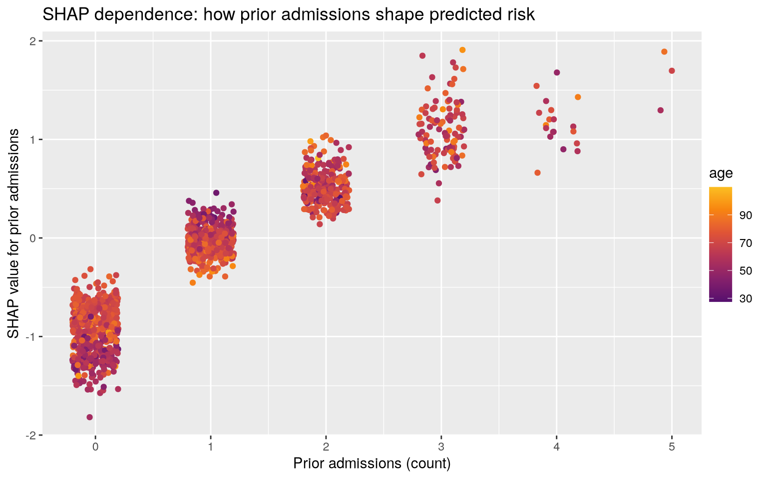
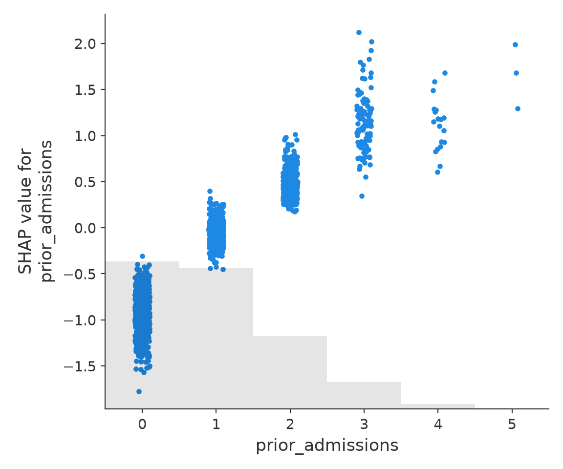
What to look for. An upward trend confirms the risk-increasing relationship; any vertical spread at a given x-value hints that the effect is modulated by other variables (an interaction).
16.4.3 Explaining one patient: local
For a single patient, the waterfall plot (or the equivalent force plot) is the clinician’s friend. It starts at the baseline (the average predicted risk) at the bottom and stacks one bar per variable, each pushing the running total up (red, risk-increasing) or down (blue, risk-decreasing), until it lands on this patient’s final predicted risk at the top. Read top to bottom, it is a plain sentence: “This patient’s risk is high mainly because they have four prior admissions (+12%) and a low discharge haemoglobin (+4%), partly offset by their relatively young age (−3%).” That is exactly the kind of justification you can put in a note or discuss with a patient.
Code
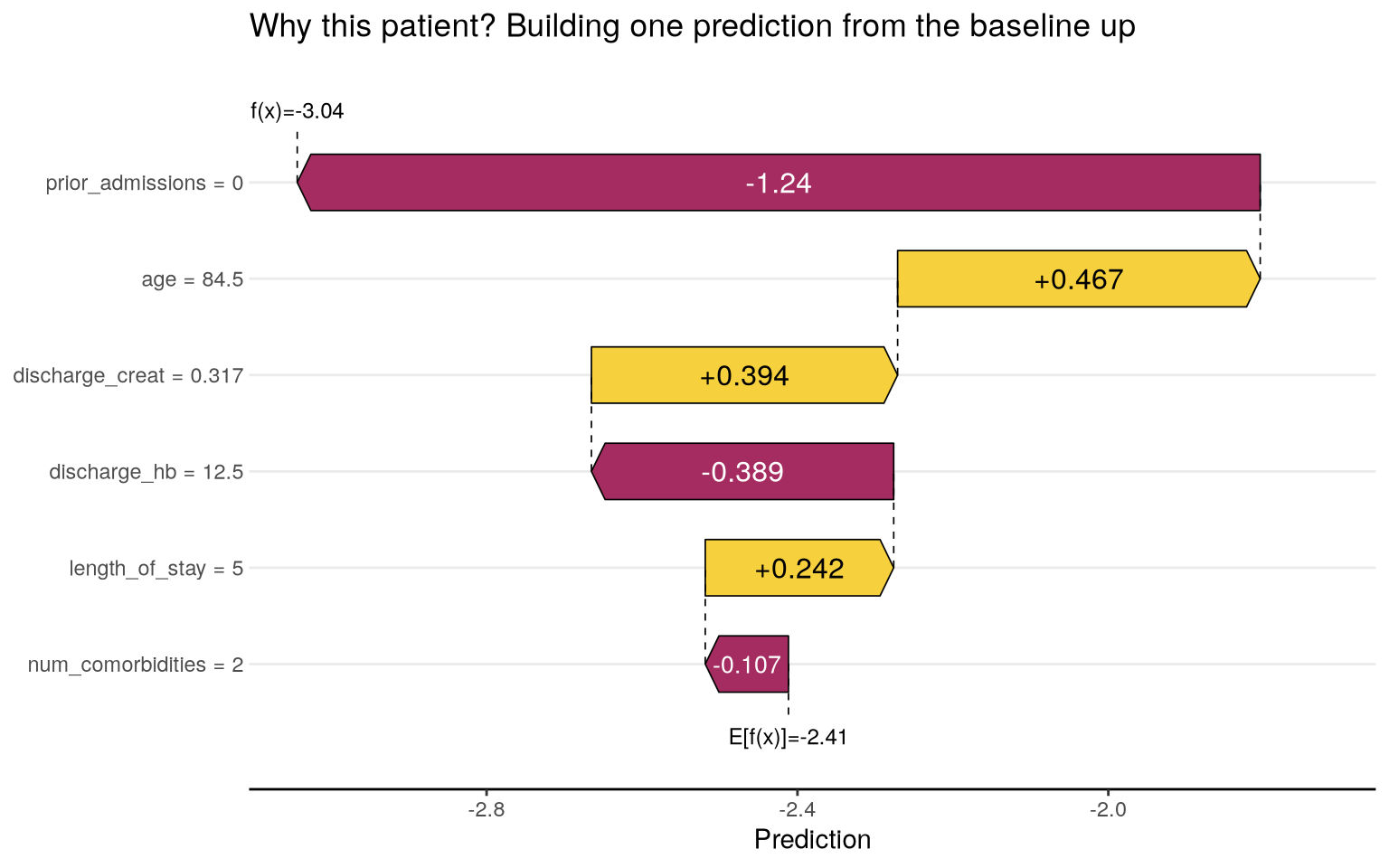
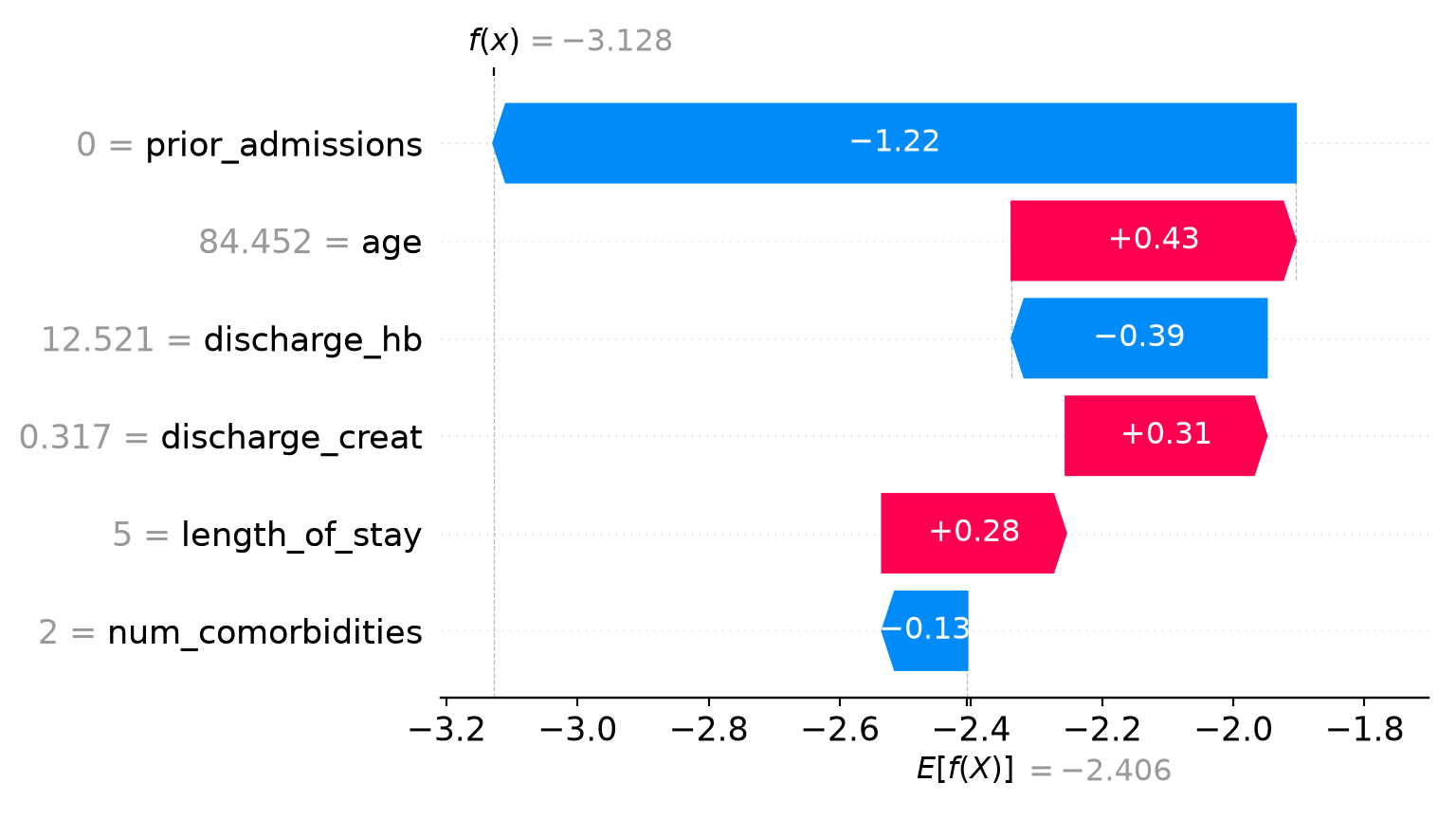
What to look for. The baseline (cohort-average) risk sits at one end and this patient’s final predicted risk at the other, with the coloured bars in between showing exactly which of their characteristics raised or lowered the prediction, and by how much. This is the figure to show when someone asks “why is this patient flagged?”
Taken together, SHAP lets you audit the model globally and defend any single prediction locally, using one coherent, additive accounting. That combination is why it has become the default tool. For a concrete clinical example, Lundberg and colleagues used SHAP to explain a model that predicts intraoperative hypoxaemia in real time, and showed that surfacing the per-patient risk factors to anaesthetists improved their ability to anticipate events, a demonstration that local explanations can change behaviour at the bedside, not just on paper (Lundberg et al. 2018). A practical note: TreeSHAP is exact and fast for the tree models above; for other model types SHAP falls back to slower approximations (KernelExplainer in Python, kernelshap in R), so on large datasets you may explain a representative sample of patients rather than all of them.
16.5 LIME (Local)
Although less popular than Shapley Values for tabular clinical data, Local Interpretable Model-agnostic Explanations (LIME) (Ribeiro et al. 2016) can be useful for local explanations. To explain one patient’s prediction, LIME creates a cloud of slightly altered versions of that patient (nudging variables up and down), asks the model to score all of them, then fits a simple, transparent model (usually a small linear regression) to that local cloud. Because the simple model only has to be accurate near this one patient (vs. the entire dataset), its coefficients give a readable, local approximation, e.g., “in the neighbourhood of this patient, higher creatinine and more prior admissions are what drive the risk up.”
Compared to SHAP which rests on firm game theory (the fairness guarantees of Shapley values) and its local explanations add up exactly to the prediction, LIME depends on somewhat arbitrary choices (how big is the local neighbourhood? how is “local” defined?) that can make explanations unstable. Reach for SHAP first; understand LIME so you can read older literature and appreciate the shared “explain locally with a simple surrogate” idea.
16.6 A Health-Focused Warning: What Explanations Do and Do Not Tell You
Whilst the above tools are powerful, and precisely because their output looks so authoritative, they are easy to over-trust. Ghassemi, Oakden-Rayner, and Beam make this case forcefully in The Lancet Digital Health (Ghassemi et al. 2021), arguing that current explainability methods offer a “false hope” for patient-level decision support: an explanation can describe how the model behaves without ever assuring you that it reached its decision for a clinically valid reason, and they urge that rigorous internal and external validation, not explanation, is the more direct route to a trustworthy model. We recommend reading that paper alongside this section.
ImportantExplanations show association, not causation… and not correctness
- They describe the model, not the disease. A SHAP plot says “the model uses high creatinine to raise predicted risk.” It does not say “high creatinine causes readmission,” and it certainly does not license “lowering creatinine will prevent readmission.” The variable may be a proxy for sicker patients. Never read an importance ranking or a SHAP plot as a causal effect. Intervening on a predictor is a different question entirely, requiring the causal-inference methods covered elsewhere on this website.
- A plausible explanation is not proof the model is right. If a model has secretly learned to read the scanner artefact, SHAP will faithfully and confidently report the scanner-related variable as important. The explanation is “correct” about the model and yet exposes that the model is wrong. Explanations are a tool for catching such failures, but only if you scrutinise them against clinical knowledge rather than rationalising whatever they show.
- Explanations can be unstable. Re-run LIME, or compute SHAP on a different background sample, and the numbers can shift. Treat explanations as estimates with their own uncertainty, not as exact readouts.
- Correlated features split the credit. When two variables carry overlapping information (say, weight and BMI), the model can use either, and the importance or SHAP credit gets divided between them in ways that can look arbitrary. A variable showing “low importance” may simply have had its thunder stolen by a correlated twin, not be genuinely irrelevant.
The honest stance is this: explanations are an indispensable tool for building trust, satisfying reporting standards, and (most valuably) catching a model that is right for the wrong reasons. They are not a substitute for external validation, for clinical judgement, or for the causal questions that ultimately matter to patients.
16.7 Exercises
TipExercise 1: Permutation importance and the wrong-reason model
Take the readmission dataset from the permutation-importance code and add a new variable that is essentially a leak (for example, discharge_disposition constructed to be strongly associated with the outcome but clinically a consequence of risk rather than a cause). Re-fit the random forest and recompute permutation importance.
- Where does the leaky variable rank?
- Explain to a colleague why a high-ranking variable here is a warning sign, not a discovery.
- What real-world variables in routine hospital data might behave like this leak?
NoteSolution
Code
# =============================================================================
# Chapter 9b, Exercise 1: Permutation importance and the wrong-reason model
# Add a leaky variable (discharge_disposition) and see it dominate the ranking.
# =============================================================================

library(ranger)
library(dplyr)
library(tibble)
library(ggplot2)
library(pROC)

# --- Re-create the readmission data ------------------------------------------
set.seed(42)
n <- 1500
dat <- tibble(
  age              = rnorm(n, 68, 12),
  length_of_stay   = rpois(n, 5) + 1,
  num_comorbidities= rpois(n, 3),
  prior_admissions = rpois(n, 1),
  discharge_hb     = rnorm(n, 11, 2),
  discharge_creat  = rlnorm(n, 0.2, 0.5)
)
# True risk depends mostly on prior admissions and comorbidities
lin <- -3 + 0.45 * dat$prior_admissions + 0.20 * dat$num_comorbidities +
        0.015 * (dat$age - 68) - 0.05 * dat$discharge_hb
readmit_num <- rbinom(n, 1, plogis(lin))
dat$readmit <- factor(readmit_num, labels = c("No", "Yes"))

# --- Add a LEAKY variable: discharge_disposition -----------------------------
# Where the patient was discharged TO is recorded AFTER the clinical course has
# played out. Patients who go on to be readmitted were far more likely to have
# been sent to a skilled-nursing facility / rehab (a marker that the team already
# judged them frail), whereas those who did well went home. The disposition is a
# CONSEQUENCE of the underlying risk (and of information not available at the
# moment we would actually make a prediction), not a cause of readmission.
disp <- ifelse(
  readmit_num == 1,
  sample(c("SNF", "Rehab", "Home"), n, replace = TRUE, prob = c(0.55, 0.30, 0.15)),
  sample(c("SNF", "Rehab", "Home"), n, replace = TRUE, prob = c(0.08, 0.12, 0.80))
)
dat$discharge_disposition <- factor(disp)

# --- Re-fit the random forest with the leaky variable included ---------------
rf <- ranger(readmit ~ ., data = dat, probability = TRUE,
             num.trees = 500, seed = 42)

# --- Permutation importance, computed directly (as in the chapter) -----------
auc_for <- function(prob) {
  as.numeric(pROC::auc(dat$readmit, prob,
                       levels = c("No", "Yes"), direction = "<"))
}
baseline_auc <- auc_for(predict(rf, dat)$predictions[, "Yes"])

predictors <- setdiff(names(dat), "readmit")
set.seed(1)
importance <- sapply(predictors, function(v) {
  drops <- replicate(10, {
    shuffled <- dat
    shuffled[[v]] <- sample(shuffled[[v]]) # break this variable only
    baseline_auc - auc_for(predict(rf, shuffled)$predictions[, "Yes"])
  })
  mean(drops)
})

imp_df <- tibble(Variable = predictors, Importance = importance) |>
  arrange(desc(Importance))

cat("=== Permutation importance (drop in AUC when shuffled) ===\n")
print(as.data.frame(imp_df), row.names = FALSE)

leak_rank <- which(imp_df$Variable == "discharge_disposition")
cat(sprintf("\nBaseline AUC (with leak): %.3f\n", baseline_auc))
cat(sprintf("discharge_disposition ranks #%d of %d predictors.\n",
            leak_rank, nrow(imp_df)))

# --- Plot (saved to a temp file, no display needed) --------------------------
p <- ggplot(imp_df, aes(x = reorder(Variable, Importance), y = Importance)) +
  geom_col(fill = "#2E86AB") +
  coord_flip() +
  labs(x = NULL, y = "Drop in AUC when shuffled",
       title = "Permutation importance with a leaky variable") +
  theme_minimal(base_size = 13)
out <- file.path(tempdir(), "ch09b_ex1_importance.png")
ggsave(out, p, width = 7, height = 4, dpi = 100)
cat("Plot saved to:", out, "\n")

# =============================================================================
# INTERPRETATION
#
# 1) Where does the leaky variable rank?
#    discharge_disposition rockets to the TOP of the permutation-importance
#    ranking -- shuffling it collapses the AUC far more than shuffling any
#    genuine clinical predictor. It looks like the single "best" variable.
#
# 2) Why is a high rank here a WARNING, not a discovery?
#    Permutation importance only tells you how much the MODEL leans on a
#    variable to reproduce the observed outcome -- not whether that variable is
#    usable or causal. discharge_disposition is recorded at (or after) the very
#    event we are trying to predict and is a downstream MARKER of the risk the
#    clinical team already perceived. A model that leans on it will look
#    brilliant in development and then fail in deployment, because at true
#    prediction time (before discharge decisions are finalised) the value is
#    unavailable or not yet meaningful. A variable that dominates the ranking
#    for no plausible clinical reason should trigger a hunt for leakage, not a
#    celebration. "Too good to be true" usually is.
#
# 3) Real-world variables that behave like this leak:
#    - Discharge destination / disposition codes (as here).
#    - Palliative-care or hospice referral flags.
#    - "Do not resuscitate" orders entered late in the stay.
#    - Number of consults, ICU transfers, or rapid-response calls during the
#      index stay (consequences of deterioration).
#    - Medications started for complications (e.g. vasopressors, broad-spectrum
#      antibiotics) that postdate the predictor cut-off.
#    - Billing/DRG codes finalised after the outcome is known.
#    - Timestamps or ward names that proxy for how sick a patient was.
#    Each is associated with the outcome because it is a CONSEQUENCE of the
#    illness, not a baseline predictor available when the model must act.
# =============================================================================
Code
# =============================================================================
# Chapter 9b, Exercise 1: Permutation importance and the wrong-reason model
# Add a leaky variable (discharge_disposition) and see it dominate the ranking.
# =============================================================================

import numpy as np
import pandas as pd
import matplotlib
matplotlib.use("Agg")  # no display needed; save figures to file
import matplotlib.pyplot as plt
from sklearn.ensemble import RandomForestClassifier
from sklearn.inspection import permutation_importance
import tempfile
import os

# --- Re-create the readmission data ------------------------------------------
np.random.seed(42)
rng = np.random.default_rng(42)
n = 1500
X = pd.DataFrame({
    "age":               rng.normal(68, 12, n),
    "length_of_stay":    rng.poisson(5, n) + 1,
    "num_comorbidities": rng.poisson(3, n),
    "prior_admissions":  rng.poisson(1, n),
    "discharge_hb":      rng.normal(11, 2, n),
    "discharge_creat":   rng.lognormal(0.2, 0.5, n),
})
lin = (-3 + 0.45 * X["prior_admissions"] + 0.20 * X["num_comorbidities"]
       + 0.015 * (X["age"] - 68) - 0.05 * X["discharge_hb"])
y = rng.binomial(1, 1 / (1 + np.exp(-lin)))

# --- Add a LEAKY variable: discharge_disposition -----------------------------
# Where the patient was discharged TO is recorded AFTER the clinical course has
# played out. Patients who go on to be readmitted were far more likely to have
# been sent to a skilled-nursing facility / rehab, whereas those who did well
# went home. The disposition is a CONSEQUENCE of the underlying risk, not a
# cause of readmission -- and it is not truly available at prediction time.
disp_codes = np.array(["Home", "Rehab", "SNF"])  # encoded 0, 1, 2
disp = np.where(
    y == 1,
    rng.choice([0, 1, 2], size=n, p=[0.15, 0.30, 0.55]),
    rng.choice([0, 1, 2], size=n, p=[0.80, 0.12, 0.08]),
)
X["discharge_disposition"] = disp  # integer encoding (0=Home,1=Rehab,2=SNF)

# --- Re-fit the random forest with the leaky variable included ---------------
rf = RandomForestClassifier(n_estimators=500, random_state=42, n_jobs=-1)
rf.fit(X, y)

# --- Permutation importance (shuffle each column, watch AUC fall) ------------
result = permutation_importance(rf, X, y, scoring="roc_auc",
                                n_repeats=10, random_state=1)
imp = (pd.DataFrame({"Variable": X.columns,
                     "Importance": result.importances_mean})
       .sort_values("Importance", ascending=False)
       .reset_index(drop=True))

print("=== Permutation importance (drop in AUC when shuffled) ===")
print(imp.to_string(index=False))

leak_rank = imp.index[imp["Variable"] == "discharge_disposition"][0] + 1
print(f"\ndischarge_disposition ranks #{leak_rank} of {len(imp)} predictors.")

# --- Plot (saved to a temp file, no display needed) --------------------------
order = result.importances_mean.argsort()
plt.figure(figsize=(7, 4))
plt.barh(X.columns[order], result.importances_mean[order], color="#2E86AB")
plt.xlabel("Mean drop in AUC when the variable is shuffled")
plt.title("Permutation importance with a leaky variable")
plt.tight_layout()
out = os.path.join(tempfile.gettempdir(), "ch09b_ex1_importance.png")
plt.savefig(out, dpi=100)
print("Plot saved to:", out)

# =============================================================================
# INTERPRETATION
#
# 1) Where does the leaky variable rank?
#    discharge_disposition jumps to the TOP of the ranking -- shuffling it
#    collapses the AUC more than shuffling any genuine clinical predictor.
#
# 2) Why is a high rank here a WARNING, not a discovery?
#    Permutation importance measures how much the MODEL leans on a variable to
#    reproduce the observed outcome -- not whether the variable is usable or
#    causal. discharge_disposition is decided at/after the event we predict and
#    is a downstream MARKER of the risk the team already perceived. A model that
#    leans on it looks brilliant in development and fails in deployment, because
#    at true prediction time the value is unavailable or not yet meaningful. A
#    variable that dominates for no plausible clinical reason should trigger a
#    hunt for leakage, not a celebration.
#
# 3) Real-world variables that behave like this leak:
#    - Discharge destination / disposition codes (as here).
#    - Palliative-care or hospice referral flags; late DNR orders.
#    - Counts of consults, ICU transfers, or rapid-response calls in the stay.
#    - Medications started for complications (vasopressors, broad-spectrum
#      antibiotics) that postdate the predictor cut-off.
#    - Billing/DRG codes finalised after the outcome is known.
#    - Timestamps or ward names that proxy for how sick a patient was.
#    Each is associated with the outcome because it is a CONSEQUENCE of illness,
#    not a baseline predictor available when the model must act.
# =============================================================================
TipExercise 2: Reading a SHAP beeswarm
Using the SHAP code, produce the beeswarm summary plot and answer:
- Which two variables are globally most important?
- For the top variable, do high values (red dots) push the prediction up or down? Is this clinically sensible?
- Pick a variable whose dots show no clear left-right colour pattern. What might that tell you about how the model uses it?
NoteSolution
Code
# =============================================================================
# Chapter 9b, Exercise 2: Reading a SHAP beeswarm
# Fit XGBoost, compute TreeSHAP, draw the beeswarm, and read it clinically.
# =============================================================================

library(xgboost)
library(shapviz)
library(dplyr)
library(tibble)
library(ggplot2)

# --- Re-create data and fit an XGBoost model ---------------------------------
set.seed(42)
n <- 1500
dat <- tibble(
  age              = rnorm(n, 68, 12),
  length_of_stay   = rpois(n, 5) + 1,
  num_comorbidities= rpois(n, 3),
  prior_admissions = rpois(n, 1),
  discharge_hb     = rnorm(n, 11, 2),
  discharge_creat  = rlnorm(n, 0.2, 0.5)
)
lin <- -3 + 0.45 * dat$prior_admissions + 0.20 * dat$num_comorbidities +
        0.015 * (dat$age - 68) - 0.05 * dat$discharge_hb
dat$readmit <- rbinom(n, 1, plogis(lin))

X <- dat %>% select(-readmit) %>% as.matrix()
xgb <- xgb.train(
  params = list(objective = "binary:logistic",
                max_depth = 4, learning_rate = 0.1),
  data = xgb.DMatrix(X, label = dat$readmit),
  nrounds = 100, verbose = 0
)

# --- Compute SHAP values once (fast exact TreeSHAP) --------------------------
sv <- shapviz(xgb, X_pred = X, X = as.data.frame(X))

# --- Global SHAP importance ordering (mean |SHAP|) ---------------------------
mean_abs <- colMeans(abs(get_shap_values(sv)))
imp_order <- sort(mean_abs, decreasing = TRUE)
cat("=== Global SHAP importance (mean |SHAP value|) ===\n")
print(round(imp_order, 4))
cat("\nTop two variables:", paste(names(imp_order)[1:2], collapse = ", "), "\n")

# --- Beeswarm summary plot (saved to a temp file) ----------------------------
p <- sv_importance(sv, kind = "beeswarm") +
  labs(title = "Global SHAP summary: which variables matter, and how",
       x = "SHAP value (left = lowers risk, right = raises it)")
out <- file.path(tempdir(), "ch09b_ex2_beeswarm.png")
ggsave(out, p, width = 7, height = 4.5, dpi = 100)
cat("Beeswarm saved to:", out, "\n")

# =============================================================================
# INTERPRETATION
#
# 1) Which two variables are globally most important?
#    Read them off the printed ranking above. prior_admissions is clearly the
#    single most important variable; the second slot is taken by another genuine
#    risk driver -- here discharge_hb (with num_comorbidities and age close
#    behind). All of the top variables are ones that actually enter the
#    simulated true risk, while the two variables that do NOT (length_of_stay
#    and discharge_creat) fall to the bottom. Reassuring: the model relies on
#    clinically sensible signals. (The exact 2nd place can differ by backend --
#    e.g. num_comorbidities in the scikit-learn version -- because discharge_hb
#    has a wide spread and num_comorbidities a narrow one; trust the printout.)
#
# 2) For the TOP variable (prior_admissions), do high values push the
#    prediction UP or DOWN?
#    HIGH values (red dots) sit on the RIGHT -- more prior admissions push the
#    predicted readmission risk UP; few prior admissions (blue) push it down.
#    This is clinically sensible: a history of admissions is a well-known marker
#    of frailty and unstable disease, so higher predicted risk is expected.
#
# 3) A variable with NO clear left-right colour pattern:
#    discharge_creat (and, to a lesser extent, length_of_stay) shows red and
#    blue dots mixed on both sides with SHAP values tightly clustered near zero.
#    We built creatinine as pure noise (it enters neither the true risk nor a
#    correlation), so the model has found no consistent signal in it. A scrambled
#    colour pattern with small SHAP values means the variable is essentially
#    unused; a scrambled pattern with LARGE SHAP values would instead flag a
#    complex, non-monotonic or interaction-driven effect worth investigating.
# =============================================================================
Code
# =============================================================================
# Chapter 9b, Exercise 2: Reading a SHAP beeswarm
# Fit a model, compute SHAP, draw the beeswarm, and read it clinically.
# =============================================================================

import numpy as np
import pandas as pd
import matplotlib
matplotlib.use("Agg")  # no display needed; save figures to file
import matplotlib.pyplot as plt
import xgboost as xgb
import shap
import tempfile
import os

# --- Re-create data and fit the model ----------------------------------------
np.random.seed(42)
rng = np.random.default_rng(42)
n = 1500
X = pd.DataFrame({
    "age":               rng.normal(68, 12, n),
    "length_of_stay":    rng.poisson(5, n) + 1,
    "num_comorbidities": rng.poisson(3, n),
    "prior_admissions":  rng.poisson(1, n),
    "discharge_hb":      rng.normal(11, 2, n),
    "discharge_creat":   rng.lognormal(0.2, 0.5, n),
})
lin = (-3 + 0.45 * X["prior_admissions"] + 0.20 * X["num_comorbidities"]
       + 0.015 * (X["age"] - 68) - 0.05 * X["discharge_hb"])
y = rng.binomial(1, 1 / (1 + np.exp(-lin)))

model = xgb.XGBClassifier(
    n_estimators=100, max_depth=4, learning_rate=0.1, eval_metric="logloss"
)
model.fit(X, y)

# --- Compute SHAP values once (TreeExplainer = fast exact TreeSHAP) ----------
explainer = shap.TreeExplainer(model, feature_perturbation="tree_path_dependent")
sv = explainer(X)

# --- Global SHAP importance ordering (mean |SHAP|) ---------------------------
mean_abs = np.abs(sv.values).mean(axis=0)
imp = (pd.Series(mean_abs, index=X.columns)
       .sort_values(ascending=False))
print("=== Global SHAP importance (mean |SHAP value|) ===")
print(imp.round(4).to_string())
print("\nTop two variables:", ", ".join(imp.index[:2]))

# --- Beeswarm summary plot (saved to a temp file) ----------------------------
plt.figure()
shap.plots.beeswarm(sv, show=False)
plt.tight_layout()
out = os.path.join(tempfile.gettempdir(), "ch09b_ex2_beeswarm.png")
plt.savefig(out, dpi=100, bbox_inches="tight")
print("Beeswarm saved to:", out)

# =============================================================================
# INTERPRETATION
#
# 1) Which two variables are globally most important?
#    Read them off the printed ranking above. prior_admissions is clearly the
#    single most important variable; num_comorbidities takes the second slot
#    here (with discharge_hb and age close behind). All of the top variables are
#    ones that actually enter the simulated true risk, while the two that do NOT
#    (length_of_stay and discharge_creat) fall to the bottom. Reassuring: the
#    model relies on clinically sensible signals. (The exact 2nd place can
#    differ by backend -- e.g. discharge_hb in the R/XGBoost version -- because
#    the two variables have different spreads; trust the printout.)
#
# 2) For the TOP variable (prior_admissions), do high values push the
#    prediction UP or DOWN?
#    HIGH values (red dots) sit on the RIGHT -- more prior admissions push the
#    predicted readmission risk UP; few prior admissions (blue) push it down.
#    This is clinically sensible: a history of admissions marks frailty and
#    unstable disease, so higher predicted risk is expected.
#
# 3) A variable with NO clear left-right colour pattern:
#    discharge_creat (and, to a lesser extent, length_of_stay) shows red and
#    blue dots mixed on both sides with SHAP values clustered near zero. We
#    built creatinine as pure noise, so the model found no consistent signal.
#    A scrambled colour pattern with small SHAP values means the variable is
#    essentially unused; the same pattern with LARGE SHAP values would instead
#    flag a complex, non-monotonic or interaction-driven effect to investigate.
# =============================================================================
TipExercise 3: Explaining one patient to a patient
Produce a SHAP waterfall plot for a single high-risk patient and a single low-risk patient.
- Write one or two sentences, in plain language a patient could understand, explaining each prediction from its waterfall.
- For the high-risk patient, which characteristic contributed most? Would intervening on that characteristic necessarily reduce the patient’s risk? Explain, drawing on the caveats section.
NoteSolution
Code
# =============================================================================
# Chapter 9b, Exercise 3: Explaining one patient to a patient
# SHAP waterfall plots for one high-risk and one low-risk patient.
# =============================================================================

library(xgboost)
library(shapviz)
library(dplyr)
library(tibble)
library(ggplot2)

# --- Re-create data and fit an XGBoost model ---------------------------------
set.seed(42)
n <- 1500
dat <- tibble(
  age              = rnorm(n, 68, 12),
  length_of_stay   = rpois(n, 5) + 1,
  num_comorbidities= rpois(n, 3),
  prior_admissions = rpois(n, 1),
  discharge_hb     = rnorm(n, 11, 2),
  discharge_creat  = rlnorm(n, 0.2, 0.5)
)
lin <- -3 + 0.45 * dat$prior_admissions + 0.20 * dat$num_comorbidities +
        0.015 * (dat$age - 68) - 0.05 * dat$discharge_hb
dat$readmit <- rbinom(n, 1, plogis(lin))

X <- dat %>% select(-readmit) %>% as.matrix()
xgb <- xgb.train(
  params = list(objective = "binary:logistic",
                max_depth = 4, learning_rate = 0.1),
  data = xgb.DMatrix(X, label = dat$readmit),
  nrounds = 100, verbose = 0
)
sv <- shapviz(xgb, X_pred = X, X = as.data.frame(X))

# --- Pick one high-risk and one low-risk patient by predicted probability ----
preds <- predict(xgb, xgb.DMatrix(X))
hi <- which.max(preds)   # highest predicted readmission risk
lo <- which.min(preds)   # lowest predicted readmission risk

cat(sprintf("High-risk patient: row %d, predicted risk = %.1f%%\n",
            hi, 100 * preds[hi]))
print(as.data.frame(X)[hi, , drop = FALSE])
cat(sprintf("\nLow-risk patient:  row %d, predicted risk = %.1f%%\n",
            lo, 100 * preds[lo]))
print(as.data.frame(X)[lo, , drop = FALSE])

# --- Waterfall plots (saved to temp files) -----------------------------------
p_hi <- sv_waterfall(sv, row_id = hi) +
  labs(title = "High-risk patient: building the prediction from baseline up")
p_lo <- sv_waterfall(sv, row_id = lo) +
  labs(title = "Low-risk patient: building the prediction from baseline up")
out_hi <- file.path(tempdir(), "ch09b_ex3_waterfall_high.png")
out_lo <- file.path(tempdir(), "ch09b_ex3_waterfall_low.png")
ggsave(out_hi, p_hi, width = 7, height = 4.5, dpi = 100)
ggsave(out_lo, p_lo, width = 7, height = 4.5, dpi = 100)
cat("\nWaterfalls saved to:\n  ", out_hi, "\n  ", out_lo, "\n")

# --- Which characteristic contributed most for the high-risk patient? --------
shap_hi <- get_shap_values(sv)[hi, ]
top_feat <- names(shap_hi)[which.max(abs(shap_hi))]
cat(sprintf("\nLargest contributor for the high-risk patient: %s (SHAP = %+.3f)\n",
            top_feat, shap_hi[which.max(abs(shap_hi))]))

# =============================================================================
# INTERPRETATION
#
# 1) Plain-language explanations from each waterfall:
#
#    HIGH-RISK patient (to the patient):
#    "Our tool starts everyone at the average readmission risk. For you it moved
#     UP mainly because you have had several previous hospital admissions and a
#     number of ongoing health conditions, which together point to a higher
#     chance of coming back within 30 days. A couple of your other results
#     nudged the estimate down a little, but not enough to change the picture."
#
#    LOW-RISK patient (to the patient):
#    "Starting from the average, your estimate moved DOWN because you have had
#     few or no previous admissions and few ongoing conditions. That is why the
#     tool puts your 30-day readmission risk below average."
#
# 2) Which characteristic contributed most for the high-risk patient, and would
#    intervening on it necessarily reduce risk?
#    For this patient the largest single contributor is prior_admissions (read
#    the printed top contributor above; it is a marker of high baseline risk).
#    It is tempting to conclude "reduce that variable and the risk falls" -- but
#    that is a CAUSAL claim the SHAP value does NOT support. SHAP only reports
#    how the MODEL used this patient's data; prior admissions (like a
#    comorbidity count) is a MARKER of underlying frailty and unstable disease,
#    not plausibly the direct cause of the next readmission. You cannot
#    "intervene" on a count of past events, and even the underlying frailty it
#    proxies would need a genuine causal-inference study (not an explanation
#    plot) to know whether any action actually lowers risk. Explanations
#    describe association learned by the model, never an intervention effect
#    (see the chapter's health warning: "Never read a SHAP value as a causal
#    effect").
# =============================================================================
Code
# =============================================================================
# Chapter 9b, Exercise 3: Explaining one patient to a patient
# SHAP waterfall plots for one high-risk and one low-risk patient.
# =============================================================================

import numpy as np
import pandas as pd
import matplotlib
matplotlib.use("Agg")  # no display needed; save figures to file
import matplotlib.pyplot as plt
import xgboost as xgb
import shap
import tempfile
import os

# --- Re-create data and fit the model ----------------------------------------
np.random.seed(42)
rng = np.random.default_rng(42)
n = 1500
X = pd.DataFrame({
    "age":               rng.normal(68, 12, n),
    "length_of_stay":    rng.poisson(5, n) + 1,
    "num_comorbidities": rng.poisson(3, n),
    "prior_admissions":  rng.poisson(1, n),
    "discharge_hb":      rng.normal(11, 2, n),
    "discharge_creat":   rng.lognormal(0.2, 0.5, n),
})
lin = (-3 + 0.45 * X["prior_admissions"] + 0.20 * X["num_comorbidities"]
       + 0.015 * (X["age"] - 68) - 0.05 * X["discharge_hb"])
y = rng.binomial(1, 1 / (1 + np.exp(-lin)))

model = xgb.XGBClassifier(
    n_estimators=100, max_depth=4, learning_rate=0.1, eval_metric="logloss"
)
model.fit(X, y)

explainer = shap.TreeExplainer(model, feature_perturbation="tree_path_dependent")
sv = explainer(X)

# --- Pick one high-risk and one low-risk patient -----------------------------
preds = model.predict_proba(X)[:, 1]
hi = int(np.argmax(preds))
lo = int(np.argmin(preds))

print(f"High-risk patient: row {hi}, predicted risk = {100*preds[hi]:.1f}%")
print(X.iloc[[hi]].to_string())
print(f"\nLow-risk patient:  row {lo}, predicted risk = {100*preds[lo]:.1f}%")
print(X.iloc[[lo]].to_string())

# --- Waterfall plots (saved to temp files) -----------------------------------
plt.figure()
shap.plots.waterfall(sv[hi], show=False)
out_hi = os.path.join(tempfile.gettempdir(), "ch09b_ex3_waterfall_high.png")
plt.savefig(out_hi, dpi=100, bbox_inches="tight")
plt.close()

plt.figure()
shap.plots.waterfall(sv[lo], show=False)
out_lo = os.path.join(tempfile.gettempdir(), "ch09b_ex3_waterfall_low.png")
plt.savefig(out_lo, dpi=100, bbox_inches="tight")
plt.close()
print("\nWaterfalls saved to:\n  ", out_hi, "\n  ", out_lo)

# --- Which characteristic contributed most for the high-risk patient? --------
shap_hi = pd.Series(sv.values[hi], index=X.columns)
top_feat = shap_hi.abs().idxmax()
print(f"\nLargest contributor for the high-risk patient: "
      f"{top_feat} (SHAP = {shap_hi[top_feat]:+.3f})")

# =============================================================================
# INTERPRETATION
#
# 1) Plain-language explanations from each waterfall:
#
#    HIGH-RISK patient (to the patient):
#    "Our tool starts everyone at the average readmission risk. For you it moved
#     UP mainly because you have had several previous hospital admissions and a
#     number of ongoing health conditions, which together point to a higher
#     chance of coming back within 30 days."
#
#    LOW-RISK patient (to the patient):
#    "Starting from the average, your estimate moved DOWN because you have had
#     few or no previous admissions and few ongoing conditions, which is why the
#     tool puts your 30-day readmission risk below average."
#
# 2) Which characteristic contributed most for the high-risk patient, and would
#    intervening on it necessarily reduce risk?
#    Read the printed top contributor above. It is tempting to conclude
#    "reduce that variable and the risk falls" -- but that is a CAUSAL claim
#    SHAP does NOT support. SHAP only reports how the MODEL used this patient's
#    data; a comorbidity count (like prior admissions) is a MARKER of underlying
#    frailty, not plausibly the direct cause of the next readmission, and you
#    cannot meaningfully "intervene" on the count itself. Establishing whether
#    any action lowers risk needs a genuine causal-inference study, not an
#    explanation plot. Explanations describe association learned by the model,
#    never an intervention effect.
# =============================================================================
TipExercise 4: PDP versus ALE with correlated predictors
Modify the simulation so that discharge_creat and age are strongly correlated (e.g. make creatinine rise with age). Plot the partial dependence of predicted risk on creatinine, then an ALE plot for the same variable (use iml or DALEX in R, or PyALE in Python).
- Do the two curves agree?
- If they differ, explain why the PDP may be misleading here.
NoteSolution
Code
# =============================================================================
# Chapter 9b, Exercise 4: PDP versus ALE with correlated predictors
# Make creatinine rise with age, then compare PDP and ALE for creatinine.
# =============================================================================

library(ranger)
library(pdp)     # partial() for partial dependence
library(iml)     # FeatureEffect(..., method = "ale") for ALE
library(dplyr)
library(tibble)
library(ggplot2)

# --- Re-create data, but make discharge_creat CORRELATED with age ------------
set.seed(42)
n <- 1500
dat <- tibble(
  age              = rnorm(n, 68, 12),
  length_of_stay   = rpois(n, 5) + 1,
  num_comorbidities= rpois(n, 3),
  prior_admissions = rpois(n, 1),
  discharge_hb     = rnorm(n, 11, 2)
)
# Creatinine now RISES WITH AGE (very strong correlation, corr ~ 0.98) plus a
# little noise. Crucially it is NOT part of the true risk -- it is a proxy for
# age. The tighter the correlation, the more the PDP is forced to extrapolate.
dat$discharge_creat <- 0.4 + 0.02 * dat$age + rnorm(n, 0, 0.05)

cat(sprintf("Correlation(age, discharge_creat) = %.2f\n",
            cor(dat$age, dat$discharge_creat)))

# True risk depends on age (and prior admissions, comorbidities), NOT creatinine
lin <- -3 + 0.45 * dat$prior_admissions + 0.20 * dat$num_comorbidities +
        0.05 * (dat$age - 68) - 0.05 * dat$discharge_hb
dat$readmit <- factor(rbinom(n, 1, plogis(lin)), labels = c("No", "Yes"))

rf <- ranger(readmit ~ ., data = dat, probability = TRUE,
             num.trees = 500, seed = 42)

predictors <- setdiff(names(dat), "readmit")
pred_fun <- function(object, newdata) {
  predict(object, newdata)$predictions[, "Yes"]
}

# --- Partial dependence (PDP) of predicted risk on creatinine ----------------
pd <- partial(rf, pred.var = "discharge_creat", pred.fun = pred_fun,
              train = as.data.frame(dat), grid.resolution = 25)
# pdp with a per-row pred.fun returns one row per (grid point, obs);
# aggregate to the mean prediction at each creatinine grid value.
pd_curve <- pd %>%
  group_by(discharge_creat) %>%
  summarise(pdp = mean(yhat), .groups = "drop")

p_pdp <- ggplot(pd_curve, aes(discharge_creat, pdp)) +
  geom_line(linewidth = 1.2, colour = "#2E86AB") +
  labs(title = "PDP: predicted risk vs discharge creatinine",
       x = "Discharge creatinine (mg/dL)", y = "Average predicted risk") +
  theme_minimal(base_size = 13)
out_pdp <- file.path(tempdir(), "ch09b_ex4_pdp.png")
ggsave(out_pdp, p_pdp, width = 7, height = 4, dpi = 100)

# --- ALE plot for the same variable (iml) ------------------------------------
predictor <- Predictor$new(
  rf, data = as.data.frame(dat[predictors]), y = dat$readmit,
  predict.function = pred_fun
)
ale <- FeatureEffect$new(predictor, feature = "discharge_creat", method = "ale")
p_ale <- plot(ale) +
  labs(title = "ALE: predicted risk vs discharge creatinine")
out_ale <- file.path(tempdir(), "ch09b_ex4_ale.png")
ggsave(out_ale, p_ale, width = 7, height = 4, dpi = 100)

cat("PDP saved to:", out_pdp, "\n")
cat("ALE saved to:", out_ale, "\n")

# --- Quantify the slope of each curve for comparison -------------------------
pdp_slope <- coef(lm(pdp ~ discharge_creat, data = pd_curve))[2]
ale_df <- ale$results
ale_slope <- coef(lm(.value ~ discharge_creat, data = ale_df))[2]
cat(sprintf("\nPDP slope (risk per mg/dL creatinine): %+.4f\n", pdp_slope))
cat(sprintf("ALE slope (centred effect per mg/dL): %+.4f\n", ale_slope))

# =============================================================================
# INTERPRETATION
#
# 1) Do the two curves agree?
#    No. The PDP shows a steep UPWARD slope, making creatinine look strongly
#    risk-increasing. The ALE curve rises too but is SUBSTANTIALLY FLATTER (its
#    slope is roughly a third to a half of the PDP's -- see the printed slopes),
#    indicating that once age is accounted for, creatinine's own conditional
#    effect is much smaller than the PDP suggests.
#
# 2) Why is the PDP misleading here?
#    We built creatinine as a pure PROXY for age: they are strongly correlated
#    and only AGE truly drives risk. A PDP works by forcing EVERY patient to a
#    given creatinine value while leaving their real age untouched -- so to draw
#    the point at "high creatinine" it averages predictions for IMPOSSIBLE
#    patients (young people with an old person's creatinine). Because age and
#    creatinine travel together in the real data, the model learned to read
#    creatinine partly as a stand-in for age; when the PDP breaks that link it
#    smears age's genuine effect onto the creatinine axis, producing a spurious
#    upward slope. ALE avoids this by measuring how the prediction CHANGES
#    within small, realistic windows of creatinine (where age is roughly
#    constant) and accumulating those local changes -- so it never evaluates
#    impossible combinations and reports creatinine's much smaller independent
#    effect. With correlated clinical predictors, trust the ALE.
# =============================================================================
Code
# =============================================================================
# Chapter 9b, Exercise 4: PDP versus ALE with correlated predictors
# Make creatinine rise with age, then compare PDP and a (manual) ALE.
# =============================================================================

import numpy as np
import pandas as pd
import matplotlib
matplotlib.use("Agg")  # no display needed; save figures to file
import matplotlib.pyplot as plt
from sklearn.ensemble import RandomForestClassifier
from sklearn.inspection import PartialDependenceDisplay
import tempfile
import os

# --- Re-create data, but make discharge_creat CORRELATED with age ------------
np.random.seed(42)
rng = np.random.default_rng(42)
n = 1500
X = pd.DataFrame({
    "age":               rng.normal(68, 12, n),
    "length_of_stay":    rng.poisson(5, n) + 1,
    "num_comorbidities": rng.poisson(3, n),
    "prior_admissions":  rng.poisson(1, n),
    "discharge_hb":      rng.normal(11, 2, n),
})
# Creatinine now RISES WITH AGE (very strong correlation, corr ~ 0.98) plus a
# little noise. Crucially it is NOT part of the true risk -- it is a proxy for
# age. The tighter the correlation, the more the PDP is forced to extrapolate.
X["discharge_creat"] = 0.4 + 0.02 * X["age"] + rng.normal(0, 0.05, n)
print(f"Correlation(age, discharge_creat) = "
      f"{X['age'].corr(X['discharge_creat']):.2f}")

# True risk depends on age (and prior admissions, comorbidities), NOT creatinine
lin = (-3 + 0.45 * X["prior_admissions"] + 0.20 * X["num_comorbidities"]
       + 0.05 * (X["age"] - 68) - 0.05 * X["discharge_hb"])
y = rng.binomial(1, 1 / (1 + np.exp(-lin)))

rf = RandomForestClassifier(n_estimators=500, random_state=42, n_jobs=-1)
rf.fit(X, y)

feat = "discharge_creat"
j = list(X.columns).index(feat)

# --- Partial dependence (PDP) with scikit-learn ------------------------------
fig, ax = plt.subplots(figsize=(7, 4))
disp = PartialDependenceDisplay.from_estimator(rf, X, features=[feat], ax=ax)
ax.set_title("PDP: predicted risk vs discharge creatinine")
plt.tight_layout()
out_pdp = os.path.join(tempfile.gettempdir(), "ch09b_ex4_pdp.png")
plt.savefig(out_pdp, dpi=100)
plt.close()

# Extract PDP grid + values for a numeric slope comparison
pdp_res = disp.pd_results[0]
pdp_x = pdp_res["grid_values"][0] if "grid_values" in pdp_res else pdp_res["values"][0]
pdp_y = np.asarray(pdp_res["average"]).ravel()

# --- Manual 1D ALE for the same variable -------------------------------------
def ale_1d(model, X, feature, n_bins=20):
    """Simple binned 1D ALE for the positive-class probability."""
    x = X[feature].values
    # quantile bin edges (unique to avoid empty bins)
    edges = np.unique(np.quantile(x, np.linspace(0, 1, n_bins + 1)))
    centers, local = [], []
    for k in range(1, len(edges)):
        lo, hi = edges[k - 1], edges[k]
        mask = (x >= lo) & (x <= hi) if k == 1 else (x > lo) & (x <= hi)
        if mask.sum() == 0:
            continue
        Xlo = X.loc[mask].copy(); Xlo[feature] = lo
        Xhi = X.loc[mask].copy(); Xhi[feature] = hi
        diff = (model.predict_proba(Xhi)[:, 1]
                - model.predict_proba(Xlo)[:, 1])
        local.append(diff.mean())
        centers.append((lo + hi) / 2)
    ale = np.cumsum(local)
    ale = ale - ale.mean()  # centre the curve
    return np.array(centers), ale

ale_x, ale_y = ale_1d(rf, X, feat, n_bins=20)

plt.figure(figsize=(7, 4))
plt.plot(ale_x, ale_y, lw=1.5, color="#A23B72")
plt.axhline(0, ls="--", color="grey", alpha=0.6)
plt.xlabel("Discharge creatinine (mg/dL)")
plt.ylabel("ALE (centred effect on risk)")
plt.title("ALE: predicted risk vs discharge creatinine")
plt.tight_layout()
out_ale = os.path.join(tempfile.gettempdir(), "ch09b_ex4_ale.png")
plt.savefig(out_ale, dpi=100)
plt.close()

print("PDP saved to:", out_pdp)
print("ALE saved to:", out_ale)

# --- Quantify the slope of each curve for comparison -------------------------
pdp_slope = np.polyfit(pdp_x, pdp_y, 1)[0]
ale_slope = np.polyfit(ale_x, ale_y, 1)[0]
print(f"\nPDP slope (risk per mg/dL creatinine): {pdp_slope:+.4f}")
print(f"ALE slope (centred effect per mg/dL):  {ale_slope:+.4f}")

# =============================================================================
# INTERPRETATION
#
# 1) Do the two curves agree?
#    No. The PDP shows a steep UPWARD slope, making creatinine look strongly
#    risk-increasing. The ALE curve rises too but is SUBSTANTIALLY FLATTER (its
#    slope is roughly a third to a half of the PDP's -- see the printed slopes),
#    indicating that once age is accounted for, creatinine's own conditional
#    effect is much smaller than the PDP suggests.
#
# 2) Why is the PDP misleading here?
#    Creatinine was built as a pure PROXY for age: they are strongly correlated
#    and only AGE truly drives risk. A PDP works by forcing EVERY patient to a
#    given creatinine value while leaving their real age untouched -- so to draw
#    the point at "high creatinine" it averages predictions for IMPOSSIBLE
#    patients (young people with an old person's creatinine). Because age and
#    creatinine travel together in the real data, the model reads creatinine
#    partly as a stand-in for age; when the PDP breaks that link it smears age's
#    genuine effect onto the creatinine axis, giving a spurious upward slope.
#    ALE avoids this by measuring how the prediction CHANGES within small,
#    realistic windows of creatinine (where age is roughly constant) and
#    accumulating those local changes -- it never evaluates impossible
#    combinations and reports creatinine's much smaller independent effect. With
#    correlated clinical predictors, trust the ALE.
# =============================================================================
16.8 Summary
- Accurate tree-ensemble models (random forests, XGBoost) are black boxes; explainability tools open them after training so we can see what they learned.
- Global explanations describe the model overall; local explanations justify a single patient’s prediction. You need both.
- Permutation importance ranks variables by how much shuffling each one hurts model performance, the cheapest check that the model relies on sensible variables.
- Partial dependence plots show the average shape of one variable’s effect; switch to ALE when predictors are correlated.
- SHAP is the modern standard: it fairly allocates each prediction among the variables, gives an exact additive local explanation (waterfall/force plots), and aggregates to a global view (beeswarm summary). For tree models it is fast and exact (TreeSHAP).
- LIME is the older local method (a simple surrogate fitted near one patient), now largely superseded by SHAP but still seen in the literature.
- Explanations reveal association learned by the model, not causation, and a plausible explanation is not proof the model is correct. Their greatest value is catching a model that predicts well for the wrong reason.
TipKey Takeaways
- A prediction you cannot explain is a clinical liability. Explainability supports trust, fairness, and the TRIPOD+AI reporting expectation.
- Distinguish global (“what drives the model?”) from local (“why this patient?”).
- Use permutation importance for a quick global sanity check, PDP/ALE for the shape of effects, and SHAP as your primary tool for both global summaries (beeswarm) and per-patient explanations (waterfall).
- Always sanity-check explanations against clinical knowledge; an unexpected top variable may signal a data leak or a proxy, not a finding.
- Explanations are not causal. Never read a SHAP value or importance score as an intervention effect.
16.9 References and Further Reading
- For comprehensive treatments of interpretable machine learning, see Molnar (2022) and Biecek and Burzykowski (2021).
Biecek, Przemysław, and Tomasz Burzykowski. 2021. Explanatory Model Analysis: Explore, Explain, and Examine Predictive Models. Chapman; Hall/CRC. https://doi.org/10.1201/9780429027192.
Collins, Gary S, Karel G M Moons, Paula Dhiman, et al. 2024. “TRIPOD+AI Statement: Updated Guidance for Reporting Clinical Prediction Models That Use Regression or Machine Learning Methods.” BMJ 385: e078378. https://doi.org/10.1136/bmj-2023-078378.
Ghassemi, Marzyeh, Luke Oakden-Rayner, and Andrew L Beam. 2021. “The False Hope of Current Approaches to Explainable Artificial Intelligence in Health Care.” The Lancet Digital Health 3 (11): e745–50. https://doi.org/10.1016/S2589-7500(21)00208-9.
Lundberg, Scott M, and Su-In Lee. 2017. “A Unified Approach to Interpreting Model Predictions.” Advances in Neural Information Processing Systems (NeurIPS) 30: 4765–74.
Lundberg, Scott M, Bala Nair, Monica S Vavilala, et al. 2018. “Explainable Machine-Learning Predictions for the Prevention of Hypoxaemia During Surgery.” Nature Biomedical Engineering 2 (10): 749–60. https://doi.org/10.1038/s41551-018-0304-0.
Molnar, Christoph. 2022. Interpretable Machine Learning: A Guide for Making Black Box Models Explainable. 2nd ed. https://christophm.github.io/interpretable-ml-book/.
Reddy, Sandeep. 2022. “Explainability and Artificial Intelligence in Medicine.” The Lancet Digital Health 4 (4): e214–15. https://doi.org/10.1016/S2589-7500(22)00029-2.
Ribeiro, Marco Tulio, Sameer Singh, and Carlos Guestrin. 2016. “‘Why Should i Trust You?’: Explaining the Predictions of Any Classifier.” Proceedings of the 22nd ACM SIGKDD International Conference on Knowledge Discovery and Data Mining (KDD), 1135–44. https://doi.org/10.1145/2939672.2939778.
Shapley, Lloyd S. 1953. In Contributions to the Theory of Games II, edited by Harold W Kuhn and Albert W Tucker. Annals of Mathematics Studies 28. Princeton University Press.