21  Clustering: Discovering Groups in Data

Clustering answers a question every clinician has asked: “are all my patients really the same, or are there hidden subgroups in here?” Given a collection of unlabelled data, clustering algorithms propose a grouping of samples so that you can then ask whether the groups differ in various covariates of interest. In clinical research, clustering can be used to identify patient phenotypes, that is subgroups of patients with similar clinical profiles but may not correspond to any established diagnostic category. These phenotypes can reveal heterogeneity within a disease, suggest new treatment targets, or identify patients who respond differently to therapy. A well-known example of clustering in practice is the identification of sepsis and ARDS subtypes.

In this chapter, we will detail three popular algorithms (\(k\)-means, hierarchical clustering, and DBSCAN), their potential pitfalls, methods for choosing the number of clusters and validating results, and how to integrate clustering with the dimensionality reduction methods from the previous chapter.

21.1 K-Means Clustering

21.1.1 General Algorithm

\(k\)-means is the simplest and most widely used clustering algorithm. It aims to partition the data into \(k\) clusters, where each sample belongs to the cluster with the nearest centroid (the mean of the points in that cluster). The algorithm requires you to specify \(k\) (the number of clusters) and then iteratively refines the cluster assignments and centroids until convergence. The naive algorithm works as follows:

  1. Initialise: place \(k\) centroids in the feature space. A naive way to do so is to pick \(k\) random patients as the starting centroids, but there are more sophisticated methods (like \(k\)-means++) for speeding up convergence and avoiding poor local minima.
  2. Assign: assign each patient to the nearest centroid (using Euclidean distance, the ordinary straight-line distance between two points).
  3. Update: recompute each centroid as the mean of all patients assigned to it.
  4. Repeat steps 2–3 until assignments converge.

The intuition: drop \(k\) flags on the map, send each patient to their nearest flag, then move each flag to the middle of the patients who joined it, and repeat until nobody switches flags.

NoteScaling before clustering

Because \(k\)-means uses Euclidean distance, features on different scales will dominate the distance calculations. Standardising (mean = 0, SD = 1) before running \(k\)-means is thus common practice.

\(k\)-means minimises the within-cluster sum of squares (WCSS), that is the total squared distance from each patient to their assigned centroid. Intuitively, this number measures how tightly packed the groups are: tight, well-defined clusters give a small WCSS; loose, scattered ones give a large WCSS.

21.1.2 Choosing K: Elbow Method, Silhouette Scores, Gap Statistic

By construction, \(k\)-means requires two inputs: the data and the number of clusters \(k\). The data is given, but how to choose \(k\)? Although there is no single correct answer, several heuristics can help guide the choice.

Elbow method. Run \(k\)-means for a range of \(k\) values and plot the optimal WCSS for each \(k\). You should observe an “elbow” shape in the plot, where the WCSS decreases rapidly at first and then levels off. The “elbow” point suggests a good choice for \(k\), as adding more clusters beyond this point yields diminishing returns in terms of reducing WCSS.

Silhouette score. For each sample, the silhouette score measures how similar it is to its own cluster compared to other clusters. Scores run from –1 (closer to another group) through 0 (sitting on a boundary) to +1 (comfortably in the right group). From this individual score, a common heuristic is to pick the \(k\) that maximises the average silhouette score across all samples.

Gap statistic. The gap statistic compares the tightness (WCSS) of your real data to the tightness you would get from structureless random data spread evenly across the same space (the “reference null”). The “gap” is largest at the \(k\) where your data shows more grouping than random noise would, i.e. where the structure is most likely to be real.

In practice, treat these as advisers rather than oracles: run all three, see where they agree, and let clinical sense settle disagreements.

21.1.3 Limitations of K-Means

  • Assumes spherical, equally sized clusters. Because \(k\)-means uses the Euclidean distance to measure similarity, it finds globular clusters. Thus, irregularly shaped clusters (which are not that uncommon in clinical data) can be difficult to recover.
  • Sensitive to initialisation. Despite approaches like \(k\)-means++ and repeated initialisations to mitigate initialisation sensitivity, \(k\)-means can converge to local minima, especially when clusters are not well-separated or when the data is noisy.
  • Sensitive to outliers. A single extreme point can pull a centroid substantially.

21.1.4 Clinical Example: Patient Phenotyping from Lab Data

Code
library(tidyverse)   # tibble(), bind_rows(), ggplot2
library(cluster)     # silhouette()

set.seed(42)
n <- 400

# Simulate 3 patient phenotypes with distinct lab profiles
pheno1 <- tibble(
  # Metabolic syndrome phenotype
  glucose = rnorm(n * 0.35, 140, 20),
  crp = rnorm(n * 0.35, 5, 2),
  albumin = rnorm(n * 0.35, 3.5, 0.3),
  wbc = rnorm(n * 0.35, 8, 2)
)
pheno2 <- tibble(
  # Inflammatory phenotype
  glucose = rnorm(n * 0.35, 100, 15),
  crp = rnorm(n * 0.35, 15, 4),
  albumin = rnorm(n * 0.35, 3.0, 0.4),
  wbc = rnorm(n * 0.35, 14, 3)
)
pheno3 <- tibble(
  # Healthy-ish phenotype
  glucose = rnorm(n * 0.30, 90, 10),
  crp = rnorm(n * 0.30, 2, 1),
  albumin = rnorm(n * 0.30, 4.2, 0.2),
  wbc = rnorm(n * 0.30, 7, 1.5)
)

lab_data <- bind_rows(pheno1, pheno2, pheno3)
lab_scaled <- scale(lab_data)

# Elbow and silhouette plots
wcss <- numeric(10)
sil_avg <- numeric(10)
for (k in 2:10) {
  km <- kmeans(lab_scaled, centers = k, nstart = 25)
  wcss[k] <- km$tot.withinss
  sil_avg[k] <- mean(silhouette(km$cluster, dist(lab_scaled))[, 3])
}

par(mfrow = c(1, 3), mar = c(4, 4, 3, 1))

# Elbow plot
plot(
  2:10,
  wcss[2:10],
  type = "b",
  pch = 16,
  col = "steelblue",
  xlab = "Number of clusters (k)",
  ylab = "Within-cluster SS",
  main = "Elbow Method"
)

# Silhouette plot
plot(
  2:10,
  sil_avg[2:10],
  type = "b",
  pch = 16,
  col = "firebrick",
  xlab = "Number of clusters (k)",
  ylab = "Average silhouette",
  main = "Silhouette Scores"
)

# $k$-means with k=3, visualise on first 2 PCs
km3 <- kmeans(lab_scaled, centers = 3, nstart = 25)
pca2 <- prcomp(lab_scaled)$x[, 1:2]
plot(
  pca2,
  col = c("steelblue", "firebrick", "forestgreen")[km3$cluster],
  pch = 16,
  cex = 0.7,
  main = "$k$-means (k=3) on PCA",
  xlab = "PC1",
  ylab = "PC2"
)
Figure 21.1: \(k\)-means clustering of simulated patient lab data: choosing k and visualising clusters.
Code
library(cluster)  # silhouette()

sil <- silhouette(km3$cluster, dist(lab_scaled))

plot(
  sil,
  col = c("steelblue", "firebrick", "forestgreen"),
  main = "Silhouette Plot (k = 3)",
  border = NA
)

# The three numbers you actually need to read off
cat("Overall average silhouette width:", round(mean(sil[, 3]), 3), "\n")
cat("Per-cluster averages:",
    paste(round(tapply(sil[, 3], sil[, 1], mean), 3), collapse = ", "), "\n")
cat("Patients with a NEGATIVE width (probably in the wrong cluster):",
    sum(sil[, 3] < 0), "\n")
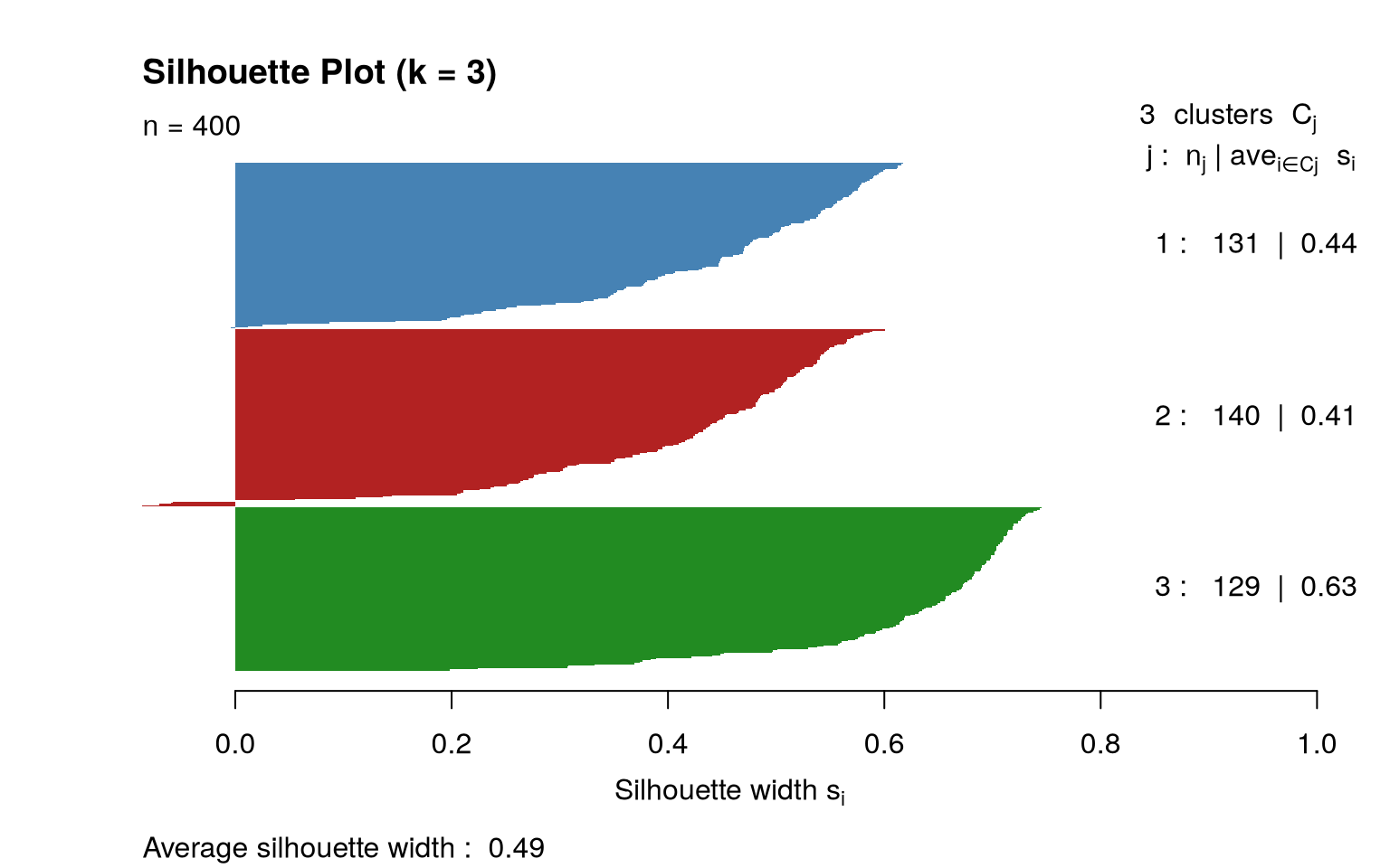
Overall average silhouette width: 0.493 
Per-cluster averages: 0.443, 0.414, 0.629 
Patients with a NEGATIVE width (probably in the wrong cluster): 6 
Figure 21.2: Silhouette plot for \(k\)-means with k=3 on the lab data.
Code
import numpy as np
import matplotlib.pyplot as plt
from sklearn.preprocessing import StandardScaler
from sklearn.cluster import KMeans
from sklearn.metrics import silhouette_score
from sklearn.decomposition import PCA

np.random.seed(42)

# Simulate phenotypes
g1 = np.column_stack([np.random.normal(140, 20, 140),
                       np.random.normal(5, 2, 140),
                       np.random.normal(3.5, 0.3, 140),
                       np.random.normal(8, 2, 140)])
g2 = np.column_stack([np.random.normal(100, 15, 140),
                       np.random.normal(15, 4, 140),
                       np.random.normal(3.0, 0.4, 140),
                       np.random.normal(14, 3, 140)])
g3 = np.column_stack([np.random.normal(90, 10, 120),
                       np.random.normal(2, 1, 120),
                       np.random.normal(4.2, 0.2, 120),
                       np.random.normal(7, 1.5, 120)])

X = np.vstack([g1, g2, g3])
X_scaled = StandardScaler().fit_transform(X)

ks = range(2, 11)
wcss = []
sils = []
for k in ks:
    km = KMeans(n_clusters=k, n_init=25, random_state=42)
    km.fit(X_scaled)
    wcss.append(km.inertia_)
    sils.append(silhouette_score(X_scaled, km.labels_))

fig, axes = plt.subplots(1, 3, figsize=(16, 5))

axes[0].plot(list(ks), wcss, "o-", color="steelblue")
axes[0].set_xlabel("Number of clusters (k)")
axes[0].set_ylabel("Within-cluster SS")
axes[0].set_title("Elbow Method")

axes[1].plot(list(ks), sils, "o-", color="firebrick")
axes[1].set_xlabel("Number of clusters (k)")
axes[1].set_ylabel("Average silhouette")
axes[1].set_title("Silhouette Scores")

km3 = KMeans(n_clusters=3, n_init=25, random_state=42).fit(X_scaled)
pca2 = PCA(n_components=2).fit_transform(X_scaled)
colors = ["steelblue", "firebrick", "forestgreen"]
for c in range(3):
    mask = km3.labels_ == c
    axes[2].scatter(pca2[mask, 0], pca2[mask, 1], c=colors[c],
                    s=12, alpha=0.6, label=f"Cluster {c+1}")
axes[2].set_xlabel("PC1")
axes[2].set_ylabel("PC2")
axes[2].set_title("$k$-means (k=3) on PCA")
axes[2].legend()

plt.tight_layout()
plt.show()
KMeans(n_clusters=10, n_init=25, random_state=42)
In a Jupyter environment, please rerun this cell to show the HTML representation or trust the notebook.
On GitHub, the HTML representation is unable to render, please try loading this page with nbviewer.org.
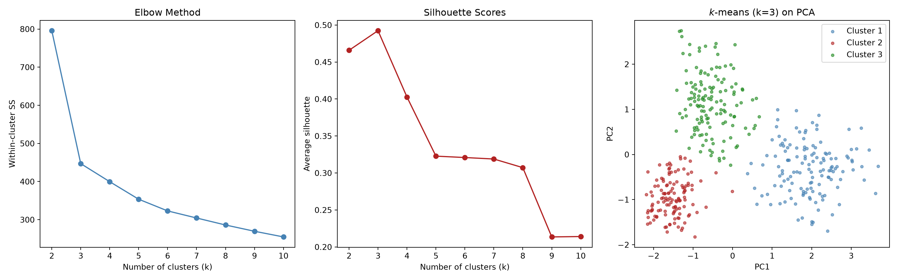
Figure 21.3: \(k\)-means clustering: elbow method, silhouette scores, and cluster visualisation.
Figure 21.4: \(k\)-means clustering: elbow method, silhouette scores, and cluster visualisation.
Code
import numpy as np
import matplotlib.pyplot as plt
from sklearn.metrics import silhouette_samples, silhouette_score

sil_vals = silhouette_samples(X_scaled, km3.labels_)
avg_sil = silhouette_score(X_scaled, km3.labels_)

fig, ax = plt.subplots(figsize=(8, 5))
y_lower = 0
colors = ["steelblue", "firebrick", "forestgreen"]
for c in range(3):
    c_sil = np.sort(sil_vals[km3.labels_ == c])
    y_upper = y_lower + len(c_sil)
    ax.barh(range(y_lower, y_upper), c_sil, height=1.0,
            color=colors[c], edgecolor="none")
    y_lower = y_upper + 5

ax.axvline(avg_sil, color="black", linestyle="--",
           label=f"Average: {avg_sil:.3f}")
ax.set_xlabel("Silhouette Coefficient")
ax.set_ylabel("Patients (sorted within cluster)")
ax.set_title("Silhouette Plot (k=3)")
ax.legend()
plt.tight_layout()
plt.show()

# The three numbers you actually need to read off
print(f"Overall average silhouette width: {avg_sil:.3f}")
for c in range(3):
    print(f"  Cluster {c+1} average: {sil_vals[km3.labels_ == c].mean():.3f}")
print("Patients with a NEGATIVE width (probably in the wrong cluster):",
      int((sil_vals < 0).sum()))
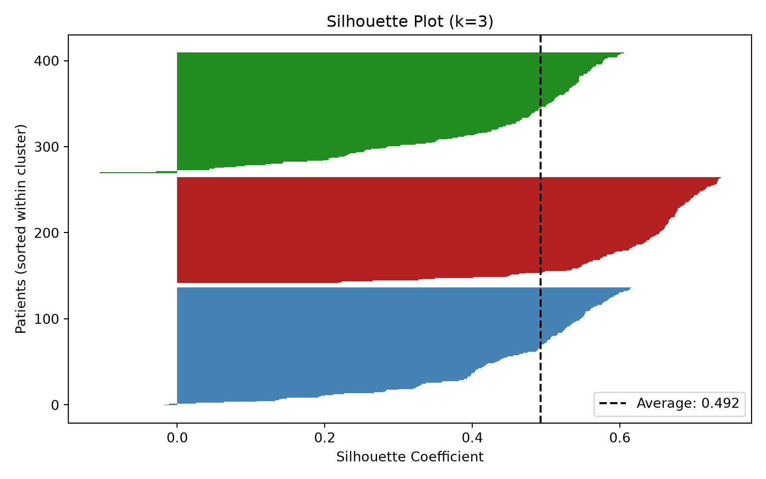
Figure 21.5: Silhouette scores by cluster for \(k\)-means with k=3.
Overall average silhouette width: 0.492
  Cluster 1 average: 0.448
  Cluster 2 average: 0.622
  Cluster 3 average: 0.423
Patients with a NEGATIVE width (probably in the wrong cluster): 4

What the code is showing. We simulate 400 patients drawn from three hidden lab-profile phenotypes (a metabolic, an inflammatory, and a healthier group), scale the labs, and then ask \(k\)-means to try every value of \(k\) from 2 to 10, recording two diagnostics each time. The elbow plot (left) shows within-cluster spread falling as \(k\) rises, with an elbow around \(k = 3\). The silhouette-vs-k plot (middle) also peaks around \(k = 3\). The PCA scatter (right) depicts the first two principal components, with each patient coloured by assigned cluster for \(k = 3\), showing well-separated colours overall. Finally, the per-point silhouette plot shows one horizontal bar per patient: wide, positive bars mean the patient sits comfortably in its cluster; short or negative bars flag patients near a cluster boundary. If one cluster’s bars are systematically shorter, that cluster is poorly defined.

21.1.5 How to Read a Silhouette Plot

The silhouette plot is the single most useful diagnostic in this chapter, so it is worth spending a page on how to actually read one.

What one bar means. Each horizontal bar is one patient. Its length is that patient’s silhouette width, which compares two distances: how far the patient sits from the other members of their own cluster, versus how far they sit from the members of the nearest other cluster. A patient who is much closer to their own group than to the next-best group gets a bar near +1. A patient sitting exactly on the fence gets a bar near 0. A patient who is actually closer to a different cluster gets a negative bar — the algorithm has, in effect, filed them in the wrong drawer.

What a good plot looks like. Four things, in order of importance:

  1. Long bars. Most patients should have widths well above 0. Fat, wide blocks mean well-separated groups.
  2. Few or no negative bars. A handful in a cohort of several hundred is normal; a visible spike of negative bars means that cluster is not real, or \(k\) is too large.
  3. Clusters of similar quality. Each cluster’s block should be roughly as wide as the others. One conspicuously thin, short-barred block is a cluster that exists only because you asked for it.
  4. Clusters of sensible size. A block containing five patients out of 400 is usually noise or outliers, not a phenotype.

What counts as a good average width? The measure was introduced by Rousseeuw (1987), and the conventional benchmarks for reading it come from Kaufman and Rousseeuw (1990):

Average silhouette width Conventional reading
0.71 – 1.00 Strong structure: the groups are clearly separated
0.51 – 0.70 Reasonable structure
0.26 – 0.50 Weak structure: could be real, could be an artefact — do not stop here
\(\le\) 0.25 No substantial structure found

Treat these as rough signposts, not a significance test. They also fall with dimensionality: in a 50-variable dataset, an average width of 0.35 may be about as good as it gets, because distances between patients become more uniform as variables pile up (see Section 21.3.1).

ImportantIs our plot a good plot? Honestly, only middling — and that is instructive

Our \(k = 3\) solution has an average silhouette width of 0.49, which lands in the “weak structure” band, just short of “reasonable”. The per-cluster averages are uneven: the healthier phenotype scores 0.63 (well separated), while the metabolic and inflammatory phenotypes score 0.44 and 0.41 — they overlap each other. Six of the 400 patients have negative widths.

And yet we built this data with exactly three real phenotypes, and the clustering assigns 97% of patients to the correct one. So a middling silhouette does not mean there are no clusters. It means the clusters touch — which is what genuine clinical phenotypes almost always do, because patients do not come in tidy, non-overlapping boxes. Sepsis patients shade into each other; that is a fact about sepsis, not a failure of the algorithm.

The practical lesson: use the silhouette to rule out obviously bad choices of \(k\) and to spot clusters that are junk, but never let a 0.5 average talk you out of a grouping that is stable (Section 21.4) and that differs on outcomes. Conversely, never let a 0.8 average convince you a grouping is clinically meaningful — you can get 0.8 by clustering random noise in two dimensions.

21.2 Agglomerative Clustering

21.2.1 General algorithm

Agglomerative clustering is a hierarchical clustering method, meaning that it involves building a hierarchy of clusters rather than a single flat partition. Most implementations require you to specify three parameters: \(k\) cluster (like in \(k\)-means), a linkage method (how to measure distance between clusters, see below), and a distance metric (how to measure distance between patients). The general algorithm involves two steps:

  • Start with each patient in their own cluster, and iteratively merge the closest clusters (as determined by the linkage method) until all patients are in a single cluster. The resulting hierarchy can be represented as a dendrogram.
  • Cut the dendrogram into \(k\) clusters by choosing a height at which to “cut” the tree. The height corresponds to the distance at which clusters are merged, so cutting low gives many small clusters, while cutting high gives a few large clusters.

To pick \(k\), you can use silhouette scores and the gap statistic as in \(k\)-means. The elbow method is less natural here as we do not explicitly minimise a metric such as the WCSS (except for Ward’s method, see Linkage Methods). The dendrogram itself can also provide insight into the natural number of clusters by looking for large gaps in the merging heights (see Reading a Dendrogram).

A dendrogram in miniature: five patients

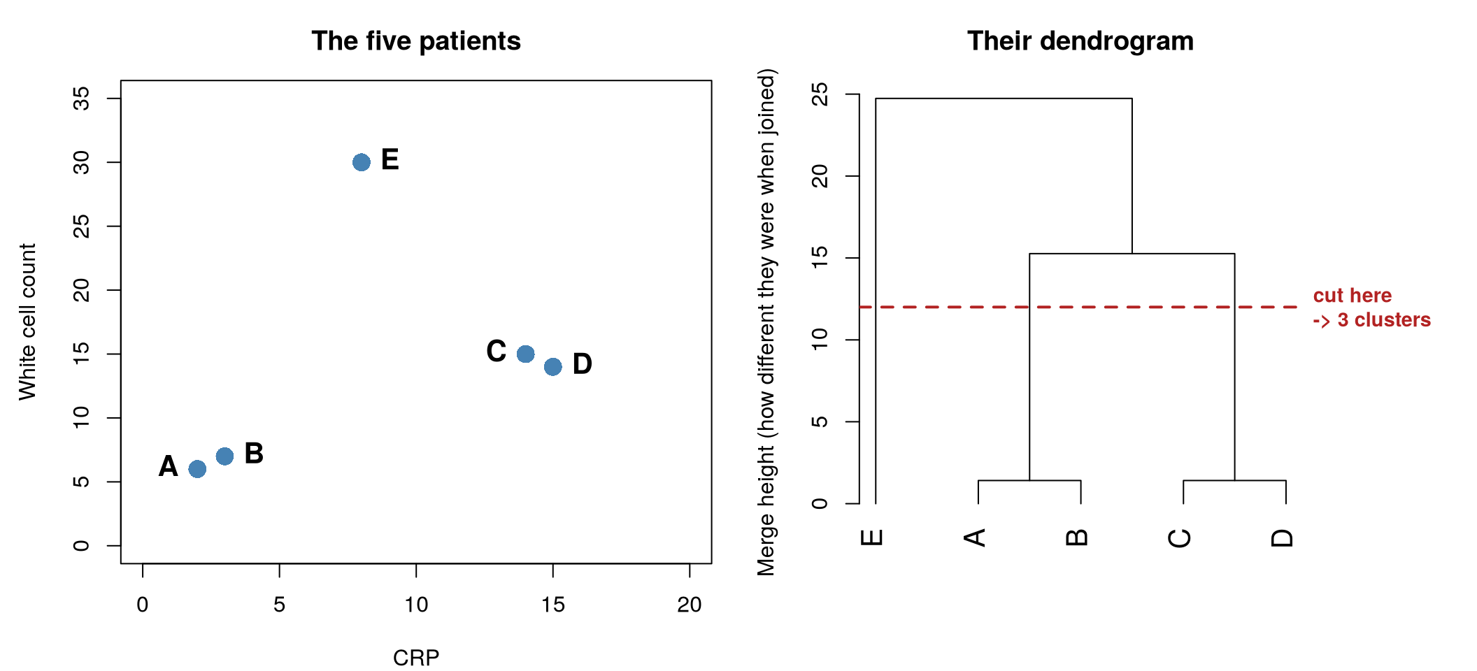
Dendrograms are easier to trust once you have seen one built from a handful of patients you can check by eye. Below are five patients described by just two labs, CRP and white cell count, alongside the dendrogram the algorithm produces from them.

Code
# Five patients, two labs. Rows are named so they are labelled in the tree.
toy <- data.frame(
  crp = c(2, 3, 14, 15, 8),
  wbc = c(6, 7, 15, 14, 30),
  row.names = c("A", "B", "C", "D", "E")
)

hc_toy <- hclust(dist(toy), method = "complete")

par(mfrow = c(1, 2), mar = c(4, 4.5, 3, 1))

plot(toy$crp, toy$wbc,
  pch = 16, col = "steelblue", cex = 1.8,
  xlim = c(0, 20), ylim = c(0, 35),
  xlab = "CRP", ylab = "White cell count",
  main = "The five patients"
)
text(toy$crp, toy$wbc,
  labels = rownames(toy),
  pos = c(2, 4, 2, 4, 4), offset = 0.7, cex = 1.3, font = 2
)

par(mar = c(4, 4.5, 3, 6.5))   # room on the right for the cut label
plot(hc_toy,
  main = "Their dendrogram",
  xlab = "", sub = "",
  ylab = "Merge height (how different they were when joined)",
  hang = -1, cex = 1.3
)
abline(h = 12, col = "firebrick", lty = 2, lwd = 2)
mtext("cut here\n-> 3 clusters",
  side = 4, at = 12, las = 1,
  col = "firebrick", line = 0.4, cex = 0.9, font = 2
)
Figure 21.6: Left: five patients, two labs. A and B are near-identical; C and D are near-identical; E is unlike anyone. Right: the dendrogram built from exactly those five patients. The height at which two branches join is how different they were when they merged: A–B and C–D join near the floor (height 1.4), the A/B and C/D pairs join at 15.3, and E is only absorbed at 24.7. Cutting across at any height gives you clusters — the dashed line cuts the three vertical lines it crosses, giving {A,B}, {C,D}, and {E}.

Read the right-hand panel from the bottom up, which is the order the algorithm actually works in:

  1. Every patient starts alone, sitting on the floor of the plot.
  2. The two most similar patients are joined first. A and B differ by 1 point of CRP and 1 of white cells, so they are joined at height 1.4 — essentially the floor. C and D likewise.
  3. Next, the closest two groups are joined: the {A, B} pair and the {C, D} pair, at height 15.3. That is much higher up, because those two pairs are genuinely unlike each other.
  4. Finally E, who resembles nobody, is absorbed at height 24.7 — the very top.

The height is the whole point of the figure: low join = similar, high join = different. And once you have the tree, you choose clusters not by re-running anything, but simply by drawing a horizontal line across it. The dashed line at height 12 crosses three vertical branches, so it splits the patients into three clusters: {A, B}, {C, D}, and {E} on their own. Slide the line up to height 20 and it crosses only two branches, giving {A, B, C, D} and {E}.

NoteA dendrogram is not a decision tree

The tree structure invites a comparison with the classification trees and random forests of Chapter 13, and they are worth keeping firmly apart, because they are built in opposite directions and answer different questions.

Dendrogram (this chapter) Decision tree / random forest
Needs an outcome? No — unsupervised; there is no right answer to learn Yes — supervised; it is trained to predict a known label
Direction of build Bottom-up: starts with 400 single patients and merges Top-down: starts with all 400 patients and splits
What a node means A group of patients that were merged A question about one variable (“is CRP > 12?”)
What the height/depth means How different the two groups were Which split best separated the outcome
What you do with it Cut it at a height to define subgroups Follow a new patient down it to get a prediction

The confusion is understandable but the practical difference is sharp: you can push a brand-new patient through a decision tree and read off a prediction. You cannot do that with a dendrogram — adding one patient can change which branches merge, so the whole tree may be redrawn. If you want the predictive cousin of clustering, that is what supervised learning is for.

21.2.2 Linkage Methods

Linkage methods are the crux of the merging rule in agglomerative clustering, as they determine how to measure the distance between clusters. Depending on the use case, several linkage methods can be employed:

Single linkage. Distance = the closest pair of patients across the two clusters. Two groups count as near if they have even one near-neighbour, which tends to produce long, straggly, chain-like clusters.

Complete linkage. Distance = the farthest pair of patients. Groups merge only when even their most distant members are reasonably close. This tends to produce tight, roughly equal-sized clusters.

Average linkage. Distance = the average of all patient-to-patient distances between the two clusters. A compromise between single and complete.

Ward’s method. At each step, merges the pair of clusters that increases total within-cluster spread (WCSS) the least. This tends to produce compact, roughly spherical clusters of similar size. This is a common default choice in modern package implementations.

Code
# Use a smaller subset for readable dendrogram
set.seed(42)
idx <- sample(nrow(lab_scaled), 80)
hc <- hclust(dist(lab_scaled[idx, ]), method = "ward.D2")

# Plot dendrogram
plot(
  hc,
  labels = FALSE,
  main = "Hierarchical Clustering (Ward's Method)",
  xlab = "",
  sub = "",
  hang = -1,
  cex = 0.6
)
rect.hclust(hc, k = 3, border = c("steelblue", "firebrick", "forestgreen"))
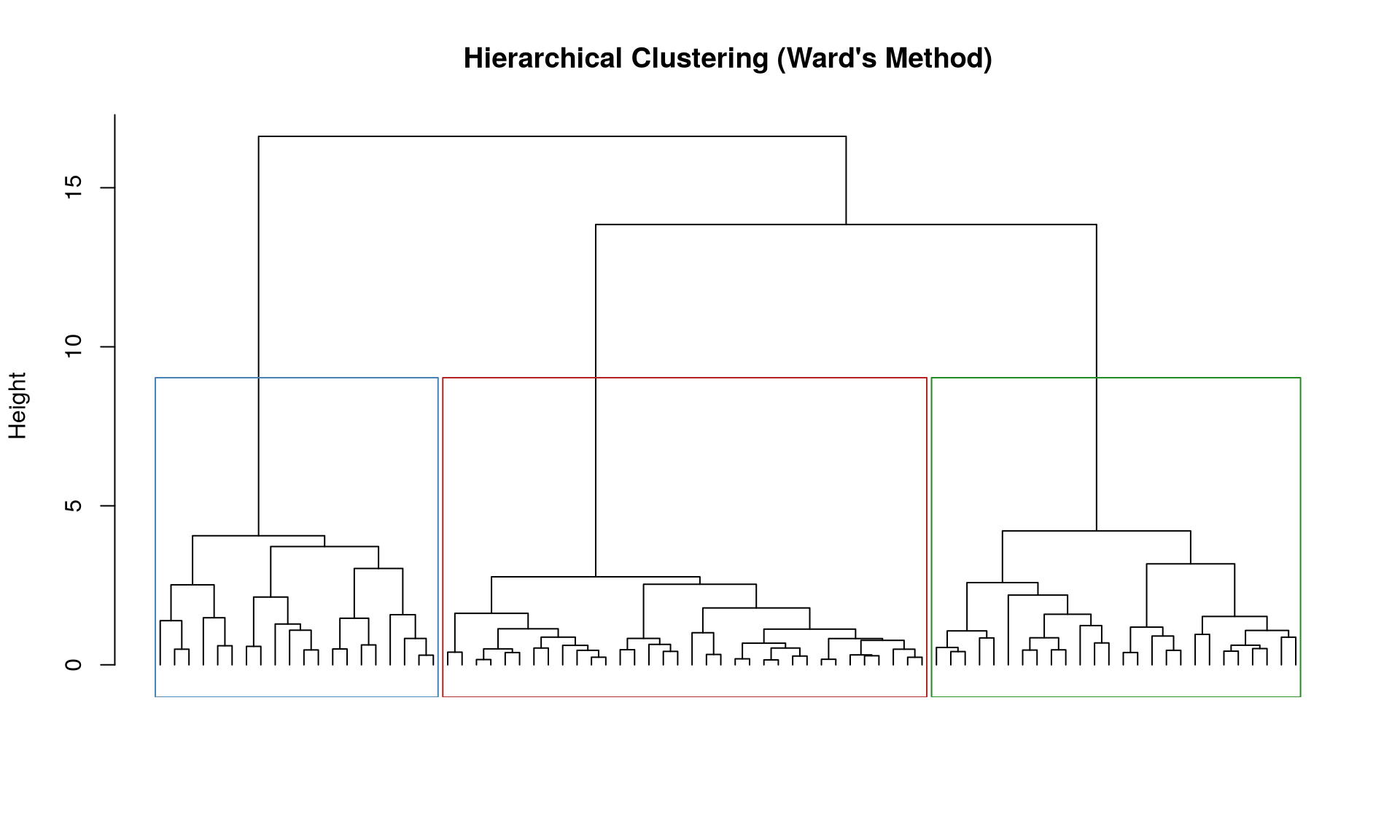
Figure 21.7: Dendrogram from hierarchical clustering (Ward’s method) with 3 clusters highlighted.
Code
par(mfrow = c(1, 4), mar = c(2, 2, 3, 1))
methods <- c("single", "complete", "average", "ward.D2")
titles <- c("Single", "Complete", "Average", "Ward's")

for (i in seq_along(methods)) {
  hc_i <- hclust(dist(lab_scaled[idx, ]), method = methods[i])
  plot(
    hc_i,
    labels = FALSE,
    main = titles[i],
    xlab = "",
    sub = "",
    hang = -1,
    cex = 0.5
  )
  rect.hclust(hc_i, k = 3, border = "firebrick")
}
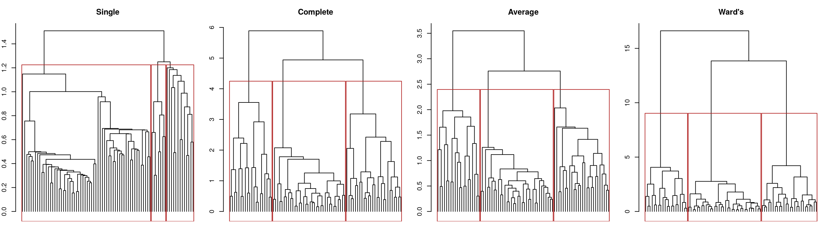
Figure 21.8: Comparison of linkage methods on the same dataset.
Code
import numpy as np
import matplotlib.pyplot as plt
from scipy.cluster.hierarchy import dendrogram, linkage, fcluster

np.random.seed(42)
idx = np.random.choice(len(X_scaled), 80, replace=False)
X_sub = X_scaled[idx]

Z = linkage(X_sub, method="ward")

fig, ax = plt.subplots(figsize=(12, 5))
dendrogram(Z, ax=ax, no_labels=True, color_threshold=Z[-3, 2])
ax.set_title("Hierarchical Clustering (Ward's Method)")
ax.set_xlabel("Patients")
ax.set_ylabel("Height")
ax.axhline(y=Z[-3, 2], color="firebrick", linestyle="--", linewidth=1)
ax.text(5, Z[-3, 2] + 0.5, "Cut for k=3", color="firebrick", fontsize=10)
plt.tight_layout()
plt.show()
{'icoord': [[15.0, 15.0, 25.0, 25.0], [5.0, 5.0, 20.0, 20.0], [35.0, 35.0, 45.0, 45.0], [12.5, 12.5, 40.0, 40.0], [75.0, 75.0, 85.0, 85.0], [65.0, 65.0, 80.0, 80.0], [55.0, 55.0, 72.5, 72.5], [26.25, 26.25, 63.75, 63.75], [115.0, 115.0, 125.0, 125.0], [105.0, 105.0, 120.0, 120.0], [95.0, 95.0, 112.5, 112.5], [45.0, 45.0, 103.75, 103.75], [165.0, 165.0, 175.0, 175.0], [155.0, 155.0, 170.0, 170.0], [145.0, 145.0, 162.5, 162.5], [135.0, 135.0, 153.75, 153.75], [195.0, 195.0, 205.0, 205.0], [185.0, 185.0, 200.0, 200.0], [235.0, 235.0, 245.0, 245.0], [225.0, 225.0, 240.0, 240.0], [215.0, 215.0, 232.5, 232.5], [192.5, 192.5, 223.75, 223.75], [144.375, 144.375, 208.125, 208.125], [74.375, 74.375, 176.25, 176.25], [255.0, 255.0, 265.0, 265.0], [295.0, 295.0, 305.0, 305.0], [285.0, 285.0, 300.0, 300.0], [275.0, 275.0, 292.5, 292.5], [260.0, 260.0, 283.75, 283.75], [325.0, 325.0, 335.0, 335.0], [345.0, 345.0, 355.0, 355.0], [330.0, 330.0, 350.0, 350.0], [315.0, 315.0, 340.0, 340.0], [385.0, 385.0, 395.0, 395.0], [375.0, 375.0, 390.0, 390.0], [415.0, 415.0, 425.0, 425.0], [405.0, 405.0, 420.0, 420.0], [445.0, 445.0, 455.0, 455.0], [435.0, 435.0, 450.0, 450.0], [412.5, 412.5, 442.5, 442.5], [382.5, 382.5, 427.5, 427.5], [365.0, 365.0, 405.0, 405.0], [327.5, 327.5, 385.0, 385.0], [271.875, 271.875, 356.25, 356.25], [465.0, 465.0, 475.0, 475.0], [495.0, 495.0, 505.0, 505.0], [485.0, 485.0, 500.0, 500.0], [515.0, 515.0, 525.0, 525.0], [535.0, 535.0, 545.0, 545.0], [520.0, 520.0, 540.0, 540.0], [492.5, 492.5, 530.0, 530.0], [470.0, 470.0, 511.25, 511.25], [555.0, 555.0, 565.0, 565.0], [585.0, 585.0, 595.0, 595.0], [575.0, 575.0, 590.0, 590.0], [560.0, 560.0, 582.5, 582.5], [625.0, 625.0, 635.0, 635.0], [615.0, 615.0, 630.0, 630.0], [605.0, 605.0, 622.5, 622.5], [655.0, 655.0, 665.0, 665.0], [645.0, 645.0, 660.0, 660.0], [675.0, 675.0, 685.0, 685.0], [695.0, 695.0, 705.0, 705.0], [680.0, 680.0, 700.0, 700.0], [652.5, 652.5, 690.0, 690.0], [725.0, 725.0, 735.0, 735.0], [755.0, 755.0, 765.0, 765.0], [745.0, 745.0, 760.0, 760.0], [730.0, 730.0, 752.5, 752.5], [715.0, 715.0, 741.25, 741.25], [785.0, 785.0, 795.0, 795.0], [775.0, 775.0, 790.0, 790.0], [728.125, 728.125, 782.5, 782.5], [671.25, 671.25, 755.3125, 755.3125], [613.75, 613.75, 713.28125, 713.28125], [571.25, 571.25, 663.515625, 663.515625], [490.625, 490.625, 617.3828125, 617.3828125], [314.0625, 314.0625, 554.00390625, 554.00390625], [125.3125, 125.3125, 434.033203125, 434.033203125]], 'dcoord': [[0.0, np.float64(0.5619100773664829), np.float64(0.5619100773664829), 0.0], [0.0, np.float64(0.7994431520576291), np.float64(0.7994431520576291), np.float64(0.5619100773664829)], [0.0, np.float64(0.9647675245082076), np.float64(0.9647675245082076), 0.0], [np.float64(0.7994431520576291), np.float64(1.2492971794123582), np.float64(1.2492971794123582), np.float64(0.9647675245082076)], [0.0, np.float64(0.6741255883849526), np.float64(0.6741255883849526), 0.0], [0.0, np.float64(1.0862548046016112), np.float64(1.0862548046016112), np.float64(0.6741255883849526)], [0.0, np.float64(1.6006574895035057), np.float64(1.6006574895035057), np.float64(1.0862548046016112)], [np.float64(1.2492971794123582), np.float64(2.342847275685918), np.float64(2.342847275685918), np.float64(1.6006574895035057)], [0.0, np.float64(0.873921219047725), np.float64(0.873921219047725), 0.0], [0.0, np.float64(1.2666645815417696), np.float64(1.2666645815417696), np.float64(0.873921219047725)], [0.0, np.float64(2.509220019107944), np.float64(2.509220019107944), np.float64(1.2666645815417696)], [np.float64(2.342847275685918), np.float64(3.7492455803106894), np.float64(3.7492455803106894), np.float64(2.509220019107944)], [0.0, np.float64(0.7027826881408542), np.float64(0.7027826881408542), 0.0], [0.0, np.float64(1.0161052231240624), np.float64(1.0161052231240624), np.float64(0.7027826881408542)], [0.0, np.float64(1.1749602395746965), np.float64(1.1749602395746965), np.float64(1.0161052231240624)], [0.0, np.float64(1.544626962635264), np.float64(1.544626962635264), np.float64(1.1749602395746965)], [0.0, np.float64(1.1607539892354823), np.float64(1.1607539892354823), 0.0], [0.0, np.float64(1.4318213694685775), np.float64(1.4318213694685775), np.float64(1.1607539892354823)], [0.0, np.float64(0.7814974106402005), np.float64(0.7814974106402005), 0.0], [0.0, np.float64(1.455836610881791), np.float64(1.455836610881791), np.float64(0.7814974106402005)], [0.0, np.float64(1.9309333389583156), np.float64(1.9309333389583156), np.float64(1.455836610881791)], [np.float64(1.4318213694685775), np.float64(2.528353851505334), np.float64(2.528353851505334), np.float64(1.9309333389583156)], [np.float64(1.544626962635264), np.float64(3.922654880573046), np.float64(3.922654880573046), np.float64(2.528353851505334)], [np.float64(3.7492455803106894), np.float64(5.45882492347627), np.float64(5.45882492347627), np.float64(3.922654880573046)], [0.0, np.float64(0.3650146543080423), np.float64(0.3650146543080423), 0.0], [0.0, np.float64(0.19643792326156986), np.float64(0.19643792326156986), 0.0], [0.0, np.float64(0.35947028453533736), np.float64(0.35947028453533736), np.float64(0.19643792326156986)], [0.0, np.float64(0.44830169928118035), np.float64(0.44830169928118035), np.float64(0.35947028453533736)], [np.float64(0.3650146543080423), np.float64(1.4739743469053104), np.float64(1.4739743469053104), np.float64(0.44830169928118035)], [0.0, np.float64(0.37936941116959805), np.float64(0.37936941116959805), 0.0], [0.0, np.float64(0.47613709425814343), np.float64(0.47613709425814343), 0.0], [np.float64(0.37936941116959805), np.float64(0.6378380641716876), np.float64(0.6378380641716876), np.float64(0.47613709425814343)], [0.0, np.float64(0.6916401373319286), np.float64(0.6916401373319286), np.float64(0.6378380641716876)], [0.0, np.float64(0.2838122794021745), np.float64(0.2838122794021745), 0.0], [0.0, np.float64(0.6541512026329938), np.float64(0.6541512026329938), np.float64(0.2838122794021745)], [0.0, np.float64(0.2825583416756875), np.float64(0.2825583416756875), 0.0], [0.0, np.float64(0.45068448134444933), np.float64(0.45068448134444933), np.float64(0.2825583416756875)], [0.0, np.float64(0.2298819423355412), np.float64(0.2298819423355412), 0.0], [0.0, np.float64(0.4790831349388125), np.float64(0.4790831349388125), np.float64(0.2298819423355412)], [np.float64(0.45068448134444933), np.float64(1.0883448941054277), np.float64(1.0883448941054277), np.float64(0.4790831349388125)], [np.float64(0.6541512026329938), np.float64(1.3603031848275775), np.float64(1.3603031848275775), np.float64(1.0883448941054277)], [0.0, np.float64(1.7367328379537454), np.float64(1.7367328379537454), np.float64(1.3603031848275775)], [np.float64(0.6916401373319286), np.float64(2.0012066824170542), np.float64(2.0012066824170542), np.float64(1.7367328379537454)], [np.float64(1.4739743469053104), np.float64(2.750206709621728), np.float64(2.750206709621728), np.float64(2.0012066824170542)], [0.0, np.float64(1.363315523077555), np.float64(1.363315523077555), 0.0], [0.0, np.float64(0.2729971268368318), np.float64(0.2729971268368318), 0.0], [0.0, np.float64(0.7336417983732602), np.float64(0.7336417983732602), np.float64(0.2729971268368318)], [0.0, np.float64(0.403618730126789), np.float64(0.403618730126789), 0.0], [0.0, np.float64(0.8167688897131289), np.float64(0.8167688897131289), 0.0], [np.float64(0.403618730126789), np.float64(1.2304311588293417), np.float64(1.2304311588293417), np.float64(0.8167688897131289)], [np.float64(0.7336417983732602), np.float64(1.705701767078173), np.float64(1.705701767078173), np.float64(1.2304311588293417)], [np.float64(1.363315523077555), np.float64(2.7036109461432902), np.float64(2.7036109461432902), np.float64(1.705701767078173)], [0.0, np.float64(0.6957203794767504), np.float64(0.6957203794767504), 0.0], [0.0, np.float64(0.4151549681304198), np.float64(0.4151549681304198), 0.0], [0.0, np.float64(0.8933426686200009), np.float64(0.8933426686200009), np.float64(0.4151549681304198)], [np.float64(0.6957203794767504), np.float64(1.2877030421376734), np.float64(1.2877030421376734), np.float64(0.8933426686200009)], [0.0, np.float64(0.4771786460403722), np.float64(0.4771786460403722), 0.0], [0.0, np.float64(0.7533550488006873), np.float64(0.7533550488006873), np.float64(0.4771786460403722)], [0.0, np.float64(1.1691902045609521), np.float64(1.1691902045609521), np.float64(0.7533550488006873)], [0.0, np.float64(0.34505152885398294), np.float64(0.34505152885398294), 0.0], [0.0, np.float64(0.5952053294191955), np.float64(0.5952053294191955), np.float64(0.34505152885398294)], [0.0, np.float64(0.07050209744623666), np.float64(0.07050209744623666), 0.0], [0.0, np.float64(0.220146837444341), np.float64(0.220146837444341), 0.0], [np.float64(0.07050209744623666), np.float64(0.8067417053440179), np.float64(0.8067417053440179), np.float64(0.220146837444341)], [np.float64(0.5952053294191955), np.float64(1.3942536378222732), np.float64(1.3942536378222732), np.float64(0.8067417053440179)], [0.0, np.float64(0.22399363210679604), np.float64(0.22399363210679604), 0.0], [0.0, np.float64(0.2715965823950072), np.float64(0.2715965823950072), 0.0], [0.0, np.float64(0.36268436060027165), np.float64(0.36268436060027165), np.float64(0.2715965823950072)], [np.float64(0.22399363210679604), np.float64(0.5105856359373322), np.float64(0.5105856359373322), np.float64(0.36268436060027165)], [0.0, np.float64(0.6031696399871634), np.float64(0.6031696399871634), np.float64(0.5105856359373322)], [0.0, np.float64(0.40138925095493216), np.float64(0.40138925095493216), 0.0], [0.0, np.float64(1.0116327585042153), np.float64(1.0116327585042153), np.float64(0.40138925095493216)], [np.float64(0.6031696399871634), np.float64(1.7150827696253068), np.float64(1.7150827696253068), np.float64(1.0116327585042153)], [np.float64(1.3942536378222732), np.float64(1.9664735056177605), np.float64(1.9664735056177605), np.float64(1.7150827696253068)], [np.float64(1.1691902045609521), np.float64(2.2144897561845505), np.float64(2.2144897561845505), np.float64(1.9664735056177605)], [np.float64(1.2877030421376734), np.float64(3.0068244158833584), np.float64(3.0068244158833584), np.float64(2.2144897561845505)], [np.float64(2.7036109461432902), np.float64(4.618985587046023), np.float64(4.618985587046023), np.float64(3.0068244158833584)], [np.float64(2.750206709621728), np.float64(12.124396138057895), np.float64(12.124396138057895), np.float64(4.618985587046023)], [np.float64(5.45882492347627), np.float64(18.27444241841274), np.float64(18.27444241841274), np.float64(12.124396138057895)]], 'ivl': ['78', '59', '67', '23', '49', '62', '46', '38', '47', '32', '27', '3', '56', '57', '8', '16', '34', '75', '0', '18', '39', '28', '31', '71', '76', '22', '68', '17', '52', '11', '66', '30', '6', '74', '45', '77', '70', '61', '19', '54', '37', '40', '79', '51', '1', '25', '36', '65', '41', '44', '69', '10', '60', '48', '55', '35', '73', '72', '9', '14', '7', '2', '13', '50', '5', '4', '26', '15', '29', '42', '63', '12', '33', '64', '20', '21', '58', '24', '43', '53'], 'leaves': [78, 59, 67, 23, 49, 62, 46, 38, 47, 32, 27, 3, 56, 57, 8, 16, 34, 75, 0, 18, 39, 28, 31, 71, 76, 22, 68, 17, 52, 11, 66, 30, 6, 74, 45, 77, 70, 61, 19, 54, 37, 40, 79, 51, 1, 25, 36, 65, 41, 44, 69, 10, 60, 48, 55, 35, 73, 72, 9, 14, 7, 2, 13, 50, 5, 4, 26, 15, 29, 42, 63, 12, 33, 64, 20, 21, 58, 24, 43, 53], 'color_list': ['C1', 'C1', 'C1', 'C1', 'C1', 'C1', 'C1', 'C1', 'C1', 'C1', 'C1', 'C1', 'C2', 'C2', 'C2', 'C2', 'C2', 'C2', 'C2', 'C2', 'C2', 'C2', 'C2', 'C0', 'C3', 'C3', 'C3', 'C3', 'C3', 'C3', 'C3', 'C3', 'C3', 'C3', 'C3', 'C3', 'C3', 'C3', 'C3', 'C3', 'C3', 'C3', 'C3', 'C3', 'C4', 'C4', 'C4', 'C4', 'C4', 'C4', 'C4', 'C4', 'C4', 'C4', 'C4', 'C4', 'C4', 'C4', 'C4', 'C4', 'C4', 'C4', 'C4', 'C4', 'C4', 'C4', 'C4', 'C4', 'C4', 'C4', 'C4', 'C4', 'C4', 'C4', 'C4', 'C4', 'C4', 'C0', 'C0'], 'leaves_color_list': ['C1', 'C1', 'C1', 'C1', 'C1', 'C1', 'C1', 'C1', 'C1', 'C1', 'C1', 'C1', 'C1', 'C2', 'C2', 'C2', 'C2', 'C2', 'C2', 'C2', 'C2', 'C2', 'C2', 'C2', 'C2', 'C3', 'C3', 'C3', 'C3', 'C3', 'C3', 'C3', 'C3', 'C3', 'C3', 'C3', 'C3', 'C3', 'C3', 'C3', 'C3', 'C3', 'C3', 'C3', 'C3', 'C3', 'C4', 'C4', 'C4', 'C4', 'C4', 'C4', 'C4', 'C4', 'C4', 'C4', 'C4', 'C4', 'C4', 'C4', 'C4', 'C4', 'C4', 'C4', 'C4', 'C4', 'C4', 'C4', 'C4', 'C4', 'C4', 'C4', 'C4', 'C4', 'C4', 'C4', 'C4', 'C4', 'C4', 'C4']}
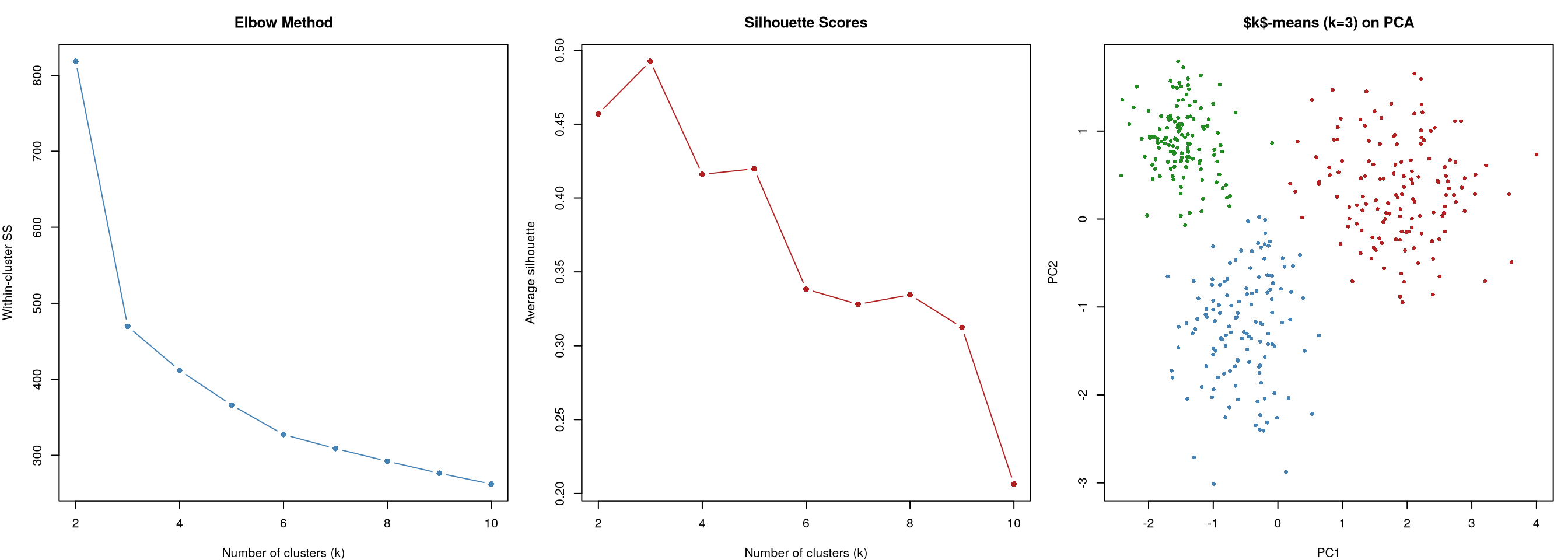
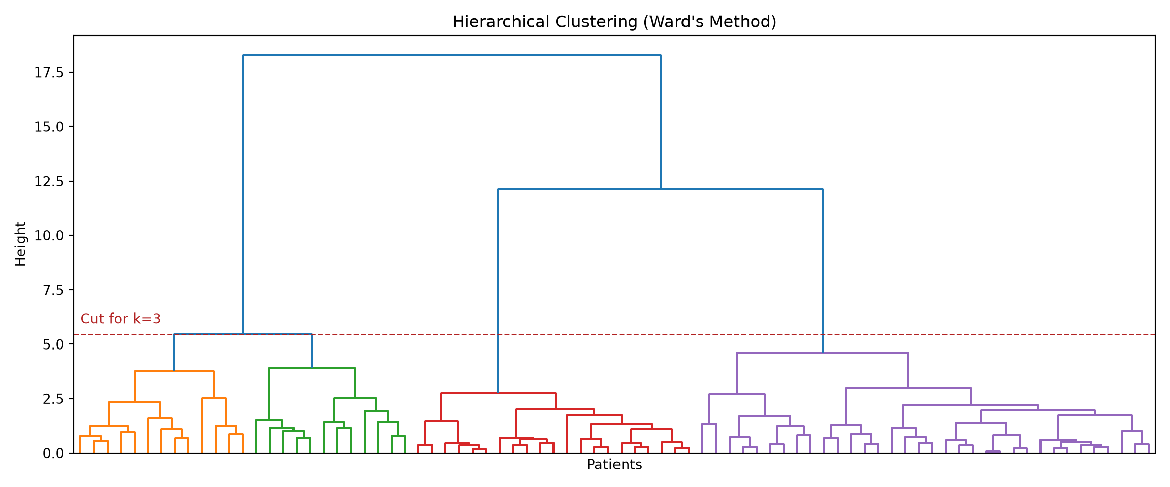
Figure 21.9: Dendrogram from hierarchical clustering (Ward’s method).
Code
import matplotlib.pyplot as plt
from scipy.cluster.hierarchy import dendrogram, linkage

fig, axes = plt.subplots(1, 4, figsize=(18, 4))
methods = ['single', 'complete', 'average', 'ward']
titles = ['Single', 'Complete', 'Average', "Ward's"]

for ax, method, title in zip(axes, methods, titles):
    Z_i = linkage(X_sub, method=method)
    dendrogram(Z_i, ax=ax, no_labels=True, color_threshold=0)
    ax.set_title(title)
    ax.set_xlabel("")

plt.tight_layout()
plt.show()
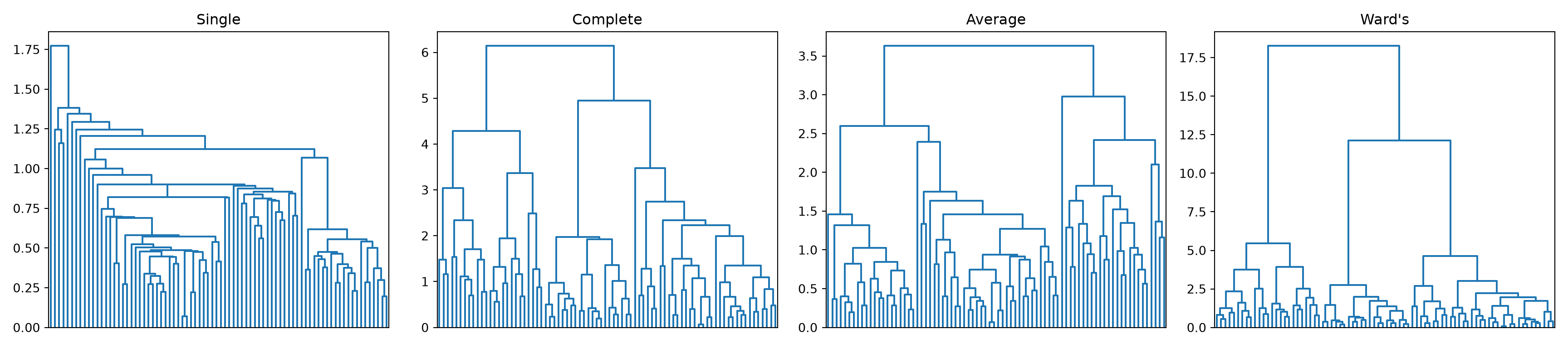
Figure 21.10: Comparison of linkage methods.

What the code is showing. The first block builds a dendrogram, the upside-down tree that records, branch by branch, which patients (then which groups of patients) got merged and at what distance. The coloured rectangles show where we “cut” the tree to get three clusters. The second block redraws the dendrogram four times, once per linkage rule (single, complete, average, Ward’s), so you can see how the choice of linkage reshapes the tree. The practical lesson from that comparison: single linkage often produces one lopsided “chain” with stragglers, while Ward’s gives balanced, compact groups, which is why Ward’s is the recommended default for clinical data.

21.2.3 Reading a Dendrogram

The dendrogram encodes the full merging history:

  • The height of each horizontal line represents the distance at which two clusters were merged.
  • Long vertical lines before a merge indicate well-separated clusters.
  • Short vertical lines indicate merges of similar clusters, i.e. less clear separation.

Cutting the dendrogram at different heights gives different numbers of clusters. A large “gap” between merging heights (a long vertical line) suggests a natural number of clusters.

21.3 DBSCAN: Density-Based Clustering

As mentioned earlier, clusters in clinical data may be irregularly shaped, overlap, or contain noise (e.g., outlier patients who do not belong to any group). Compared to \(k\)-means and agglomerative clustering, DBSCAN (Density-Based Spatial Clustering of Applications with Noise) takes a different approach that defines clusters based on density rather than distance. Importantly, DBSCAN does not require specifying the number of clusters in advance, and it can identify outliers explicitly.

DBSCAN defines clusters as dense (crowded) regions of data points separated by sparse (empty) regions, similar to spotting towns on a night-time satellite photo by their clusters of lights. Two settings control its behaviour:

  • eps (\(\varepsilon\)): how close two samples must be to count as neighbours, i.e. the radius of the neighbourhood drawn around each sample.
  • min_samples: how many neighbours a sample needs within that radius before the surrounding area counts as “crowded” (dense).

The algorithm then sorts every sample into one of three types:

  1. Core point: sits in a crowded area, has at least min_samples neighbours within radius \(\varepsilon\).
  2. Border point: on the edge of a crowd, close to a core point but without enough neighbours of its own to be core.
  3. Noise point: out on its own, neither core nor border. These are the outliers, and DBSCAN flags them explicitly instead of forcing them into a group.

Clusters grow by linking up core points that fall within \(\varepsilon\) of each other, so a cluster can snake into any shape the dense region happens to take.

21.3.1 Advantages and Limitations

Advantages:

  • Does not require specifying \(k\) in advance.
  • Can find arbitrarily shaped clusters.
  • Identifies outliers explicitly.

Limitations:

  • Sensitive to the choice of \(\varepsilon\) and min_samples.
  • Struggles when clusters have very different densities.
  • Not ideal for very high-dimensional data, for the reason spelled out just below.
WarningWhy many variables break density-based clustering

DBSCAN works by asking, of each patient, “how many other patients are within \(\varepsilon\) of you?” That question only discriminates if some patients have many close neighbours and others have few. With a lot of variables, that stops being true.

Here is the intuition, no algebra required. Two patients count as close only if they are similar on every variable at once. With 4 labs, two patients from the same phenotype have a fair chance of matching on all 4. With 60 labs, almost every pair of patients will differ noticeably on something — a random high potassium here, an odd liver enzyme there. Each extra variable is another opportunity to be far apart, and none of them are opportunities to be closer. So as variables accumulate, every pair of patients drifts towards being roughly equally far apart.

The consequence is fatal for DBSCAN specifically. If the nearest patient is 8.9 units away and the average patient is 9.4 units away, there is no radius \(\varepsilon\) you can choose that puts the neighbours inside and the strangers outside: pick \(\varepsilon\) slightly too small and everyone is “noise”; pick it slightly too large and everyone is one giant cluster. You will see exactly this symptom in practice — DBSCAN returning either 95% noise or a single cluster, with almost nothing in between, and flipping between the two as you nudge \(\varepsilon\).

This is one face of the curse of dimensionality met in Chapter 20. Two practical responses:

  • Reduce first. Run PCA and cluster on the first 10–20 components rather than the 60 raw labs. This is the standard fix and is discussed in Section 21.5.2.
  • Choose variables deliberately. Twelve labs picked because they are clinically relevant to your question usually beat sixty labs thrown in because the database had them.

The same pressure affects \(k\)-means and hierarchical clustering, since they use the same distances — but they are somewhat less fragile, because they only need distances to be relatively informative in order to partition, whereas DBSCAN needs an absolute radius that separates dense from sparse.

Code
library(dbscan)

set.seed(42)

# Create data with two crescent-shaped clusters + noise
n_each <- 150
theta1 <- seq(0, pi, length.out = n_each)
theta2 <- seq(0, pi, length.out = n_each)

x1 <- cos(theta1) + rnorm(n_each, 0, 0.08)
y1 <- sin(theta1) + rnorm(n_each, 0, 0.08)
x2 <- 1 - cos(theta2) + rnorm(n_each, 0, 0.08)
y2 <- 1 - sin(theta2) - 0.5 + rnorm(n_each, 0, 0.08)

# Add noise
x_noise <- runif(30, -0.5, 2)
y_noise <- runif(30, -1, 1.5)

crescent_data <- rbind(
  cbind(x1, y1),
  cbind(x2, y2),
  cbind(x_noise, y_noise)
)

# Compare $k$-means and DBSCAN
km_crescents <- kmeans(crescent_data, centers = 2, nstart = 25)
db_crescents <- dbscan(crescent_data, eps = 0.15, minPts = 5)

par(mfrow = c(1, 2), mar = c(4, 4, 3, 1))
cols_km <- c("steelblue", "firebrick")[km_crescents$cluster]
plot(
  crescent_data,
  col = cols_km,
  pch = 16,
  cex = 0.7,
  main = "$k$-means (k=2)",
  xlab = "x",
  ylab = "y"
)

# DBSCAN: cluster 0 = noise (grey), others = colours
db_cols <- c("grey50", "steelblue", "firebrick", "forestgreen")
plot(
  crescent_data,
  col = db_cols[db_crescents$cluster + 1],
  pch = ifelse(db_crescents$cluster == 0, 4, 16),
  cex = 0.7,
  main = "DBSCAN (eps=0.15)",
  xlab = "x",
  ylab = "y"
)
legend(
  "topright",
  c("Noise", "Cluster 1", "Cluster 2"),
  col = db_cols[1:3],
  pch = c(4, 16, 16),
  cex = 0.8
)
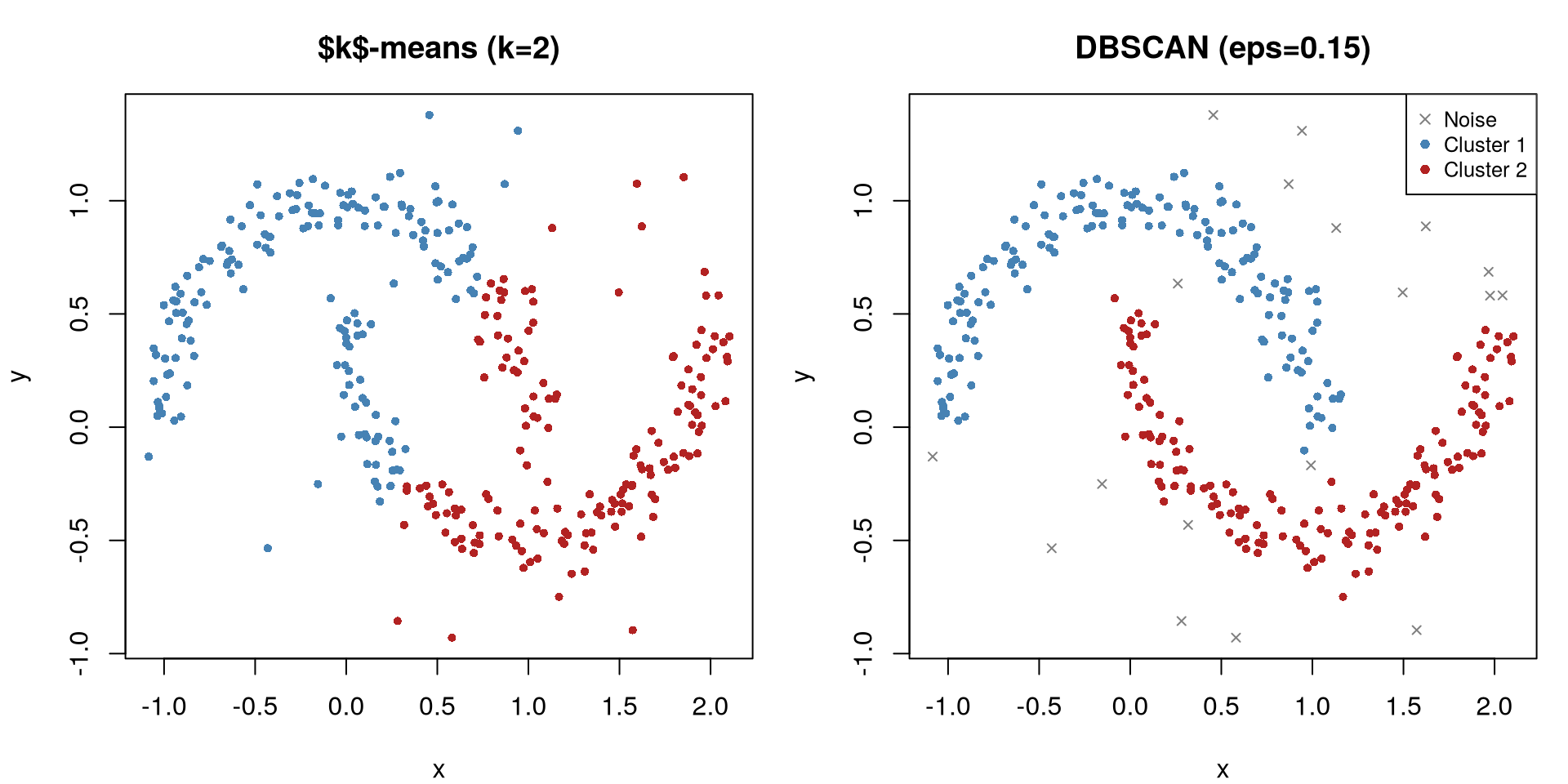
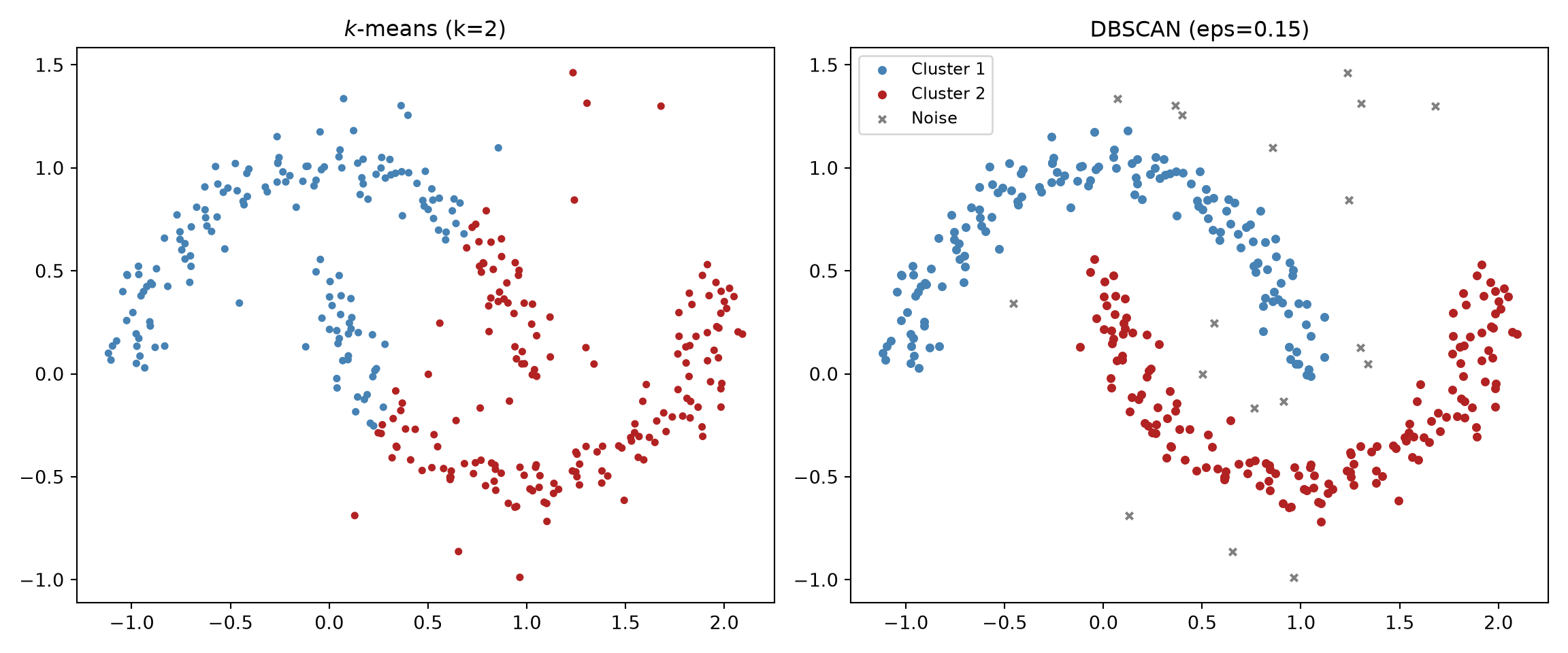
Figure 21.11: DBSCAN identifies irregularly shaped clusters and noise points.
Code
import numpy as np
import matplotlib.pyplot as plt
from sklearn.cluster import KMeans, DBSCAN

np.random.seed(42)
n_each = 150

theta1 = np.linspace(0, np.pi, n_each)
theta2 = np.linspace(0, np.pi, n_each)

x1 = np.cos(theta1) + np.random.normal(0, 0.08, n_each)
y1 = np.sin(theta1) + np.random.normal(0, 0.08, n_each)
x2 = 1 - np.cos(theta2) + np.random.normal(0, 0.08, n_each)
y2 = 1 - np.sin(theta2) - 0.5 + np.random.normal(0, 0.08, n_each)

x_noise = np.random.uniform(-0.5, 2, 30)
y_noise = np.random.uniform(-1, 1.5, 30)

X_crescent = np.vstack(
    [
        np.column_stack([x1, y1]),
        np.column_stack([x2, y2]),
        np.column_stack([x_noise, y_noise]),
    ]
)

km = KMeans(n_clusters=2, n_init=25, random_state=42).fit(X_crescent)
db = DBSCAN(eps=0.15, min_samples=5).fit(X_crescent)

fig, axes = plt.subplots(1, 2, figsize=(12, 5))

colors_km = ["steelblue" if c == 0 else "firebrick" for c in km.labels_]
axes[0].scatter(X_crescent[:, 0], X_crescent[:, 1], c=colors_km, s=10)
axes[0].set_title("$k$-means (k=2)")

color_map = {-1: "grey", 0: "steelblue", 1: "firebrick"}
colors_db = [color_map.get(c, "forestgreen") for c in db.labels_]
markers = ["x" if c == -1 else "o" for c in db.labels_]
for c_val in set(db.labels_):
    mask = db.labels_ == c_val
    m = "x" if c_val == -1 else "o"
    label = "Noise" if c_val == -1 else f"Cluster {c_val+1}"
    axes[1].scatter(
        X_crescent[mask, 0],
        X_crescent[mask, 1],
        c=color_map.get(c_val, "forestgreen"),
        marker=m,
        s=15,
        label=label,
    )
axes[1].set_title("DBSCAN (eps=0.15)")
axes[1].legend(fontsize=9)

plt.tight_layout()
plt.show()
Figure 21.12: DBSCAN correctly identifies crescent-shaped clusters that \(k\)-means cannot handle.

What the code is showing. We deliberately build a hard case: two interlocking crescent (banana) shapes plus a scatter of random “noise” patients who belong to neither. The left panel is \(k\)-means asked for two clusters. Because it can only carve out round blobs, it slices each crescent in half. The right panel is DBSCAN, which grows clusters by following dense trails of points, so it traces each crescent correctly and marks the scattered outliers as “noise” (the crosses).

21.4 Cluster Validation

Beyond internal metrics described above (e.g., the silhouette score, as well as other existing ones such as the Calinski-Harabasz index), a stronger test is whether the clusters are stable. Internal metrics can be misleading: they can be high even for meaningless clusters.

Bootstrap stability provides a more robust check:

  1. Resample the data with replacement many times.
  2. Re-run the clustering on each bootstrap sample.
  3. Measure how often the same points end up in the same cluster.

If clusters are stable across resamples, they likely reflect real structure. If membership changes dramatically, the clusters may be artefacts.

21.4.1 Bootstrap stability in practice

The logic is worth writing out in code, because it is short and because it will change how you choose \(k\).

The question we are asking is: if I had happened to recruit a slightly different set of patients, would I have found the same groups? We cannot recruit again, so we fake it. A bootstrap resample is a new dataset of the same size drawn from our patients with replacement, so some patients appear twice or three times and others not at all — a plausible alternative cohort. We re-cluster that alternative cohort and ask how much its groups look like the original ones.

To compare two groupings we use the Jaccard index: for a cluster in the original solution and a cluster in the resampled solution, it is the number of patients in both divided by the number in either. It runs from 0 (no shared patients) to 1 (identical membership). For each original cluster we take its best match in the resample, then average over many resamples. Hennig (2007), who developed this approach, suggests reading the result as:

  • above 0.85 — a highly stable cluster, safe to interpret;
  • 0.6 to 0.85 — a real pattern but with fuzzy edges; report it cautiously;
  • below 0.6 — do not trust this cluster; it is an artefact of these particular patients.

One implementation detail matters. After re-clustering a resample, we assign every original patient to their nearest resampled centroid. That way both groupings cover the same 400 patients and can be compared patient by patient, even though the resample itself contains duplicates.

Code
library(tidyverse)  # tibble(), bind_rows()

# Jaccard index: overlap between two sets of patient IDs
jaccard <- function(a, b) length(intersect(a, b)) / length(union(a, b))

cluster_stability <- function(x, k, B = 100, seed = 1) {
  set.seed(seed)
  original <- kmeans(x, centers = k, nstart = 25)

  best <- matrix(NA_real_, nrow = B, ncol = k)
  for (b in seq_len(B)) {
    # (1) a plausible alternative cohort: resample patients WITH replacement
    idx <- sample(nrow(x), replace = TRUE)
    km_b <- kmeans(x[idx, ], centers = k, nstart = 25)

    # (2) label every ORIGINAL patient by their nearest bootstrap centroid,
    #     so the two groupings cover the same patients and are comparable
    d <- as.matrix(dist(rbind(x, km_b$centers)))
    d <- d[seq_len(nrow(x)), nrow(x) + seq_len(k)]
    lab_b <- apply(d, 1, which.min)

    # (3) for each original cluster, how well does its best match overlap?
    for (j in seq_len(k)) {
      orig_j <- which(original$cluster == j)
      best[b, j] <- max(vapply(
        seq_len(k),
        function(m) jaccard(orig_j, which(lab_b == m)),
        numeric(1)
      ))
    }
  }
  colMeans(best)   # mean best-match Jaccard per original cluster
}

stability <- lapply(2:5, function(k) {
  s <- cluster_stability(lab_scaled, k)
  tibble(
    k = k,
    mean_jaccard = round(mean(s), 2),
    per_cluster = paste(round(s, 2), collapse = ", ")
  )
}) |>
  bind_rows()

stability
# A tibble: 4 × 3
      k mean_jaccard per_cluster                
  <int>        <dbl> <chr>                      
1     2         1    1, 1                       
2     3         0.99 1, 0.99, 0.99              
3     4         0.81 0.98, 0.63, 0.65, 1        
4     5         0.74 0.99, 0.77, 0.66, 0.56, 0.7
Code
import numpy as np
from sklearn.cluster import KMeans

# Jaccard index: overlap between two sets of patient indices
def jaccard(a, b):
    a, b = set(a), set(b)
    return len(a & b) / len(a | b)

def cluster_stability(X, k, B=100, seed=1):
    rng = np.random.default_rng(seed)
    original = KMeans(n_clusters=k, n_init=25, random_state=42).fit(X)

    best = np.zeros((B, k))
    for b in range(B):
        # (1) a plausible alternative cohort: resample WITH replacement
        idx = rng.integers(0, len(X), len(X))
        km_b = KMeans(n_clusters=k, n_init=25, random_state=b).fit(X[idx])

        # (2) label every ORIGINAL patient by their nearest bootstrap centroid
        lab_b = km_b.predict(X)

        # (3) for each original cluster, how well does its best match overlap?
        for j in range(k):
            orig_j = np.where(original.labels_ == j)[0]
            best[b, j] = max(jaccard(orig_j, np.where(lab_b == m)[0])
                             for m in range(k))
    return best.mean(axis=0)

for k in range(2, 6):
    s = cluster_stability(X_scaled, k)
    print(f"k = {k}:  mean Jaccard = {s.mean():.2f}   "
          f"per cluster = {np.round(s, 2)}")
k = 2:  mean Jaccard = 0.99   per cluster = [0.99 0.99]
k = 3:  mean Jaccard = 1.00   per cluster = [1.   1.   0.99]
k = 4:  mean Jaccard = 0.75   per cluster = [0.57 0.99 0.84 0.6 ]
k = 5:  mean Jaccard = 0.80   per cluster = [0.66 0.87 0.85 0.99 0.65]

What the code is showing. For each candidate \(k\) from 2 to 5, we build 100 alternative cohorts, re-cluster each one, and report how reliably each original cluster reappears. The pattern is clear-cut: \(k = 2\) and \(k = 3\) come back essentially every time (mean Jaccard around 0.99–1.00), whereas at \(k = 4\) two of the four clusters drop to roughly 0.6 and at \(k = 5\) the picture degrades further. In plain terms, the fourth and fifth clusters are not phenotypes — they are the algorithm slicing an existing group along a line that shifts depending on which patients happen to be in the sample.

Notice what this adds to the silhouette analysis. The silhouette gently preferred \(k = 3\) (0.49 versus 0.46 at \(k = 2\)) but the margin was small enough to argue about. Stability rules out \(k \ge 4\) outright, which is the more valuable statement. Read the two together: stability tells you which values of \(k\) are defensible at all, and the silhouette, plus clinical judgement, chooses among the survivors.

TipTwo shortcuts, and one thing to report

In R, fpc::clusterboot() implements this procedure (and several variants) in one call, and works with hierarchical clustering and DBSCAN as well as \(k\)-means. It is what you would reach for in a real analysis; we have written it out longhand here so that the number you report is a number you understand.

Whatever you use, report per-cluster stability, not just the average. An average of 0.81 sounds respectable, but at \(k = 4\) above it is hiding two rock-solid clusters and two that fall apart. It is the individual weak cluster that will embarrass you in review.

21.5 Clinical Applications

21.5.1 Patient Phenotyping

The most impactful use of clustering in clinical research is identifying disease subtypes that were previously unrecognised. Notable examples:

  • ARDS phenotypes. Calfee et al. (2014) applied latent class analysis to two ARDS clinical trial datasets and identified two phenotypes (“hyperinflammatory” and “hypoinflammatory”) with different mortality rates and different responses to treatment. The hyperinflammatory phenotype had higher IL-6, higher vasopressor use, and worse outcomes.

  • Sepsis endotypes. Seymour et al. (2019) used \(k\)-means clustering on EHR data from over 20,000 sepsis patients and identified four phenotypes (alpha, beta, gamma, delta) with distinct organ dysfunction patterns and 28-day mortality rates ranging from 5% to 40%.

  • Heart failure subtypes. Shah et al. (2015) applied hierarchical clustering to echocardiographic and clinical data from HFpEF patients and identified three phenotypes with different pathophysiology and prognosis.

21.5.2 Disease Subtyping from Lab Panels

A practical workflow for phenotyping:

  1. Select clinically relevant variables (labs, vitals, demographics).
  2. Handle missing data (imputation or exclusion).
  3. Standardise all variables.
  4. Reduce dimensionality (PCA to 10–20 components if many variables).
  5. Apply multiple clustering algorithms (\(k\)-means, hierarchical) and compare.
  6. Validate: silhouette scores, stability analysis, and (most importantly) clinical interpretation.
  7. Compare clusters on outcomes (mortality, length of stay, treatment response).

Why steps 3 and 4? Why not just cluster the raw values?

Two of those steps look like unnecessary bureaucracy, and they are the two that most often get skipped. Both matter, for different reasons.

Step 3, standardising, is not optional — skip it and one variable silently decides everything. Every algorithm in this chapter measures how far apart two patients are by adding up their differences across all variables. But raw clinical variables come in wildly different units. Two patients might differ by 40 mg/dL of glucose and by 0.4 g/dL of albumin. In raw units, the glucose difference is 100 times larger, so it contributes 10,000 times more to the squared distance — and albumin, along with every other variable measured on a small numeric scale, is effectively ignored. You have not clustered patients; you have sorted them by glucose. Standardising (subtract the mean, divide by the standard deviation) puts every variable on the same footing, so “different” means different relative to how much this variable normally varies between patients, which is what a clinician means by the word.

Step 4, reducing dimensions, is a genuine judgement call — and no, you would not usually cluster 60 raw labs. Three reasons, in order of how often they bite:

  • Redundancy. Clinical variables are heavily correlated. If your panel contains urea, creatinine, and eGFR, you have measured kidney function three times, and the distance calculation counts it three times. Kidney function will then dominate the clustering purely because your database happened to store three versions of it. PCA collapses those three into roughly one component, so kidney function gets one vote instead of three. This is the reason that matters most in practice, and it is not fixed by standardising.
  • Noise. Each individual lab carries measurement error. Sixty labs contribute sixty independent doses of noise to every pairwise distance, while the real phenotype signal lives in a handful of underlying patterns. Keeping the first 10–20 principal components keeps most of the shared signal and discards a good deal of the noise.
  • Distances stop discriminating. With enough variables, all patients drift towards being equidistant, for the reason set out in Section 21.3.1.
WarningBut do not reduce reflexively — there is a real cost

PCA buys you those three benefits and charges you interpretability, which is the currency clinical phenotyping runs on. A cluster described as “high CRP, high white cells, low albumin” is a phenotype a clinician can recognise on a ward round. A cluster described as “high on component 3” is not, until you go back and work out what component 3 is made of.

So the honest guidance is:

  • Fewer than about 10 variables, not badly correlated: cluster the standardised raw values. Nothing is gained by reducing, and you keep direct interpretability. This is what we did earlier with the four labs.
  • Dozens of variables, or obvious redundancy: reduce first. Cluster on the components, then always profile the resulting clusters back on the original variables (step 7’s table of means per cluster) so you can describe them clinically. The PCA is scaffolding for finding the groups; it is not how you report them.
  • Either way, check it both ways. Run the clustering on raw standardised values and on components, and see whether you get the same groups. If the answer depends on that choice, say so in the paper.

And note the one thing you must not do: reduce with t-SNE or UMAP and cluster the result. PCA is a fair, distance-preserving summary; t-SNE and UMAP are not, for the reasons in the next section.

21.6 Visualising Clusters

WarningNever cluster on t-SNE or UMAP coordinates

t-SNE and UMAP distort distances and densities. They can create apparent clusters where none exist, and deform continuous structure into misleading shapes (Chari and Pachter 2023). Always cluster first on the original scaled data, then use t-SNE/UMAP only for visualisation. PCA does not suffer from this problem because it is a linear projection that preserves distances.

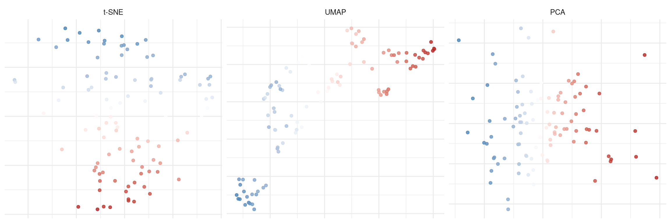
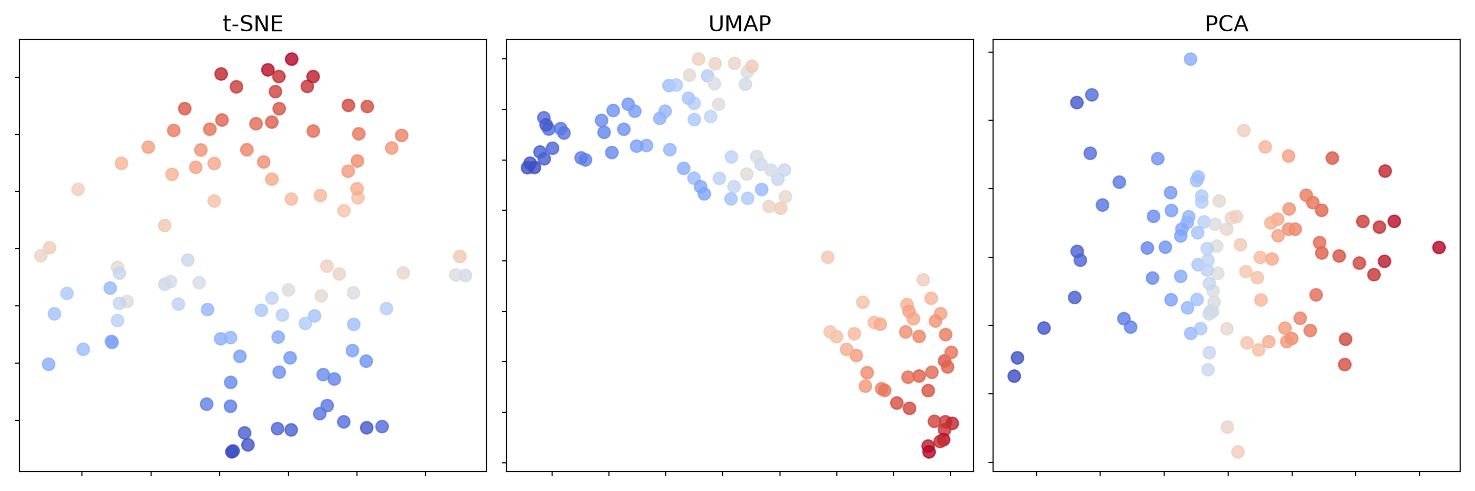
To see why this matters, we will run the methods on data that we know for certain has no groups in it at all, and watch what each one draws.

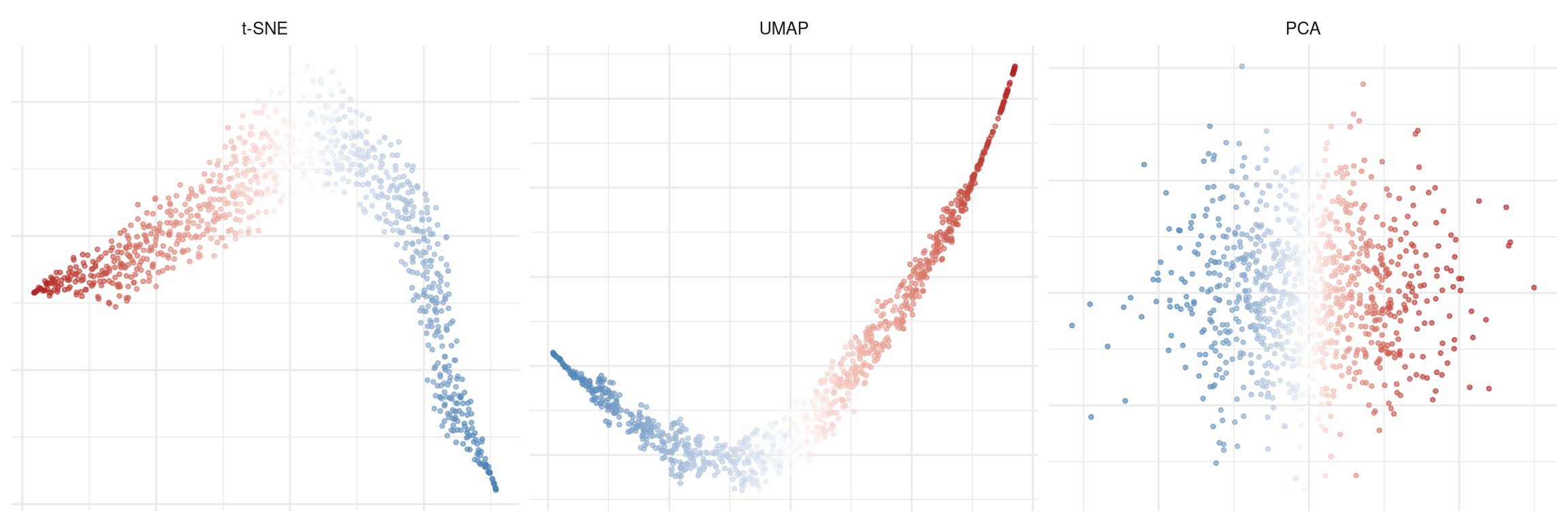
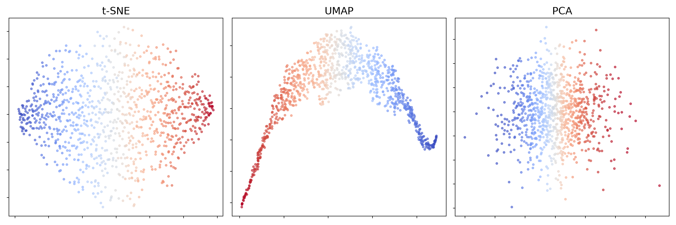
The test data is one single cloud of patients. Concretely: 1000 simulated patients, each with 100 measurements, generated so that all the measurements move together (correlation 0.8 between every pair) — think of a cohort where everyone who is a bit sicker is a bit worse on every marker at once. That produces the simplest possible structure: a smooth gradient from healthiest to sickest, with nobody falling into a distinct group. There is no “type” of patient here, only a spectrum.

We then colour each patient by where they sit on that spectrum (blue = the healthy end, red = the sick end) and ask each method to draw the 1000 patients on a flat page. A method that is telling the truth should show one continuous cloud with the colours changing smoothly across it. Any distinct blobs it shows are inventions.

Code
library(tidyverse)  # ggplot2
library(MASS)       # mvrnorm() -- note: also masks dplyr::select()
library(Rtsne)      # t-SNE
library(uwot)       # UMAP

set.seed(42)

n <- 1000
p <- 100
Sigma <- matrix(0.8, p, p)
diag(Sigma) <- 1

x <- mvrnorm(n, rep(0, p), Sigma)

ranks <- rank(rowMeans(x))
colours <- colorRampPalette(c("steelblue", "white", "firebrick"))(n)[ranks]

pca_2d <- prcomp(x)$x[, 1:2]
tsne_2d <- Rtsne(x, dims = 2, verbose = FALSE)$Y
umap_2d <- umap(x, verbose = FALSE)

plot_df <- data.frame(
  x = c(tsne_2d[, 1], umap_2d[, 1], pca_2d[, 1]),
  y = c(tsne_2d[, 2], umap_2d[, 2], pca_2d[, 2]),
  rank = rep(ranks, 3),
  method = factor(
    rep(c("t-SNE", "UMAP", "PCA"), each = n),
    levels = c("t-SNE", "UMAP", "PCA")
  )
)

ggplot(plot_df, aes(x, y, colour = rank)) +
  geom_point(alpha = 0.6, size = 0.8) +
  scale_colour_gradient2(
    low = "steelblue",
    mid = "white",
    high = "firebrick",
    midpoint = median(ranks)
  ) +
  facet_wrap(~method, scales = "free") +
  theme_minimal(base_size = 12) +
  theme(
    legend.position = "none",
    axis.title = element_blank(),
    axis.text = element_blank()
  )
Figure 21.13: A single correlated Gaussian (no clusters). t-SNE and UMAP deform the continuous structure; PCA preserves it.
Code
import numpy as np
import matplotlib.pyplot as plt
from matplotlib.colors import Normalize
import matplotlib.cm as cm
from scipy.stats import rankdata
from sklearn.decomposition import PCA
from sklearn.manifold import TSNE
from umap import UMAP

np.random.seed(42)

n, p = 1000, 100
Sigma = np.full((p, p), 0.8)
np.fill_diagonal(Sigma, 1.0)
x = np.random.multivariate_normal(np.zeros(p), Sigma, size=n)

ranks = rankdata(x.mean(axis=1))
norm = Normalize(vmin=ranks.min(), vmax=ranks.max())
colors = [cm.coolwarm(norm(r)) for r in ranks]

pca_2d  = PCA(n_components=2).fit_transform(x)
tsne_2d = TSNE(random_state=42).fit_transform(x)
umap_2d = UMAP(random_state=42).fit_transform(x)

fig, axs = plt.subplots(1, 3, figsize=(15, 5))

for ax, coords, title in zip(
    axs,
    [tsne_2d, umap_2d, pca_2d],
    ["t-SNE", "UMAP", "PCA"],
):
    ax.scatter(coords[:, 0], coords[:, 1], c=colors, s=10, alpha=0.6)
    ax.set_title(title, fontsize=16)
    ax.tick_params(labelbottom=False, labelleft=False)

plt.tight_layout()
plt.show()
Figure 21.14: A single correlated Gaussian (no clusters). t-SNE and UMAP deform the continuous structure; PCA preserves it.

What the code is showing. The data is a single smooth cloud, yet t-SNE folds the gradient into a ribbon and UMAP bends it into an arc or splits it into blobs. Both create shapes that could invite false clustering. PCA shows the truth: one continuous cloud with a smooth colour gradient.

The second example is the same experiment shrunk to a size that looks much more like a real pilot study: 100 patients with 3 measurements, generated by the identical process (all measurements correlated at 0.8, so again a single smooth spectrum and no groups whatsoever).

Code
library(tidyverse)  # ggplot2
library(MASS)       # mvrnorm()
library(Rtsne)      # t-SNE
library(uwot)       # UMAP

set.seed(42)

n <- 100
p <- 3
Sigma <- matrix(0.8, p, p)
diag(Sigma) <- 1
x <- mvrnorm(n, rep(0, p), Sigma)

ranks <- rank(rowMeans(x))

pca_2d <- prcomp(x)$x[, 1:2]
tsne_2d <- Rtsne(x, dims = 2, verbose = FALSE)$Y
umap_2d <- umap(x, verbose = FALSE)

plot_df <- data.frame(
  x = c(tsne_2d[, 1], umap_2d[, 1], pca_2d[, 1]),
  y = c(tsne_2d[, 2], umap_2d[, 2], pca_2d[, 2]),
  rank = rep(ranks, 3),
  method = factor(
    rep(c("t-SNE", "UMAP", "PCA"), each = n),
    levels = c("t-SNE", "UMAP", "PCA")
  )
)

ggplot(plot_df, aes(x, y, colour = rank)) +
  geom_point(alpha = 0.8, size = 1.5) +
  scale_colour_gradient2(
    low = "steelblue",
    mid = "white",
    high = "firebrick",
    midpoint = median(ranks)
  ) +
  facet_wrap(~method, scales = "free") +
  theme_minimal(base_size = 12) +
  theme(
    legend.position = "none",
    axis.title = element_blank(),
    axis.text = element_blank()
  )
Figure 21.15: 100 points from a single 3D Gaussian. t-SNE and UMAP create phantom clusters; PCA shows the truth.
Code
import numpy as np
import matplotlib.pyplot as plt
from matplotlib.colors import Normalize
import matplotlib.cm as cm
from scipy.stats import rankdata
from sklearn.decomposition import PCA
from sklearn.manifold import TSNE
from umap import UMAP

np.random.seed(42)

n, p = 100, 3
Sigma = np.full((p, p), 0.8)
np.fill_diagonal(Sigma, 1.0)
x = np.random.multivariate_normal(np.zeros(p), Sigma, size=n)

ranks = rankdata(x.mean(axis=1))
norm = Normalize(vmin=ranks.min(), vmax=ranks.max())
colors = [cm.coolwarm(norm(r)) for r in ranks]

pca_2d  = PCA(n_components=2).fit_transform(x)
tsne_2d = TSNE(random_state=42).fit_transform(x)
umap_2d = UMAP(random_state=42).fit_transform(x)

fig, axs = plt.subplots(1, 3, figsize=(15, 5))

for ax, coords, title in zip(
    axs,
    [tsne_2d, umap_2d, pca_2d],
    ["t-SNE", "UMAP", "PCA"],
):
    ax.scatter(coords[:, 0], coords[:, 1], c=colors, s=80, alpha=0.8)
    ax.set_title(title, fontsize=16)
    ax.tick_params(labelbottom=False, labelleft=False)

plt.tight_layout()
plt.show()
Figure 21.16: 100 points from a single 3D Gaussian. t-SNE and UMAP create phantom clusters; PCA shows the truth.

What the code is showing. Here, t-SNE and UMAP fragment the smooth cloud into what look like discrete groups, while PCA correctly shows a single continuous spread. With small sample sizes, this “phantom cluster” effect can be especially pronounced.

21.7 Cautionary Notes

ImportantClusters can be artefacts

Clustering algorithms will always produce clusters, even in completely random data. The existence of clusters in your output does not mean they are real. Validation (both statistical and clinical) is essential.

WarningClusters are hypotheses, not facts

Finding three clusters in your ICU dataset does not mean there are three types of ICU patients. It means that your data, with your chosen features, using your chosen algorithm, with your chosen parameters, can be partitioned into three groups. Whether those groups are biologically meaningful requires external validation.

Always validate clinically. Clusters should differ on outcomes, biomarkers, or treatment response, not just on the features used to create them. Clustering on lab values and then showing that the clusters differ on lab values is circular reasoning.

Try multiple algorithms. If \(k\)-means, hierarchical clustering, and DBSCAN all find the same groups, you have more confidence that the structure is real. If they disagree, the structure may be fragile.

Report negative results. Many clustering analyses find no meaningful structure. This is a legitimate finding: it means the disease population is more homogeneous than expected.

Beware of overfitting to noise. With enough features, clustering will always find patterns. Use stability analysis and, if possible, validate clusters in an independent dataset.

21.8 Exercises

TipExercise 1: K-Means on Simulated Patient Data

Simulate a dataset of 600 patients with 6 clinical variables (heart rate, respiratory rate, temperature, systolic BP, creatinine, lactate) drawn from 3 underlying phenotypes.

  1. Scale the data and apply \(k\)-means for \(k = 2, 3, 4, 5, 6\).
  2. Create elbow and silhouette plots. Which \(k\) appears optimal?
  3. Visualise the \(k = 3\) solution using PCA.
  4. Profile the clusters: compute the mean of each variable within each cluster. Do the profiles make clinical sense?
Code
# Chapter 16, Exercise 1: K-Means on Simulated Patient Data
# 600 patients, 6 clinical variables, 3 underlying phenotypes

library(tidyverse)
library(cluster)

# ---- Simulate data ----
set.seed(42)
n <- 600

# Phenotype 1: Septic shock (high HR, RR, lactate, low SBP)
p1 <- tibble(
  hr = rnorm(200, 115, 12), rr = rnorm(200, 28, 5),
  temp = rnorm(200, 38.5, 0.8), sbp = rnorm(200, 80, 12),
  creat = rnorm(200, 2.5, 0.8), lactate = rnorm(200, 5, 2)
)

# Phenotype 2: Stable critical (moderate vitals)
p2 <- tibble(
  hr = rnorm(200, 90, 10), rr = rnorm(200, 20, 3),
  temp = rnorm(200, 37.2, 0.5), sbp = rnorm(200, 110, 15),
  creat = rnorm(200, 1.2, 0.3), lactate = rnorm(200, 1.5, 0.5)
)

# Phenotype 3: Febrile, preserved hemodynamics
p3 <- tibble(
  hr = rnorm(200, 100, 10), rr = rnorm(200, 22, 4),
  temp = rnorm(200, 39.2, 0.7), sbp = rnorm(200, 120, 10),
  creat = rnorm(200, 1.0, 0.2), lactate = rnorm(200, 2.0, 0.8)
)

dat <- bind_rows(p1, p2, p3)
true_labels <- rep(1:3, each = 200)

# ---- (a) Scale and apply K-means for k = 2 to 6 ----
dat_scaled <- scale(dat)

wcss <- numeric(6)
sil_avg <- numeric(6)

for (k in 2:6) {
  km <- kmeans(dat_scaled, centers = k, nstart = 25)
  wcss[k] <- km$tot.withinss
  sil_avg[k] <- mean(silhouette(km$cluster, dist(dat_scaled))[, 3])
}

# ---- (b) Elbow and silhouette plots ----
par(mfrow = c(1, 2), mar = c(4, 4, 3, 1))

plot(2:6, wcss[2:6], type = "b", pch = 16, col = "steelblue",
     xlab = "Number of clusters (k)", ylab = "Within-cluster SS",
     main = "Elbow Method")

plot(2:6, sil_avg[2:6], type = "b", pch = 16, col = "firebrick",
     xlab = "Number of clusters (k)", ylab = "Average Silhouette",
     main = "Silhouette Scores")

cat("=== Part (b): Optimal k ===\n")
cat("Elbow plot: The elbow appears at k = 3, where WCSS decreases\n")
cat("  sharply and then flattens.\n")
cat("Silhouette: Maximum average silhouette at k =", which.max(sil_avg[2:6]) + 1, "\n")
cat("Both methods suggest k = 3, consistent with the 3 simulated phenotypes.\n")

# ---- (c) Visualise k=3 solution using PCA ----
km3 <- kmeans(dat_scaled, centers = 3, nstart = 25)
pca2 <- prcomp(dat_scaled)$x[, 1:2]

par(mfrow = c(1, 1))
cols <- c("steelblue", "firebrick", "forestgreen")
plot(pca2, col = cols[km3$cluster], pch = 16, cex = 0.7,
     main = "K-means (k=3) on First 2 PCs",
     xlab = "PC1", ylab = "PC2")
legend("topright", paste("Cluster", 1:3), col = cols, pch = 16, cex = 0.8)

# ---- (d) Profile the clusters ----
cat("\n=== Part (d): Cluster Profiles ===\n\n")

dat$cluster <- km3$cluster
profiles <- dat %>%
  group_by(cluster) %>%
  summarise(across(hr:lactate, mean), n = n(), .groups = "drop")

print(profiles)

cat("\nClinical interpretation of cluster profiles:\n\n")

# Identify which cluster matches which phenotype
for (cl in 1:3) {
  prof <- profiles %>% filter(cluster == cl)
  cat(sprintf("Cluster %d (n = %d):\n", cl, prof$n))
  cat(sprintf("  HR=%.0f, RR=%.0f, Temp=%.1f, SBP=%.0f, Creat=%.1f, Lactate=%.1f\n",
              prof$hr, prof$rr, prof$temp, prof$sbp, prof$creat, prof$lactate))

  if (prof$lactate > 3 && prof$sbp < 90) {
    cat("  -> Matches SEPTIC SHOCK phenotype: high HR, RR, lactate; low SBP\n")
  } else if (prof$temp > 38.5) {
    cat("  -> Matches FEBRILE phenotype: high temp, preserved hemodynamics\n")
  } else {
    cat("  -> Matches STABLE CRITICAL phenotype: moderate vitals\n")
  }
  cat("\n")
}

cat("The cluster profiles make clinical sense. The algorithm has\n")
cat("successfully recovered the three simulated phenotypes, each\n")
cat("with a distinct clinical profile that a clinician would recognise.\n")
Code
# Chapter 16, Exercise 1: K-Means on Simulated Patient Data
# 600 patients, 6 clinical variables, 3 underlying phenotypes

import numpy as np
import pandas as pd
import matplotlib.pyplot as plt
from sklearn.preprocessing import StandardScaler
from sklearn.cluster import KMeans
from sklearn.metrics import silhouette_score
from sklearn.decomposition import PCA

# ---- Simulate data ----
np.random.seed(42)

# Phenotype 1: Septic shock
p1 = np.column_stack([
    np.random.normal(115, 12, 200),   # hr
    np.random.normal(28, 5, 200),     # rr
    np.random.normal(38.5, 0.8, 200), # temp
    np.random.normal(80, 12, 200),    # sbp
    np.random.normal(2.5, 0.8, 200),  # creat
    np.random.normal(5, 2, 200)       # lactate
])

# Phenotype 2: Stable critical
p2 = np.column_stack([
    np.random.normal(90, 10, 200),
    np.random.normal(20, 3, 200),
    np.random.normal(37.2, 0.5, 200),
    np.random.normal(110, 15, 200),
    np.random.normal(1.2, 0.3, 200),
    np.random.normal(1.5, 0.5, 200)
])

# Phenotype 3: Febrile
p3 = np.column_stack([
    np.random.normal(100, 10, 200),
    np.random.normal(22, 4, 200),
    np.random.normal(39.2, 0.7, 200),
    np.random.normal(120, 10, 200),
    np.random.normal(1.0, 0.2, 200),
    np.random.normal(2.0, 0.8, 200)
])

X = np.vstack([p1, p2, p3])
cols = ['hr', 'rr', 'temp', 'sbp', 'creat', 'lactate']
df = pd.DataFrame(X, columns=cols)

# ---- (a) Scale and K-means for k = 2 to 6 ----
X_scaled = StandardScaler().fit_transform(X)

ks = range(2, 7)
wcss_list = []
sil_list = []

for k in ks:
    km = KMeans(n_clusters=k, n_init=25, random_state=42)
    km.fit(X_scaled)
    wcss_list.append(km.inertia_)
    sil_list.append(silhouette_score(X_scaled, km.labels_))

# ---- (b) Elbow and silhouette plots ----
fig, axes = plt.subplots(1, 2, figsize=(12, 5))

axes[0].plot(list(ks), wcss_list, "o-", color="steelblue")
axes[0].set_xlabel("Number of clusters (k)")
axes[0].set_ylabel("Within-cluster SS")
axes[0].set_title("Elbow Method")

axes[1].plot(list(ks), sil_list, "o-", color="firebrick")
axes[1].set_xlabel("Number of clusters (k)")
axes[1].set_ylabel("Average Silhouette")
axes[1].set_title("Silhouette Scores")

plt.tight_layout()
plt.savefig("ch16_ex1_elbow_silhouette.png", dpi=150)
plt.show()

best_k = list(ks)[np.argmax(sil_list)]
print(f"=== Part (b): Optimal k ===")
print(f"Elbow: Elbow appears at k = 3")
print(f"Silhouette: Maximum at k = {best_k}")
print(f"Both methods suggest k = 3, matching the 3 simulated phenotypes.")

# ---- (c) Visualise k=3 with PCA ----
km3 = KMeans(n_clusters=3, n_init=25, random_state=42).fit(X_scaled)
pca2 = PCA(n_components=2).fit_transform(X_scaled)

fig, ax = plt.subplots(figsize=(8, 6))
colors_3 = ["steelblue", "firebrick", "forestgreen"]
for c in range(3):
    mask = km3.labels_ == c
    ax.scatter(pca2[mask, 0], pca2[mask, 1], c=colors_3[c],
               s=15, alpha=0.6, label=f"Cluster {c+1}")
ax.set_xlabel("PC1")
ax.set_ylabel("PC2")
ax.set_title("K-means (k=3) on First 2 PCs")
ax.legend()
plt.tight_layout()
plt.savefig("ch16_ex1_pca_clusters.png", dpi=150)
plt.show()

# ---- (d) Profile the clusters ----
print("\n=== Part (d): Cluster Profiles ===\n")

df['cluster'] = km3.labels_
profiles = df.groupby('cluster')[cols].mean()
print(profiles.round(1))

print("\nClinical interpretation:")
for cl in range(3):
    prof = profiles.loc[cl]
    n_cl = (km3.labels_ == cl).sum()
    print(f"\nCluster {cl+1} (n = {n_cl}):")
    print(f"  HR={prof['hr']:.0f}, RR={prof['rr']:.0f}, Temp={prof['temp']:.1f}, "
          f"SBP={prof['sbp']:.0f}, Creat={prof['creat']:.1f}, Lactate={prof['lactate']:.1f}")

    if prof['lactate'] > 3 and prof['sbp'] < 90:
        print("  -> SEPTIC SHOCK: high HR, RR, lactate; low SBP")
    elif prof['temp'] > 38.5:
        print("  -> FEBRILE: high temperature, preserved hemodynamics")
    else:
        print("  -> STABLE CRITICAL: moderate vitals")

print("\nThe cluster profiles make clinical sense. The algorithm")
print("successfully recovered the three simulated phenotypes.")
TipExercise 2: Hierarchical Clustering with Different Linkage Methods

Using the same dataset from Exercise 1:

  1. Apply hierarchical clustering with single, complete, average, and Ward’s linkage.
  2. Cut each dendrogram at \(k = 3\) and compare the resulting cluster assignments.
  3. Which linkage method produces clusters most similar to the \(k\)-means solution? You can perform that qualitatively or quantitatively using the adjusted Rand index (Python; R).
  4. Which linkage method would you recommend for clinical data and why?
Code
# Chapter 16, Exercise 2: Hierarchical Clustering with Different Linkage Methods
# Using the same dataset from Exercise 1

library(tidyverse)
library(cluster)
library(mclust)  # for adjustedRandIndex

# ---- Simulate data (same as Exercise 1) ----
set.seed(42)

p1 <- tibble(hr = rnorm(200, 115, 12), rr = rnorm(200, 28, 5),
             temp = rnorm(200, 38.5, 0.8), sbp = rnorm(200, 80, 12),
             creat = rnorm(200, 2.5, 0.8), lactate = rnorm(200, 5, 2))
p2 <- tibble(hr = rnorm(200, 90, 10), rr = rnorm(200, 20, 3),
             temp = rnorm(200, 37.2, 0.5), sbp = rnorm(200, 110, 15),
             creat = rnorm(200, 1.2, 0.3), lactate = rnorm(200, 1.5, 0.5))
p3 <- tibble(hr = rnorm(200, 100, 10), rr = rnorm(200, 22, 4),
             temp = rnorm(200, 39.2, 0.7), sbp = rnorm(200, 120, 10),
             creat = rnorm(200, 1.0, 0.2), lactate = rnorm(200, 2.0, 0.8))

dat <- bind_rows(p1, p2, p3)
dat_scaled <- scale(dat)

# K-means reference solution
km3 <- kmeans(dat_scaled, centers = 3, nstart = 25)

# ---- (a) Hierarchical clustering with 4 linkage methods ----
cat("=== Part (a): Hierarchical Clustering ===\n\n")

d <- dist(dat_scaled)
methods <- c("single", "complete", "average", "ward.D2")
titles <- c("Single", "Complete", "Average", "Ward's")

# Use a subset for readable dendrograms
set.seed(42)
idx <- sample(nrow(dat_scaled), 80)

par(mfrow = c(2, 2), mar = c(2, 3, 3, 1))
for (i in seq_along(methods)) {
  hc <- hclust(dist(dat_scaled[idx, ]), method = methods[i])
  plot(hc, labels = FALSE, main = titles[i], xlab = "", sub = "",
       hang = -1, cex = 0.5)
  rect.hclust(hc, k = 3, border = "firebrick")
}

# ---- (b) Cut each dendrogram at k=3, compare assignments ----
cat("=== Part (b): Cluster Assignments ===\n\n")

hc_clusters <- list()
for (i in seq_along(methods)) {
  hc <- hclust(d, method = methods[i])
  hc_clusters[[methods[i]]] <- cutree(hc, k = 3)
}

# Crosstabulation between methods
cat("Crosstab: Ward's vs Complete linkage:\n")
print(table(Ward = hc_clusters[["ward.D2"]],
            Complete = hc_clusters[["complete"]]))

cat("\nCrosstab: Ward's vs Single linkage:\n")
print(table(Ward = hc_clusters[["ward.D2"]],
            Single = hc_clusters[["single"]]))

# ---- (c) ARI comparison with K-means ----
cat("\n=== Part (c): Adjusted Rand Index vs K-means ===\n\n")

for (i in seq_along(methods)) {
  ari <- adjustedRandIndex(km3$cluster, hc_clusters[[methods[i]]])
  cat(sprintf("ARI(%s vs K-means): %.3f\n", titles[i], ari))
}

cat("\nWard's method produces clusters most similar to K-means (highest ARI).\n")
cat("This is expected because both Ward's method and K-means minimise\n")
cat("within-cluster variance (WCSS), so they have similar objectives.\n")

# ---- (d) Recommendation for clinical data ----
cat("\n=== Part (d): Recommendation ===\n\n")

cat("Ward's method is the recommended default for clinical data because:\n\n")
cat("1. OBJECTIVE: Ward's minimises within-cluster variance, which\n")
cat("   aligns with the goal of finding compact, homogeneous clusters.\n\n")
cat("2. CONSISTENCY: It produces results most similar to K-means,\n")
cat("   which is the most widely used method. Using both and checking\n")
cat("   for agreement strengthens confidence in the results.\n\n")
cat("3. ROBUSTNESS: Complete linkage can be distorted by outliers;\n")
cat("   single linkage creates chaining effects (long, straggling\n")
cat("   clusters). Ward's avoids both issues.\n\n")
cat("4. COMPACT CLUSTERS: Clinical phenotypes are typically expected\n")
cat("   to be compact groups of similar patients, which Ward's\n")
cat("   naturally produces.\n\n")
cat("5. INTERPRETABILITY: The dendrogram from Ward's method is\n")
cat("   usually the easiest to interpret, with clear height gaps\n")
cat("   indicating natural cluster boundaries.\n\n")
cat("CAVEAT: If you suspect non-spherical clusters (e.g., disease\n")
cat("trajectories that form elongated shapes), average linkage\n")
cat("might be more appropriate. But for most clinical phenotyping\n")
cat("applications, Ward's is the safe default.\n")
Code
# Chapter 16, Exercise 2: Hierarchical Clustering with Different Linkage Methods
# Using the same dataset from Exercise 1

import numpy as np
import pandas as pd
import matplotlib.pyplot as plt
from sklearn.preprocessing import StandardScaler
from sklearn.cluster import KMeans, AgglomerativeClustering
from sklearn.metrics import adjusted_rand_score
from scipy.cluster.hierarchy import dendrogram, linkage, fcluster

# ---- Simulate data (same as Exercise 1) ----
np.random.seed(42)

p1 = np.column_stack([
    np.random.normal(115, 12, 200), np.random.normal(28, 5, 200),
    np.random.normal(38.5, 0.8, 200), np.random.normal(80, 12, 200),
    np.random.normal(2.5, 0.8, 200), np.random.normal(5, 2, 200)
])
p2 = np.column_stack([
    np.random.normal(90, 10, 200), np.random.normal(20, 3, 200),
    np.random.normal(37.2, 0.5, 200), np.random.normal(110, 15, 200),
    np.random.normal(1.2, 0.3, 200), np.random.normal(1.5, 0.5, 200)
])
p3 = np.column_stack([
    np.random.normal(100, 10, 200), np.random.normal(22, 4, 200),
    np.random.normal(39.2, 0.7, 200), np.random.normal(120, 10, 200),
    np.random.normal(1.0, 0.2, 200), np.random.normal(2.0, 0.8, 200)
])

X = np.vstack([p1, p2, p3])
X_scaled = StandardScaler().fit_transform(X)

# K-means reference
km3 = KMeans(n_clusters=3, n_init=25, random_state=42).fit(X_scaled)

# ---- (a) Hierarchical clustering with 4 linkage methods ----
print("=== Part (a): Hierarchical Clustering ===\n")

methods = ['single', 'complete', 'average', 'ward']
titles = ['Single', 'Complete', 'Average', "Ward's"]

# Dendrograms (use subset for readability)
np.random.seed(42)
idx = np.random.choice(len(X_scaled), 80, replace=False)
X_sub = X_scaled[idx]

fig, axes = plt.subplots(2, 2, figsize=(16, 10))
axes = axes.flatten()

for ax, method, title in zip(axes, methods, titles):
    Z = linkage(X_sub, method=method)
    dendrogram(Z, ax=ax, no_labels=True, color_threshold=0)
    ax.set_title(title)
    ax.set_xlabel("")

plt.suptitle("Hierarchical Clustering: Linkage Method Comparison", fontsize=14)
plt.tight_layout()
plt.savefig("ch16_ex2_dendrograms.png", dpi=150)
plt.show()

# ---- (b) Cut at k=3 and compare ----
print("=== Part (b): Cluster Assignments ===\n")

hc_labels = {}
for method in methods:
    Z = linkage(X_scaled, method=method)
    hc_labels[method] = fcluster(Z, t=3, criterion='maxclust')

# Crosstabs
print("Crosstab: Ward's vs Complete:")
ct = pd.crosstab(pd.Series(hc_labels['ward'], name='Ward'),
                  pd.Series(hc_labels['complete'], name='Complete'))
print(ct)

print("\nCrosstab: Ward's vs Single:")
ct2 = pd.crosstab(pd.Series(hc_labels['ward'], name='Ward'),
                   pd.Series(hc_labels['single'], name='Single'))
print(ct2)

# ---- (c) ARI comparison with K-means ----
print("\n=== Part (c): Adjusted Rand Index vs K-means ===\n")

for method, title in zip(methods, titles):
    ari = adjusted_rand_score(km3.labels_, hc_labels[method])
    print(f"ARI({title} vs K-means): {ari:.3f}")

print("\nWard's method produces clusters most similar to K-means (highest ARI).")
print("Both minimise within-cluster variance, so they share similar objectives.")

# ---- (d) Recommendation ----
print("\n=== Part (d): Recommendation ===\n")

print("Ward's method is recommended for clinical data because:\n")
print("1. OBJECTIVE: Minimises within-cluster variance, producing")
print("   compact, homogeneous clusters.\n")
print("2. CONSISTENCY: Most similar to K-means, strengthening")
print("   confidence when both methods agree.\n")
print("3. ROBUSTNESS: Avoids chaining (single linkage) and outlier")
print("   sensitivity (complete linkage).\n")
print("4. COMPACT CLUSTERS: Clinical phenotypes are typically compact")
print("   groups, which Ward's naturally produces.\n")
print("5. INTERPRETABILITY: Dendrogram with clear height gaps at")
print("   natural cluster boundaries.\n")
print("CAVEAT: For non-spherical clusters, average linkage may be")
print("more appropriate. But Ward's is the safe default for most")
print("clinical phenotyping applications.")
TipExercise 3: DBSCAN for Outlier Detection

Add 30 “outlier” patients to the Exercise 1 dataset: patients with extreme values across multiple variables (e.g., HR = 180, lactate = 15, creatinine = 8).

  1. Run \(k\)-means with \(k = 3\). Where do the outliers end up?
  2. Run DBSCAN with appropriate eps and min_samples. How many outliers does it identify?
  3. Compare the cluster assignments for non-outlier patients between \(k\)-means and DBSCAN.
  4. In a clinical phenotyping study, which approach would you prefer for handling outliers?
Code
# Chapter 16, Exercise 3: DBSCAN for Outlier Detection
# Add outlier patients to the Exercise 1 dataset

library(tidyverse)
library(cluster)
library(dbscan)

# ---- Simulate data (same as Exercise 1) ----
set.seed(42)

p1 <- tibble(hr = rnorm(200, 115, 12), rr = rnorm(200, 28, 5),
             temp = rnorm(200, 38.5, 0.8), sbp = rnorm(200, 80, 12),
             creat = rnorm(200, 2.5, 0.8), lactate = rnorm(200, 5, 2))
p2 <- tibble(hr = rnorm(200, 90, 10), rr = rnorm(200, 20, 3),
             temp = rnorm(200, 37.2, 0.5), sbp = rnorm(200, 110, 15),
             creat = rnorm(200, 1.2, 0.3), lactate = rnorm(200, 1.5, 0.5))
p3 <- tibble(hr = rnorm(200, 100, 10), rr = rnorm(200, 22, 4),
             temp = rnorm(200, 39.2, 0.7), sbp = rnorm(200, 120, 10),
             creat = rnorm(200, 1.0, 0.2), lactate = rnorm(200, 2.0, 0.8))

dat <- bind_rows(p1, p2, p3)
is_outlier <- rep(FALSE, 600)

# Add 30 outlier patients with extreme values
set.seed(99)
outliers <- tibble(
  hr = rnorm(30, 180, 10),       # Extreme heart rate
  rr = rnorm(30, 40, 5),         # Extreme respiratory rate
  temp = rnorm(30, 40.5, 0.5),   # Very high temperature
  sbp = rnorm(30, 50, 10),       # Very low blood pressure
  creat = rnorm(30, 8, 1.5),     # Very high creatinine
  lactate = rnorm(30, 15, 3)     # Very high lactate
)

dat <- bind_rows(dat, outliers)
is_outlier <- c(is_outlier, rep(TRUE, 30))
dat_scaled <- scale(dat)

cat("Total patients:", nrow(dat), "(600 normal + 30 outliers)\n\n")

# ---- (a) K-means with k=3 ----
cat("=== Part (a): K-means with k=3 ===\n")

km3 <- kmeans(dat_scaled, centers = 3, nstart = 25)

# Where do outliers end up?
outlier_clusters <- km3$cluster[is_outlier]
cat("Outlier distribution across K-means clusters:\n")
print(table(outlier_clusters))

cat("\nK-means assigns outliers to one of the existing clusters,\n")
cat("typically the cluster whose centroid is nearest (even if far).\n")
cat("This can distort the centroid and corrupt the cluster profiles.\n")

# Show how outliers affect cluster means
dat$km_cluster <- km3$cluster
dat$is_outlier <- is_outlier

for (cl in 1:3) {
  n_outlier_in_cl <- sum(dat$km_cluster == cl & dat$is_outlier)
  n_total_in_cl <- sum(dat$km_cluster == cl)
  cat(sprintf("Cluster %d: %d patients (%d outliers)\n",
              cl, n_total_in_cl, n_outlier_in_cl))
}

# ---- (b) DBSCAN ----
cat("\n=== Part (b): DBSCAN ===\n")

# Use kNNdistplot to help choose eps
kNNdistplot(dat_scaled, k = 5)
abline(h = 2.5, col = "firebrick", lty = 2)

# Run DBSCAN
db <- dbscan(dat_scaled, eps = 2.5, minPts = 10)

cat("DBSCAN results:\n")
cat("  Number of clusters:", max(db$cluster), "\n")
cat("  Noise points (outliers):", sum(db$cluster == 0), "\n")
cat("  Actual outliers detected as noise:",
    sum(db$cluster == 0 & is_outlier), "out of 30\n")

cat("\nDBSCAN cluster sizes:\n")
print(table(db$cluster))

# ---- (c) Compare non-outlier assignments ----
cat("\n=== Part (c): Comparison for Non-Outlier Patients ===\n")

# Get cluster assignments for non-outlier patients only
normal_idx <- !is_outlier
km_normal <- km3$cluster[normal_idx]
db_normal <- db$cluster[normal_idx]

# For DBSCAN, remove any normal patients assigned as noise
db_noise_normal <- sum(db_normal == 0)
cat("Normal patients misclassified as noise by DBSCAN:", db_noise_normal, "\n")

# ARI for non-noise, non-outlier patients
both_assigned <- db_normal > 0
if (sum(both_assigned) > 0) {
  # Use mclust for ARI
  library(mclust)
  ari <- adjustedRandIndex(km_normal[both_assigned], db_normal[both_assigned])
  cat("ARI between K-means and DBSCAN (non-outlier, non-noise):", round(ari, 3), "\n")
}

# ---- (d) Which approach for outlier handling? ----
cat("\n=== Part (d): Preferred Approach for Outlier Handling ===\n\n")

cat("DBSCAN is preferred for clinical phenotyping when outliers are expected.\n\n")

cat("Reasons:\n")
cat("1. EXPLICIT OUTLIER IDENTIFICATION: DBSCAN labels outliers as noise,\n")
cat("   making them visible for clinical review. K-means silently absorbs\n")
cat("   them into clusters, distorting the results.\n\n")

cat("2. CLINICAL RELEVANCE: Outlier patients (e.g., with extreme vitals)\n")
cat("   may represent data errors, rare presentations, or patients who\n")
cat("   need individual assessment. Identifying them is valuable.\n\n")

cat("3. CLUSTER INTEGRITY: By excluding outliers, DBSCAN preserves the\n")
cat("   purity of the main clusters. K-means cluster centroids can be\n")
cat("   pulled by outliers, producing misleading profiles.\n\n")

cat("4. PRACTICAL WORKFLOW:\n")
cat("   - Use DBSCAN to identify outliers first.\n")
cat("   - Review outliers clinically (data errors? rare cases?).\n")
cat("   - Apply K-means to the remaining non-outlier patients for\n")
cat("     cleaner phenotyping.\n\n")

cat("5. CAVEAT: DBSCAN requires tuning eps and minPts, which can be\n")
cat("   challenging. The kNN distance plot helps, but the choice\n")
cat("   affects how many points are labelled as noise.\n")

# Visualise comparison
pca2 <- prcomp(dat_scaled)$x[, 1:2]

par(mfrow = c(1, 2), mar = c(4, 4, 3, 1))

# K-means
cols_km <- c("steelblue", "firebrick", "forestgreen")[km3$cluster]
pch_km <- ifelse(is_outlier, 4, 16)
plot(pca2, col = cols_km, pch = pch_km, cex = 0.7,
     main = "K-means (k=3)\n(X = outlier patients)",
     xlab = "PC1", ylab = "PC2")

# DBSCAN
db_cols <- c("grey50", "steelblue", "firebrick", "forestgreen")
cols_db <- db_cols[db$cluster + 1]
pch_db <- ifelse(db$cluster == 0, 4, 16)
plot(pca2, col = cols_db, pch = pch_db, cex = 0.7,
     main = "DBSCAN\n(X/grey = noise)",
     xlab = "PC1", ylab = "PC2")
legend("topright", c("Noise", "Cluster 1", "Cluster 2", "Cluster 3"),
       col = db_cols, pch = c(4, 16, 16, 16), cex = 0.7)
Code
# Chapter 16, Exercise 3: DBSCAN for Outlier Detection
# Add outlier patients to the Exercise 1 dataset

import numpy as np
import pandas as pd
import matplotlib.pyplot as plt
from sklearn.preprocessing import StandardScaler
from sklearn.cluster import KMeans, DBSCAN
from sklearn.metrics import adjusted_rand_score
from sklearn.decomposition import PCA
from sklearn.neighbors import NearestNeighbors

# ---- Simulate data (same as Exercise 1) ----
np.random.seed(42)

p1 = np.column_stack([
    np.random.normal(115, 12, 200), np.random.normal(28, 5, 200),
    np.random.normal(38.5, 0.8, 200), np.random.normal(80, 12, 200),
    np.random.normal(2.5, 0.8, 200), np.random.normal(5, 2, 200)
])
p2 = np.column_stack([
    np.random.normal(90, 10, 200), np.random.normal(20, 3, 200),
    np.random.normal(37.2, 0.5, 200), np.random.normal(110, 15, 200),
    np.random.normal(1.2, 0.3, 200), np.random.normal(1.5, 0.5, 200)
])
p3 = np.column_stack([
    np.random.normal(100, 10, 200), np.random.normal(22, 4, 200),
    np.random.normal(39.2, 0.7, 200), np.random.normal(120, 10, 200),
    np.random.normal(1.0, 0.2, 200), np.random.normal(2.0, 0.8, 200)
])

X_normal = np.vstack([p1, p2, p3])
is_outlier = np.array([False] * 600)

# Add 30 outlier patients
np.random.seed(99)
outliers = np.column_stack([
    np.random.normal(180, 10, 30),     # Extreme HR
    np.random.normal(40, 5, 30),       # Extreme RR
    np.random.normal(40.5, 0.5, 30),   # Very high temp
    np.random.normal(50, 10, 30),      # Very low SBP
    np.random.normal(8, 1.5, 30),      # Very high creatinine
    np.random.normal(15, 3, 30)        # Very high lactate
])

X = np.vstack([X_normal, outliers])
is_outlier = np.concatenate([is_outlier, np.array([True] * 30)])
X_scaled = StandardScaler().fit_transform(X)

print(f"Total patients: {len(X)} (600 normal + 30 outliers)\n")

# ---- (a) K-means with k=3 ----
print("=== Part (a): K-means with k=3 ===")

km3 = KMeans(n_clusters=3, n_init=25, random_state=42).fit(X_scaled)

outlier_clusters = km3.labels_[is_outlier]
print("Outlier distribution across K-means clusters:")
for c in range(3):
    n_out = (outlier_clusters == c).sum()
    n_tot = (km3.labels_ == c).sum()
    print(f"  Cluster {c+1}: {n_tot} patients ({n_out} outliers)")

print("\nK-means assigns outliers to existing clusters, distorting centroids.")

# ---- (b) DBSCAN ----
print("\n=== Part (b): DBSCAN ===")

# kNN distance plot to choose eps
nn = NearestNeighbors(n_neighbors=5).fit(X_scaled)
distances, _ = nn.kneighbors(X_scaled)
knn_dist = np.sort(distances[:, -1])

plt.figure(figsize=(8, 4))
plt.plot(knn_dist, color="steelblue")
plt.axhline(y=2.5, color="firebrick", linestyle="--", label="eps = 2.5")
plt.xlabel("Points (sorted)")
plt.ylabel("5-NN Distance")
plt.title("kNN Distance Plot for eps Selection")
plt.legend()
plt.tight_layout()
plt.savefig("ch16_ex3_knn_dist.png", dpi=150)
plt.show()

# Run DBSCAN
db = DBSCAN(eps=2.5, min_samples=10).fit(X_scaled)

n_clusters = len(set(db.labels_)) - (1 if -1 in db.labels_ else 0)
n_noise = (db.labels_ == -1).sum()
outliers_as_noise = ((db.labels_ == -1) & is_outlier).sum()

print(f"Number of clusters: {n_clusters}")
print(f"Noise points (outliers): {n_noise}")
print(f"Actual outliers detected as noise: {outliers_as_noise} out of 30")

# ---- (c) Compare non-outlier assignments ----
print("\n=== Part (c): Comparison for Non-Outlier Patients ===")

normal_mask = ~is_outlier
km_normal = km3.labels_[normal_mask]
db_normal = db.labels_[normal_mask]

db_noise_normal = (db_normal == -1).sum()
print(f"Normal patients misclassified as noise: {db_noise_normal}")

# ARI for non-noise, non-outlier patients
both_assigned = db_normal >= 0
if both_assigned.sum() > 0:
    ari = adjusted_rand_score(km_normal[both_assigned], db_normal[both_assigned])
    print(f"ARI (K-means vs DBSCAN, non-outlier, non-noise): {ari:.3f}")

# ---- Visualise comparison ----
pca2 = PCA(n_components=2).fit_transform(X_scaled)

fig, axes = plt.subplots(1, 2, figsize=(14, 5))

# K-means
colors_km = ["steelblue", "firebrick", "forestgreen"]
for c in range(3):
    mask = (km3.labels_ == c) & ~is_outlier
    axes[0].scatter(pca2[mask, 0], pca2[mask, 1], c=colors_km[c], s=12, alpha=0.6)
    mask_out = (km3.labels_ == c) & is_outlier
    axes[0].scatter(pca2[mask_out, 0], pca2[mask_out, 1], c=colors_km[c],
                    marker="x", s=50, linewidths=2)
axes[0].set_title("K-means (k=3)\n(X = outlier patients)")
axes[0].set_xlabel("PC1")
axes[0].set_ylabel("PC2")

# DBSCAN
color_map = {-1: "grey", 0: "steelblue", 1: "firebrick", 2: "forestgreen"}
for c_val in sorted(set(db.labels_)):
    mask = db.labels_ == c_val
    marker = "x" if c_val == -1 else "o"
    label = "Noise" if c_val == -1 else f"Cluster {c_val+1}"
    axes[1].scatter(pca2[mask, 0], pca2[mask, 1],
                    c=color_map.get(c_val, "purple"),
                    marker=marker, s=15 if c_val >= 0 else 40,
                    alpha=0.6, label=label)
axes[1].set_title("DBSCAN\n(X/grey = noise)")
axes[1].set_xlabel("PC1")
axes[1].set_ylabel("PC2")
axes[1].legend(fontsize=8)

plt.tight_layout()
plt.savefig("ch16_ex3_comparison.png", dpi=150)
plt.show()

# ---- (d) Preferred approach ----
print("\n=== Part (d): Preferred Approach ===\n")
print("DBSCAN is preferred for clinical phenotyping when outliers are expected.\n")
print("1. EXPLICIT OUTLIER IDENTIFICATION: DBSCAN labels outliers as noise,")
print("   making them visible. K-means silently absorbs them.\n")
print("2. CLINICAL RELEVANCE: Outlier patients may represent data errors,")
print("   rare presentations, or patients needing individual assessment.\n")
print("3. CLUSTER INTEGRITY: DBSCAN preserves cluster purity by excluding")
print("   outliers. K-means centroids can be pulled by outliers.\n")
print("4. PRACTICAL WORKFLOW: Use DBSCAN first to identify outliers,")
print("   review them clinically, then apply K-means to non-outliers.\n")
print("5. CAVEAT: DBSCAN requires tuning eps and min_samples, which")
print("   affects how many points are labelled as noise.")
TipExercise 4: Full Pipeline (PCA + Clustering + UMAP Visualisation)

Simulate a dataset of 800 patients with 30 clinical variables and 4 underlying subtypes.

  1. Standardise the data and apply PCA. Use a scree plot to choose the number of components.
  2. Run \(k\)-means (\(k = 2, 3, 4, 5\)) on the PCA scores. Use silhouette scores to choose \(k\).
  3. Visualise the chosen clustering on a UMAP embedding.
  4. Profile the clusters: compute mean values for each variable and present in a table.
  5. Discuss: how would you validate these clusters in a real clinical study?
Code
# Chapter 16, Exercise 4: Full Pipeline - PCA + Clustering + UMAP Visualisation
# 800 patients, 30 clinical variables, 4 underlying subtypes

library(tidyverse)
library(cluster)
library(uwot)

# ---- Simulate data ----
set.seed(42)
n <- 800
p <- 30

# 4 subtypes with different prevalences
subtype_probs <- c(0.30, 0.30, 0.25, 0.15)
true_subtype <- sample(1:4, n, replace = TRUE, prob = subtype_probs)

cat("True subtype distribution:\n")
print(table(true_subtype))

# Generate base data
X <- matrix(rnorm(n * p), ncol = p)

# Add subtype-specific signals in different feature subsets
for (s in 1:4) {
  feature_start <- (s - 1) * 6 + 1
  feature_end <- min(s * 6, p)
  X[true_subtype == s, feature_start:feature_end] <-
    X[true_subtype == s, feature_start:feature_end] + 2.5
}

# ---- (a) Standardise and PCA ----
cat("\n=== Part (a): PCA ===\n")

X_scaled <- scale(X)
pca_result <- prcomp(X_scaled)

var_prop <- pca_result$sdev^2 / sum(pca_result$sdev^2)
cum_var <- cumsum(var_prop)

# Scree plot
par(mfrow = c(1, 2), mar = c(4, 4, 3, 1))
barplot(var_prop[1:15], names.arg = 1:15, col = "steelblue",
        main = "Scree Plot (first 15 PCs)",
        xlab = "Component", ylab = "Proportion of Variance")
abline(h = 1/p, col = "firebrick", lty = 2)

plot(1:15, cum_var[1:15], type = "b", pch = 16, col = "steelblue",
     main = "Cumulative Variance", xlab = "Components",
     ylab = "Cumulative Proportion", ylim = c(0, 1))
abline(h = 0.80, col = "firebrick", lty = 2)

n_80 <- which(cum_var >= 0.80)[1]
cat("PCs needed for 80% variance:", n_80, "\n")

# Use first 10 PCs for clustering
n_pcs <- 10
pca_scores <- pca_result$x[, 1:n_pcs]

# ---- (b) K-means on PCA scores ----
cat("\n=== Part (b): K-means on PCA Scores ===\n")

sil_scores <- numeric(5)
for (k in 2:5) {
  km <- kmeans(pca_scores, centers = k, nstart = 50)
  sil_scores[k] <- mean(silhouette(km$cluster, dist(pca_scores))[, 3])
  cat(sprintf("k = %d: Silhouette = %.3f\n", k, sil_scores[k]))
}

best_k <- which.max(sil_scores[2:5]) + 1
cat("Best k by silhouette:", best_k, "\n")

# Fit final clustering
km_final <- kmeans(pca_scores, centers = best_k, nstart = 50)

# ---- (c) UMAP visualisation ----
cat("\n=== Part (c): UMAP Visualisation ===\n")

set.seed(42)
umap_result <- umap(pca_scores, n_neighbors = 15, min_dist = 0.1,
                     verbose = FALSE)

plot_df <- tibble(
  UMAP1 = umap_result[, 1],
  UMAP2 = umap_result[, 2],
  Cluster = factor(km_final$cluster),
  True_subtype = factor(true_subtype)
)

cols4 <- c("steelblue", "firebrick", "forestgreen", "goldenrod")

par(mfrow = c(1, 2), mar = c(4, 4, 3, 1))

# Discovered clusters
plot(umap_result, col = cols4[km_final$cluster], pch = 16, cex = 0.6,
     main = "K-means Clusters on UMAP", xlab = "UMAP 1", ylab = "UMAP 2")
legend("topright", paste("Cluster", 1:best_k), col = cols4[1:best_k],
       pch = 16, cex = 0.7)

# True subtypes
plot(umap_result, col = cols4[true_subtype], pch = 16, cex = 0.6,
     main = "True Subtypes on UMAP", xlab = "UMAP 1", ylab = "UMAP 2")
legend("topright", paste("Subtype", 1:4), col = cols4, pch = 16, cex = 0.7)

# ---- (d) Cluster profiles ----
cat("\n=== Part (d): Cluster Profiles ===\n\n")

# Name variables for interpretability
var_names <- paste0("V", 1:p)
dat_df <- as.data.frame(X)
colnames(dat_df) <- var_names
dat_df$cluster <- km_final$cluster

# Compute mean of each variable by cluster
profiles <- dat_df %>%
  group_by(cluster) %>%
  summarise(across(everything(), mean), n = n(), .groups = "drop")

cat("Cluster sizes:\n")
print(table(km_final$cluster))

cat("\nCluster means for key variables (first 24, showing subtype signals):\n\n")

# Show means for the signal variables
signal_vars <- paste0("V", 1:24)
profile_table <- profiles %>%
  select(cluster, n, all_of(signal_vars))

# Print in a compact format
for (cl in 1:best_k) {
  prof <- profile_table %>% filter(cluster == cl)
  cat(sprintf("Cluster %d (n = %d):\n", cl, prof$n))
  for (s in 1:4) {
    start <- (s - 1) * 6 + 1
    end <- s * 6
    vars <- paste0("V", start:end)
    means <- round(unlist(prof[vars]), 2)
    cat(sprintf("  Subtype %d signal vars (V%d-V%d): mean = %.2f\n",
                s, start, end, mean(means)))
  }
  cat("\n")
}

# ---- (e) Discussion ----
cat("=== Part (e): Validation Discussion ===\n\n")

cat("To validate these clusters in a real clinical study:\n\n")

cat("1. EXTERNAL OUTCOMES: Compare clusters on outcomes NOT used in\n")
cat("   clustering (mortality, length of stay, treatment response).\n")
cat("   If clusters predict outcomes they were not trained on, the\n")
cat("   structure is likely clinically meaningful.\n\n")

cat("2. STABILITY ANALYSIS: Resample the data (bootstrap) and re-run\n")
cat("   clustering. If the same patients consistently end up in the\n")
cat("   same clusters, the results are robust. If clusters change\n")
cat("   substantially across resamples, they may be artefacts.\n\n")

cat("3. INDEPENDENT REPLICATION: Apply the same pipeline to an\n")
cat("   independent dataset (different hospital, different time period).\n")
cat("   If similar clusters emerge, the findings are generalisable.\n\n")

cat("4. CLINICAL EXPERT REVIEW: Present cluster profiles to clinicians.\n")
cat("   Do the clusters correspond to recognisable patient types?\n")
cat("   Do they suggest different management strategies?\n\n")

cat("5. MULTIPLE ALGORITHMS: Compare results from K-means, hierarchical\n")
cat("   clustering, and DBSCAN. Agreement across methods strengthens\n")
cat("   confidence. Disagreement suggests fragile structure.\n\n")

cat("6. AVOID CIRCULAR REASONING: Do NOT validate clusters by showing\n")
cat("   they differ on the same variables used to create them.\n")
cat("   This is guaranteed by construction and proves nothing.\n")
Code
# Chapter 16, Exercise 4: Full Pipeline - PCA + Clustering + UMAP Visualisation
# 800 patients, 30 clinical variables, 4 underlying subtypes

import numpy as np
import pandas as pd
import matplotlib.pyplot as plt
from sklearn.preprocessing import StandardScaler
from sklearn.decomposition import PCA
from sklearn.cluster import KMeans
from sklearn.metrics import silhouette_score
from umap import UMAP

# ---- Simulate data ----
np.random.seed(42)
n = 800
p = 30

# 4 subtypes
true_subtype = np.random.choice(4, n, p=[0.30, 0.30, 0.25, 0.15])
print("True subtype distribution:", {i: (true_subtype == i).sum() for i in range(4)})

X = np.random.normal(0, 1, (n, p))

# Add subtype-specific signals
for s in range(4):
    start = s * 6
    end = min((s + 1) * 6, p)
    X[true_subtype == s, start:end] += 2.5

# ---- (a) Standardise and PCA ----
print("\n=== Part (a): PCA ===")

X_scaled = StandardScaler().fit_transform(X)
pca = PCA()
scores = pca.fit_transform(X_scaled)

cum_var = np.cumsum(pca.explained_variance_ratio_)
n_80 = np.argmax(cum_var >= 0.80) + 1
print(f"PCs needed for 80% variance: {n_80}")

# Scree plot
fig, axes = plt.subplots(1, 2, figsize=(12, 5))

axes[0].bar(range(1, 16), pca.explained_variance_ratio_[:15],
            color="steelblue", edgecolor="white")
axes[0].axhline(y=1/p, color="firebrick", linestyle="--", label="1/p")
axes[0].set_xlabel("Component")
axes[0].set_ylabel("Proportion of Variance")
axes[0].set_title("Scree Plot")
axes[0].legend()

axes[1].plot(range(1, 16), cum_var[:15], "o-", color="steelblue")
axes[1].axhline(y=0.80, color="firebrick", linestyle="--", label="80%")
axes[1].set_xlabel("Components")
axes[1].set_ylabel("Cumulative Proportion")
axes[1].set_title("Cumulative Variance")
axes[1].legend()

plt.tight_layout()
plt.savefig("ch16_ex4_scree.png", dpi=150)
plt.show()

# Use 10 PCs
n_pcs = 10
pca_scores = scores[:, :n_pcs]

# ---- (b) K-means on PCA scores ----
print("\n=== Part (b): K-means on PCA Scores ===")

sil_list = []
for k in range(2, 6):
    km = KMeans(n_clusters=k, n_init=50, random_state=42).fit(pca_scores)
    sil = silhouette_score(pca_scores, km.labels_)
    sil_list.append(sil)
    print(f"k = {k}: Silhouette = {sil:.3f}")

best_k = list(range(2, 6))[np.argmax(sil_list)]
print(f"Best k by silhouette: {best_k}")

# Fit final clustering
km_final = KMeans(n_clusters=best_k, n_init=50, random_state=42).fit(pca_scores)

# ---- (c) UMAP visualisation ----
print("\n=== Part (c): UMAP Visualisation ===")

umap_2d = UMAP(n_components=2, n_neighbors=15, min_dist=0.1,
                random_state=42).fit_transform(pca_scores)

colors_4 = ["steelblue", "firebrick", "forestgreen", "goldenrod"]

fig, axes = plt.subplots(1, 2, figsize=(14, 5))

# Discovered clusters
for c in range(best_k):
    mask = km_final.labels_ == c
    axes[0].scatter(umap_2d[mask, 0], umap_2d[mask, 1], c=colors_4[c],
                    s=10, alpha=0.6, label=f"Cluster {c+1}")
axes[0].set_title("K-means Clusters on UMAP")
axes[0].set_xlabel("UMAP 1")
axes[0].set_ylabel("UMAP 2")
axes[0].legend(fontsize=8)

# True subtypes
for s in range(4):
    mask = true_subtype == s
    axes[1].scatter(umap_2d[mask, 0], umap_2d[mask, 1], c=colors_4[s],
                    s=10, alpha=0.6, label=f"Subtype {s+1}")
axes[1].set_title("True Subtypes on UMAP")
axes[1].set_xlabel("UMAP 1")
axes[1].set_ylabel("UMAP 2")
axes[1].legend(fontsize=8)

plt.tight_layout()
plt.savefig("ch16_ex4_umap.png", dpi=150)
plt.show()

# ---- (d) Cluster profiles ----
print("\n=== Part (d): Cluster Profiles ===\n")

var_names = [f"V{i+1}" for i in range(p)]
df = pd.DataFrame(X, columns=var_names)
df['cluster'] = km_final.labels_

print("Cluster sizes:")
print(df['cluster'].value_counts().sort_index())

print("\nCluster means for signal variables:")
for cl in range(best_k):
    mask = df['cluster'] == cl
    n_cl = mask.sum()
    print(f"\nCluster {cl+1} (n = {n_cl}):")
    for s in range(4):
        start = s * 6
        end = (s + 1) * 6
        signal_vars = [f"V{i+1}" for i in range(start, min(end, p))]
        mean_val = df.loc[mask, signal_vars].mean().mean()
        print(f"  Subtype {s+1} signal vars (V{start+1}-V{min(end,p)}): mean = {mean_val:.2f}")

# ---- (e) Discussion ----
print("\n=== Part (e): Validation Discussion ===\n")

print("To validate these clusters in a real clinical study:\n")
print("1. EXTERNAL OUTCOMES: Compare clusters on outcomes NOT used in")
print("   clustering (mortality, LOS, treatment response). Clusters")
print("   that predict external outcomes are clinically meaningful.\n")
print("2. STABILITY ANALYSIS: Bootstrap resampling + re-clustering.")
print("   Consistent membership = robust; variable = artefact.\n")
print("3. INDEPENDENT REPLICATION: Apply pipeline to an independent")
print("   dataset (different hospital/time). Similar clusters = generalisable.\n")
print("4. CLINICAL EXPERT REVIEW: Do clusters correspond to")
print("   recognisable patient types? Do they suggest different management?\n")
print("5. MULTIPLE ALGORITHMS: Compare K-means, hierarchical, DBSCAN.")
print("   Agreement across methods strengthens confidence.\n")
print("6. AVOID CIRCULAR REASONING: Do NOT validate on the same")
print("   variables used for clustering. That proves nothing.")

21.9 Summary

Clustering is a powerful tool for discovering patient subgroups. \(k\)-means is simple and effective for spherical clusters but requires specifying \(k\) and is sensitive to outliers. Hierarchical agglomerative clustering provides a dendrogram that reveals the full structure of merging. DBSCAN handles irregular cluster shapes and identifies outliers. No single method is best for all situations; using multiple methods and checking for consistency is good practice. Above all, clusters are statistical constructs: they must be validated against clinical outcomes and replicated in independent datasets before they can inform patient care.

21.10 References and Further Reading

  • For clinical phenotyping applications, see Seymour et al. (2019) (A practical guide to PyMC for applied researchers), Calfee et al. (2014) (applied latent class analysis to identify ARDS subtypes with differential treatment response), and Shah et al. (2015) (demonstrated the use of hierarchical clustering for HFpEF phenotyping).
  • For clustering algorithms and methods, see Rodriguez et al. (2024) (a review synthesising methodological best practices and the gap between statistical clusters and actionable clinical subtypes), Ester et al. (1996) (the original DBSCAN paper; surprisingly readable), and James et al. (2021).
  • For choosing and validating the number of clusters, see Rousseeuw (1987) (the paper that introduced the silhouette width), Kaufman and Rousseeuw (1990) (source of the conventional bands for reading an average silhouette width), and Hennig (2007) (the bootstrap/Jaccard approach to per-cluster stability used above).
Calfee, Carolyn S, Kevin Delucchi, Polly E Parsons, B Taylor Thompson, Lorraine B Ware, and Michael A Matthay. 2014. “Subphenotypes in Acute Respiratory Distress Syndrome: Latent Class Analysis of Data from Two Randomised Controlled Trials.” The Lancet Respiratory Medicine 2 (8): 611–20. https://doi.org/10.1016/S2213-2600(14)70097-9. Applied latent class analysis to identify ARDS subtypes with differential treatment response.
Chari, Tara, and Lior Pachter. 2023. “The Specious Art of Single-Cell Genomics.” PLOS Computational Biology 19 (8): e1011288. https://doi.org/10.1371/journal.pcbi.1011288.
Ester, Martin, Hans-Peter Kriegel, Jörg Sander, and Xiaowei Xu. 1996. “A Density-Based Algorithm for Discovering Clusters in Large Spatial Databases with Noise.” Proceedings of the 2nd International Conference on Knowledge Discovery and Data Mining (KDD), 226–31. The original DBSCAN paper; surprisingly readable.
Hennig, Christian. 2007. “Cluster-Wise Assessment of Cluster Stability.” Computational Statistics & Data Analysis 52 (1): 258–71. https://doi.org/10.1016/j.csda.2006.11.025. The bootstrap/Jaccard approach to per-cluster stability, implemented in fpc::clusterboot().
James, Gareth, Daniela Witten, Trevor Hastie, and Robert Tibshirani. 2021. An Introduction to Statistical Learning: With Applications in R. 2nd ed. Springer. https://www.statlearning.com/. An accessible introduction to statistical learning with R lab exercises. Chapters 8, 12 are particularly relevant.
Kaufman, Leonard, and Peter J. Rousseeuw. 1990. Finding Groups in Data: An Introduction to Cluster Analysis. Wiley. https://doi.org/10.1002/9780470316801. Source of the conventional bands for reading an average silhouette width.
Rodriguez, Lazaro N, Emily Finan, and Milo Engoren. 2024. “Clustering Approaches for Phenotyping in Critical Illness.” Critical Care Medicine, ahead of print. https://doi.org/10.1097/CCM.0000000000006117. A review synthesising methodological best practices and the gap between statistical clusters and actionable clinical subtypes.
Rousseeuw, Peter J. 1987. “Silhouettes: A Graphical Aid to the Interpretation and Validation of Cluster Analysis.” Journal of Computational and Applied Mathematics 20: 53–65. https://doi.org/10.1016/0377-0427(87)90125-7. The paper that introduced the silhouette width.
Seymour, Christopher W, Jason N Kennedy, Shu Wang, et al. 2019. “Derivation, Validation, and Potential Treatment Implications of Novel Clinical Phenotypes for Sepsis.” JAMA 321 (20): 2003–17. https://doi.org/10.1001/jama.2019.5791. Identified four sepsis phenotypes using k-means on EHR data from over 20,000 patients, with 28-day mortality rates ranging from 5\% to 40\%.
Shah, Sanjiv J, Daniel H Katz, Senthil Selvaraj, et al. 2015. “Phenomapping for Novel Classification of Heart Failure with Preserved Ejection Fraction.” Circulation 131 (3): 269–79. https://doi.org/10.1161/CIRCULATIONAHA.114.010637. Demonstrated the use of hierarchical clustering for HFpEF phenotyping.