flowchart LR
    A["<b>One patient</b><br/>5,000 measurements<br/>(impossible to plot)"] --> B["<b>Dimensionality<br/>reduction</b><br/>PCA · t-SNE · UMAP"]
    B --> C["<b>One dot</b><br/>on a 2-D map"]
    C --> D["<b>Whole cohort</b><br/>similar patients<br/>cluster together"]
    style A fill:#eef3fb,stroke:#4a6fa5
    style B fill:#fbf3e6,stroke:#c79a3b
    style C fill:#eef3fb,stroke:#4a6fa5
    style D fill:#e8f1ea,stroke:#4a7a55
20 Making Sense of High-Dimensional Data: PCA, t-SNE, and UMAP
The previous chapters covered methods that predict an outcome from labelled data through supervised learning. In this chapter, we turn to unsupervised methods that explore and summarise data without a specific outcome in mind.
Although many clinical tasks have a clear outcome (e.g., survival, disease progression, treatment response), there are also many situations where the goal is to explore a dataset and discover patterns that were not anticipated. For example, you might want to:
- Visualise complex datasets in a way that humans can interpret.
- Identify subgroups of patients with similar disease profiles.
- Detect outliers or unusual cases that merit further investigation.
Such tasks typically use unsupervised learning methods, as there is no outcome variable to optimise against. Instead, they optimise a certain metric (e.g., variance explained, local neighbourhood preservation) to find structure in the data.
Unsupervised learning techniques can be generally grouped into three categories depending on the outcome they generate:
- Dimensionality reduction methods aim to represent data in a continuous low-dimensional space (e.g., PCA, t-SNE, UMAP).
- Clustering methods aim to represent data in discrete clusters based on similarity (e.g., k-means, hierarchical clustering).
- Anomaly detection methods aim to identify outliers or unusual observations that do not fit the general pattern of the data.
This course will focus on the first two, which will give you the tools to explore high-dimensional clinical datasets.
20.1 The Curse of Dimensionality
A single patient encounter can generate hundreds of variables: vital signs, lab results, imaging features, medication lists, genomic markers, clinical notes. The (a priori) reason for collecting so many variables is that each one may carry some information about the patient’s health. However, study cohorts are rarely large enough to support the hundreds, if not thousands, of variables that are measured. In other words, the number of features (\(P\)) is often large relative to the number of observations (\(N\)).
This \(P \gg N\) scenario is common in modern biomedical research, and can make analysis challenging. Imagine regressing a binary outcome (e.g., disease vs. no disease) on 5,000 gene expression values with only 50 patients. As the model has far more parameters than data points, it risks overfitting the training data and producing unstable estimates. You also risk encountering collinear coefficients that make prediction unstable. The number of false positives increases with each additional predictor. If regression coefficients are unstable, imagine simply visualising trends in the dataset: how to make sense of 5,000 axes?
Such challenges are collectively referred to as the curse of dimensionality: above a certain number of dimensions, our ability to make sense of the data breaks down. Distances between points become less meaningful, and the volume of the space grows so quickly that data points become sparse. This sparsity makes it difficult to find meaningful patterns, as most points are far from each other in high-dimensional space.
To address this issue, dimensionality reduction techniques are employed to project high-dimensional data into a lower-dimensional space while preserving as much meaningful structure as possible. This chapter covers three complementary methods: PCA (principal component analysis), t-SNE (t-distributed stochastic neighbour embedding), and UMAP (uniform manifold approximation and projection). Each serves a different purpose, and understanding when to use which is a core skill in modern data analysis.
20.2 PCA: Principal Component Analysis
PCA is the oldest and most widely used dimensionality reduction technique. Before any mathematics, here is the whole idea in one sentence: PCA builds a handful of new summary measurements out of your existing ones, choosing them so that the first summary captures as much of the variation between patients as possible.
It helps to think of it as building composite scores. Suppose you measure glucose, HbA1c and triglycerides on every patient. Those three tend to rise and fall together, so they are partly telling you the same story. Rather than carry three correlated numbers, PCA constructs one new number — something like “overall metabolic derangement” — and each patient gets a single score on it. That new number is a principal component. Two properties matter:
- Each principal component is a weighted sum of the original variables. For our metabolic panel, PC1 might be \(0.5 \times \text{glucose} + 0.5 \times \text{HbA1c} + 0.4 \times \text{triglycerides} - 0.3 \times \text{HDL} + \dots\), using every variable but weighting the ones that move together most heavily.
- Each principal component is orthogonal to the others. “Orthogonal” here simply means uncorrelated: PC2 is built to describe variation that PC1 has not already accounted for, so the components do not repeat each other. This is why a few components can carry a lot of information.
20.2.1 The Core Idea
Let us build this up slowly, because the notation is where most people lose the thread.
Step 0: the data matrix. Write your dataset as a table \(\mathbf{X}\) with one row per patient and one column per variable — \(N\) rows and \(P\) columns, exactly like a spreadsheet. So \(X_{ij}\) is the value of variable \(j\) for patient \(i\): if column 1 is glucose, then \(X_{51}\) is patient 5’s glucose. (We also assume patients are independent of one another — the “i.i.d.” assumption.)
Step 1: put every variable on the same footing. Glucose runs around 100 mg/dL, HbA1c around 5.8%, and creatinine around 1.0 mg/dL. If we left them as they are, glucose would dominate everything simply because its numbers are bigger, not because it is more important. So we rescale each column to a common scale by subtracting its mean and dividing by its standard deviation. The rescaled table is called \(\mathbf{Z}\):
\[Z_{ij} = \frac{X_{ij} - \bar{X}_j}{\sigma_j}\]
Here \(\bar{X}_j\) is the average of variable \(j\) across all patients and \(\sigma_j\) is its standard deviation. So \(\mathbf{Z}\) is just your original table with every measurement rewritten as a \(z\)-score — “how many standard deviations above or below average is this patient on this variable?” A \(Z\) value of \(+2\) for glucose means two standard deviations above the cohort’s mean glucose, whatever the original units were. Every column of \(\mathbf{Z}\) now has mean 0 and standard deviation 1, so no variable can dominate through sheer magnitude. This step is what people mean by “standardising” or “scaling” the data.
Step 2: measure which variables move together. Next we need to know, for every pair of variables, whether they tend to rise and fall together. That is what a covariance matrix is: a \(P \times P\) table where the entry in row \(j\), column \(k\) tells you how strongly variables \(j\) and \(k\) move together. Positive means they rise together (glucose and HbA1c); negative means one rises as the other falls (triglycerides and HDL); near zero means they are unrelated. The diagonal entries compare each variable with itself, which is just its variance — and because we standardised in Step 1, those are all 1. For standardised data this matrix is the correlation matrix, so you can read every entry as a correlation between \(-1\) and \(+1\).
The formula is written compactly as
\[\mathbf{C} = \frac{1}{N}\mathbf{Z}^T\mathbf{Z}\]
and the notation deserves unpacking. The superscript \(T\) means transpose — flipping the table on its side so rows become columns. \(\mathbf{Z}\) is \(N \times P\) (patients down the side, variables across the top), so \(\mathbf{Z}^T\) is \(P \times N\). Multiplying \(\mathbf{Z}^T\) by \(\mathbf{Z}\) pairs up every variable with every other variable and, for each pair, multiplies the two values together for each patient and adds up across all patients. Dividing by \(N\) turns that sum into an average. In other words, \(\frac{1}{N}\mathbf{Z}^T\mathbf{Z}\) is nothing more exotic than “for each pair of variables, average their product across patients” — which, for standardised variables, is exactly their correlation. The matrix notation is a compact way of writing \(P \times P\) such calculations at once; you never have to do it by hand, and prcomp() in R or PCA() in Python does it for you.
Step 3: find the directions of greatest spread. Finally we ask the covariance matrix which combinations of variables vary the most. The mathematical tool for this is the eigendecomposition of \(\mathbf{C}\), and it returns two things:
- The eigenvectors are the principal components themselves — each one a list of \(P\) weights saying how much each original variable contributes to that component. These weights are called the loadings.
- The eigenvalues say how much variance each component captures. A big eigenvalue means that component describes a lot of the spread between patients.
By construction PC1 captures the most variance, PC2 the most of what remains (while staying uncorrelated with PC1), and so on. Keeping only the first \(K\) components reduces the data from \(P\) dimensions to \(K\).
TipThe one-paragraph version
A principal component is a recipe: a new variable made by mixing the original measurements in fixed proportions, and the weights in that recipe are the loadings. PC1 is the single mixture that spreads patients out as much as possible. PC2 is the mixture, uncorrelated with PC1, that captures the most remaining spread. Each later component captures less, because the best directions are taken first. All PCA does is find the recipes and then tell you each patient’s score on each one.
Reading the loadings on our example. Because loadings are the part you actually interpret, it is worth being concrete. These are the real loadings produced by the worked example later in this section (Section 20.2.4), for the first two components:
| Variable | PC1 | PC2 | Reading of PC1 |
|---|---|---|---|
| glucose | \(+0.48\) | \(+0.15\) | pushes PC1 up strongly |
| triglycerides | \(+0.44\) | \(+0.13\) | pushes PC1 up strongly |
| HbA1c | \(+0.44\) | \(+0.04\) | pushes PC1 up strongly |
| LDL | \(+0.36\) | \(+0.32\) | pushes PC1 up moderately |
| HDL | \(-0.34\) | \(-0.09\) | pushes PC1 down |
| ALT | \(+0.24\) | \(-0.10\) | minor positive contribution |
| albumin | \(-0.22\) | \(+0.68\) | minor on PC1, dominates PC2 |
| creatinine | \(+0.20\) | \(-0.62\) | minor on PC1, dominates PC2 |
Each loading is the weight that variable gets in the recipe, so a patient’s PC1 score is
\[0.48 \times (\text{standardised glucose}) + 0.44 \times (\text{standardised triglycerides}) + 0.44 \times (\text{standardised HbA1c}) + \dots\]
continuing across all eight variables. Note that the loadings apply to the standardised values from Step 1, not the raw lab numbers — which is why they can be compared with one another at all.
Now read the PC1 column and the component interprets itself. Glucose, triglycerides and HbA1c all load heavily and positively; HDL loads negatively; the kidney and liver markers contribute comparatively little. So PC1 is a metabolic-syndrome axis. A patient scoring high on PC1 has high sugars and triglycerides together with low HDL — exactly the pattern a clinician would recognise — and a patient scoring low has the opposite.
The PC2 column shows the second property in action. Creatinine (\(-0.62\)) and albumin (\(+0.68\)) barely featured on PC1, but they dominate PC2, which is therefore a renal/hepatic axis quite separate from the metabolic one. This is what “orthogonal” buys you: PC2 is not repeating PC1’s story, it is telling a different one.
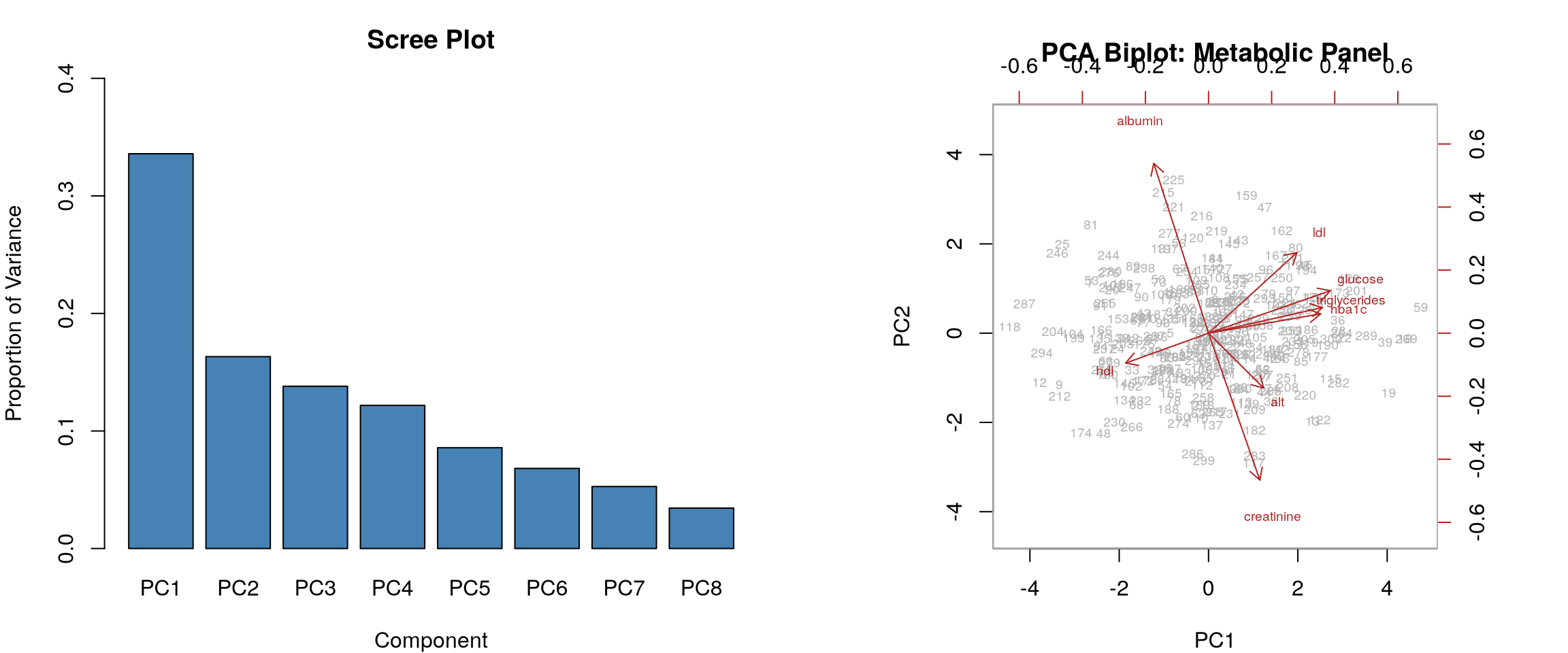
This is the payoff. Instead of eight correlated lab values, you can describe a patient with two numbers whose meanings you can each state in a sentence. “Variance explained” tells you how much of the story those numbers carry: here PC1 accounts for 33% of the total variation and PC2 a further 16%, so two axes between them capture about half of everything that distinguishes these patients.
NoteTwo cautions when reading loadings
The signs are arbitrary. PCA is free to flip a whole component, so an axis running “high sugars → positive” in one software run may run “high sugars → negative” in another. Only the relative signs within a component mean anything: that glucose and HDL have opposite signs is the finding, not that glucose happens to be positive.
A component need not be interpretable. PC1 often has a clean clinical reading, but later components frequently mix variables in ways that correspond to nothing recognisable. That is not a failure — they are still capturing real variation. Resist the urge to invent a story for every component.
20.2.2 Key Properties
- PCA is a linear method: each component is a weighted sum of the original variables.
- It is deterministic: running PCA twice on the same data gives the same result (up to sign flips).
- It preserves global structure (distances and variance) well, but may miss non-linear patterns (as it is a linear method).
20.2.3 Choosing the Number of Components
Choosing the number of components depends on the context and the goal of the analysis. Common strategies include:
Scree plot. Plot the eigenvalues (or proportion of variance explained) against the component number. Look for an “elbow,” a point where the curve flattens, suggesting that additional components contribute little.
Cumulative variance threshold. Keep enough components to explain a target percentage of total variance (commonly 90–95–99%).
20.2.4 Clinical Example: Metabolic Panel PCA
A common application: reducing a panel of correlated lab values to a few interpretable dimensions. Consider a dataset with glucose, HbA1c, triglycerides, LDL, HDL, creatinine, ALT, and albumin.
Code
library(MASS) # for mvrnorm()
library(tibble) # for tibble()

set.seed(42)
n <- 300

# Simulate correlated metabolic data
# Create correlation structure: glucose/HbA1c/triglycerides cluster;
# creatinine/albumin cluster
# fmt: skip
Sigma <- matrix(c(
  1.0, 0.7, 0.5, 0.3, -0.2, 0.1, 0.2, -0.1,
  0.7, 1.0, 0.4, 0.2, -0.2, 0.1, 0.1, -0.1,
  0.5, 0.4, 1.0, 0.4, -0.3, 0.1, 0.3, -0.1,
  0.3, 0.2, 0.4, 1.0, -0.5, 0.1, 0.2, 0.0,
  -0.2, -0.2, -0.3, -0.5, 1.0, -0.1, -0.1, 0.2,
  0.1, 0.1, 0.1, 0.1, -0.1, 1.0, 0.1, -0.3,
  0.2, 0.1, 0.3, 0.2, -0.1, 0.1, 1.0, -0.2,
  -0.1, -0.1, -0.1, 0.0, 0.2, -0.3, -0.2, 1.0
), nrow = 8)

z <- mvrnorm(n, mu = rep(0, 8), Sigma = Sigma)
metabolic <- tibble(
  glucose = round(z[, 1] * 30 + 100),
  hba1c = round(z[, 2] * 1.0 + 5.8, 1),
  triglycerides = round(z[, 3] * 50 + 150),
  ldl = round(z[, 4] * 30 + 120),
  hdl = round(z[, 5] * 12 + 55),
  creatinine = round(z[, 6] * 0.3 + 1.0, 2),
  alt = round(z[, 7] * 15 + 30),
  albumin = round(z[, 8] * 0.4 + 4.0, 1)
)

# PCA on scaled data
pca_result <- prcomp(metabolic, scale. = TRUE)

# Scree plot and biplot side by side
par(mfrow = c(1, 2), mar = c(4, 4, 3, 1))

# Scree plot
var_explained <- pca_result$sdev^2 / sum(pca_result$sdev^2)
barplot(
  var_explained,
  names.arg = paste0("PC", 1:8),
  col = "steelblue",
  main = "Scree Plot",
  ylab = "Proportion of Variance",
  xlab = "Component",
  ylim = c(0, 0.4)
)
# Biplot
biplot(
  pca_result,
  scale = 0,
  cex = 0.6,
  col = c("grey70", "firebrick"),
  main = "PCA Biplot: Metabolic Panel"
)
Code
import numpy as np
import pandas as pd
import matplotlib.pyplot as plt
from sklearn.preprocessing import StandardScaler
from sklearn.decomposition import PCA

np.random.seed(42)
n = 300

Sigma = np.array(
    [
        [1.0, 0.7, 0.5, 0.3, -0.2, 0.1, 0.2, -0.1],
        [0.7, 1.0, 0.4, 0.2, -0.2, 0.1, 0.1, -0.1],
        [0.5, 0.4, 1.0, 0.4, -0.3, 0.1, 0.3, -0.1],
        [0.3, 0.2, 0.4, 1.0, -0.5, 0.1, 0.2, 0.0],
        [-0.2, -0.2, -0.3, -0.5, 1.0, -0.1, -0.1, 0.2],
        [0.1, 0.1, 0.1, 0.1, -0.1, 1.0, 0.1, -0.3],
        [0.2, 0.1, 0.3, 0.2, -0.1, 0.1, 1.0, -0.2],
        [-0.1, -0.1, -0.1, 0.0, 0.2, -0.3, -0.2, 1.0],
    ]
)

z = np.random.multivariate_normal(np.zeros(8), Sigma, n)
labels = [
    "glucose",
    "hba1c",
    "triglycerides",
    "ldl",
    "hdl",
    "creatinine",
    "alt",
    "albumin",
]
metabolic = pd.DataFrame(z, columns=labels)

# Scale and fit PCA
scaler = StandardScaler()
X_scaled = scaler.fit_transform(metabolic)
pca = PCA()
scores = pca.fit_transform(X_scaled)

fig, axes = plt.subplots(1, 2, figsize=(14, 5))

# Scree plot
axes[0].bar(
    range(1, 9), pca.explained_variance_ratio_, color="steelblue", edgecolor="white"
)
axes[0].set_xlabel("Component")
axes[0].set_ylabel("Proportion of Variance")
axes[0].set_title("Scree Plot")
axes[0].set_xticks(range(1, 9))

# Biplot
loadings = pca.components_[:2].T  # first 2 PCs
scale_factor = 3
axes[1].scatter(scores[:, 0], scores[:, 1], alpha=0.3, s=10, color="grey")
for i, lab in enumerate(labels):
    axes[1].annotate(
        "",
        xy=(loadings[i, 0] * scale_factor, loadings[i, 1] * scale_factor),
        xytext=(0, 0),
        arrowprops=dict(arrowstyle="->", color="firebrick", lw=1.5),
    )
    axes[1].text(
        loadings[i, 0] * scale_factor * 1.15,
        loadings[i, 1] * scale_factor * 1.15,
        lab,
        fontsize=9,
        color="firebrick",
        ha="center",
    )
axes[1].set_xlabel(f"PC1 ({pca.explained_variance_ratio_[0]:.1%} var)")
axes[1].set_ylabel(f"PC2 ({pca.explained_variance_ratio_[1]:.1%} var)")
axes[1].set_title("PCA Biplot: Metabolic Panel")
axes[1].axhline(0, color="grey", linewidth=0.5)
axes[1].axvline(0, color="grey", linewidth=0.5)

plt.tight_layout()
plt.show()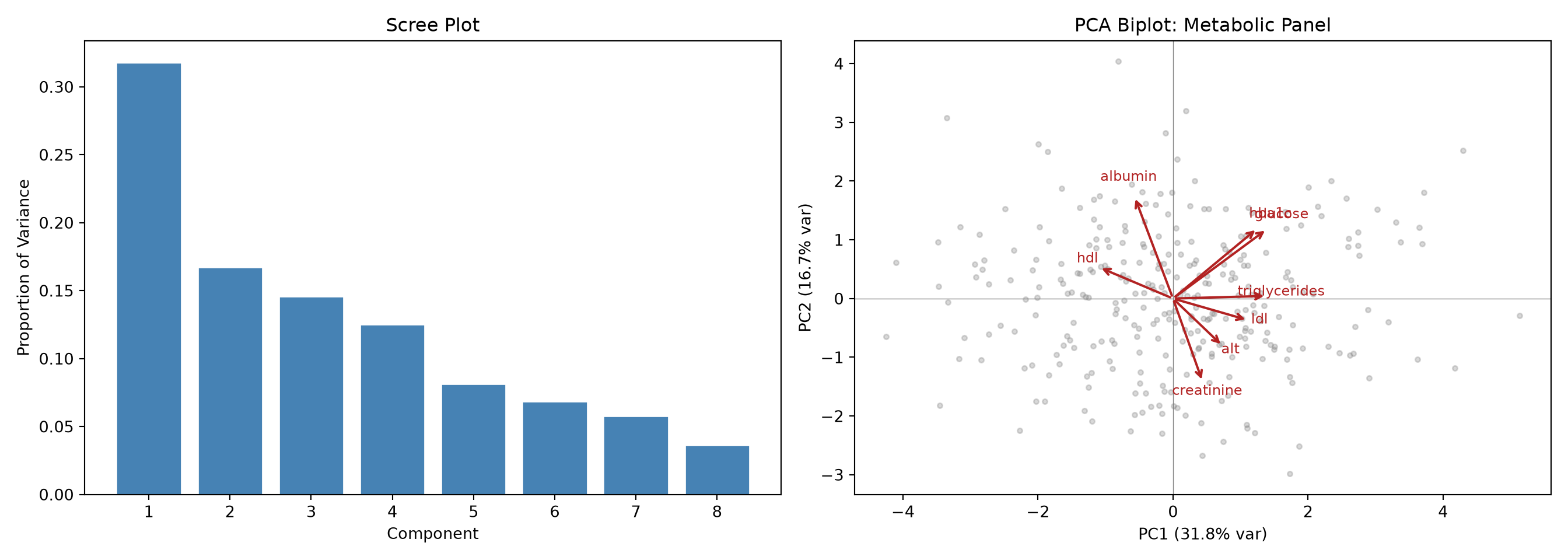
What the code is doing. We simulate 300 patients with eight correlated lab values, standardise them (so glucose in the hundreds does not drown out HbA1c around 6), and run PCA. The code then draws two figures. The scree plot (left) is a bar chart of how much variance each of the eight components captures, tallest on the left; You would look for the bars to drop off sharply after the first two or three, telling you most of the signal lives in just a few dimensions. The biplot (right) places every patient on the PC1–PC2 plane and overlays arrows for the original labs; how to read those arrows is explained next.
20.2.5 Interpreting the Biplot
The biplot overlays two things:
- Points (grey): individual patients projected onto the first two principal components.
- Arrows (red): the original variables. The direction and length of each arrow show how strongly and in which direction that variable contributes to each PC.
In our metabolic panel:
- PC1 is dominated by glucose, HbA1c, and triglycerides pointing in one direction, with HDL pointing in the opposite direction. This is a “metabolic syndrome” axis: patients to the right tend to have higher glucose and triglycerides and lower HDL.
- PC2 separates creatinine and albumin, capturing a “renal/hepatic” dimension.
This kind of interpretation is exactly what makes PCA useful in clinical research: it reveals which variables “travel together” and suggests underlying biological dimensions.
20.3 t-SNE: Non-Linear Dimensionality Reduction
20.3.1 The Core Idea
PCA preserves global, linear structure. But many datasets contain non-linear patterns that PCA cannot capture well. t-SNE (\(t\)-distributed stochastic neighbour embedding) was designed specifically for visualisation of high-dimensional data in 2 or 3 dimensions.
Here is the whole method in one sentence, before any jargon: t-SNE works out who each patient’s nearest neighbours are in the full high-dimensional data, then draws a 2-D map arranged so that those same patients end up sitting next to each other. Think of it as seating a wedding reception — the goal is that everyone is at a table with the people they are actually close to, and t-SNE does not much care where the tables themselves sit in the room.
More precisely, it works in two steps.
Step 1: in the high-dimensional data, turn distances into “neighbourliness” scores. For every pair of patients, t-SNE asks: how likely is it that I would call these two neighbours? Patients who are close together in the full dataset get a high score; patients far apart get a score near zero.
The tool it uses to convert a distance into a score is called a Gaussian kernel, and it is much simpler than it sounds. A “kernel” here is just a function that takes a distance and returns a similarity: put a distance in, get a number out that is large when the distance is small. “Gaussian” means the function has the shape of the familiar bell curve — centre it on one patient, and the score for every other patient is given by the height of the bell at their distance away. So the closest patients sit under the peak and score highly, and the score tails off smoothly as you move outwards. That is all a Gaussian kernel is: a bell-shaped rule for turning “how far apart” into “how similar,” with the bell’s width setting how far your neighbourhood extends (that width is controlled by the perplexity parameter described below).
Step 2: arrange points on a 2-D map so the same neighbourliness scores come out. Now t-SNE places every patient as a dot on a flat map and nudges the dots around, over and over, until the neighbourliness scores computed on the map match the ones computed from the real data as closely as possible. Patients who were neighbours in 200 dimensions end up as neighbours on the page.
For this second step it deliberately uses a different kernel — a t-distribution rather than a Gaussian — and the reason is worth understanding, because it is the “t” in t-SNE. A t-distribution is also bell-shaped, but it has heavier tails: it does not fall away to nearly zero as sharply as a Gaussian does, so points a long way from the centre still receive a non-negligible score.
Why does that matter? Because of the crowding problem. In high dimensions there is a great deal of room, so a patient can have many neighbours all roughly equidistant from them. Squash that onto a flat page and there is simply not enough space to keep everyone at a comfortable distance — moderately-distant points get forced inwards, and the whole map collapses into one indistinct blob in the middle. The heavier tails of the t-distribution fix this: because a moderate distance on the map still earns a decent score, t-SNE is content to place merely-similar patients quite far apart, which frees up space in the middle and lets genuinely distinct groups separate into visible clusters.
NoteThe two kernels, side by side
Both kernels do the same job — turn a distance into a similarity score — and they are used at different stages for different reasons.
| Where it is used | Shape | Why that shape | |
|---|---|---|---|
| Gaussian kernel | On the original high-dimensional data (Step 1) | Bell curve, tails fall away fast | Gives a tight, well-defined notion of “local neighbourhood” |
| t-distribution kernel | On the 2-D map being built (Step 2) | Bell curve with heavier tails | Lets moderately-similar points sit far apart on the page, so the map does not collapse into a single blob (the crowding problem) |
The payoff for a health researcher is a map where patients who are genuinely alike clump together, making subtypes pop out visually. This is why t-SNE became popular for single-cell and other omics data, where distinct cell populations or patient phenotypes hide in hundreds of dimensions.
20.3.2 The Perplexity Parameter
The most important parameter in t-SNE is perplexity (typically 5–50), which controls how many neighbours each point considers. It roughly corresponds to the effective number of local neighbours.
- Low perplexity (5–10): focuses on very local structure. May produce many small, tight clusters.
- High perplexity (30–50): considers broader neighbourhoods. Produces smoother, more global layouts.
There is no single correct value; try several and see how the structure changes.
20.3.3 Critical Pitfalls and Misinterpretations
Warningt-SNE is for exploration, not inference
t-SNE is a visualisation tool. It is not a statistical test. Do not draw conclusions about statistical significance from a t-SNE plot.
Distances between clusters are meaningless. Two clusters that appear far apart may not actually be more different than two clusters that appear close. t-SNE distorts global distances to preserve local neighbourhoods.
Cluster sizes are meaningless. A tight cluster in t-SNE space does not mean those points are more similar than a spread-out cluster.
Different runs give different layouts. t-SNE uses stochastic optimisation. Running it twice with different seeds gives different-looking plots (though the same clusters should emerge).
It does not scale well. Standard t-SNE compares every patient with every other patient, so the amount of computation grows quadratically with the sample size. In practice it makes plain t-SNE notably slow beyond ~10,000 patients.
20.3.4 Clinical Example: Visualising Patient Phenotypes
Code
library(Rtsne)

set.seed(42)

# Simulate 3 patient subtypes with 20 features
n_per_group <- 100
p <- 20

group1 <- matrix(rnorm(n_per_group * p, mean = 0, sd = 1), ncol = p)
group2 <- matrix(rnorm(n_per_group * p, mean = 2, sd = 1.2), ncol = p)
group3 <- matrix(rnorm(n_per_group * p, mean = -1, sd = 0.8), ncol = p)
# Make groups differ in specific feature subsets
group2[, 1:5] <- group2[, 1:5] + 3
group3[, 10:15] <- group3[, 10:15] - 4

X <- rbind(group1, group2, group3)
labels <- factor(rep(c("Type A", "Type B", "Type C"), each = n_per_group))

# Run t-SNE with two perplexity values
tsne_low <- Rtsne(
  X,
  perplexity = 10,
  dims = 2,
  verbose = FALSE,
  max_iter = 1000
)
tsne_high <- Rtsne(
  X,
  perplexity = 40,
  dims = 2,
  verbose = FALSE,
  max_iter = 1000
)

par(mfrow = c(1, 2), mar = c(4, 4, 3, 1))
cols <- c("steelblue", "firebrick", "forestgreen")

plot(
  tsne_low$Y,
  col = cols[labels],
  pch = 16,
  cex = 0.8,
  main = "t-SNE (perplexity = 10)",
  xlab = "t-SNE 1",
  ylab = "t-SNE 2"
)
legend("topright", levels(labels), col = cols, pch = 16, cex = 0.8)

plot(
  tsne_high$Y,
  col = cols[labels],
  pch = 16,
  cex = 0.8,
  main = "t-SNE (perplexity = 40)",
  xlab = "t-SNE 1",
  ylab = "t-SNE 2"
)
legend("topright", levels(labels), col = cols, pch = 16, cex = 0.8)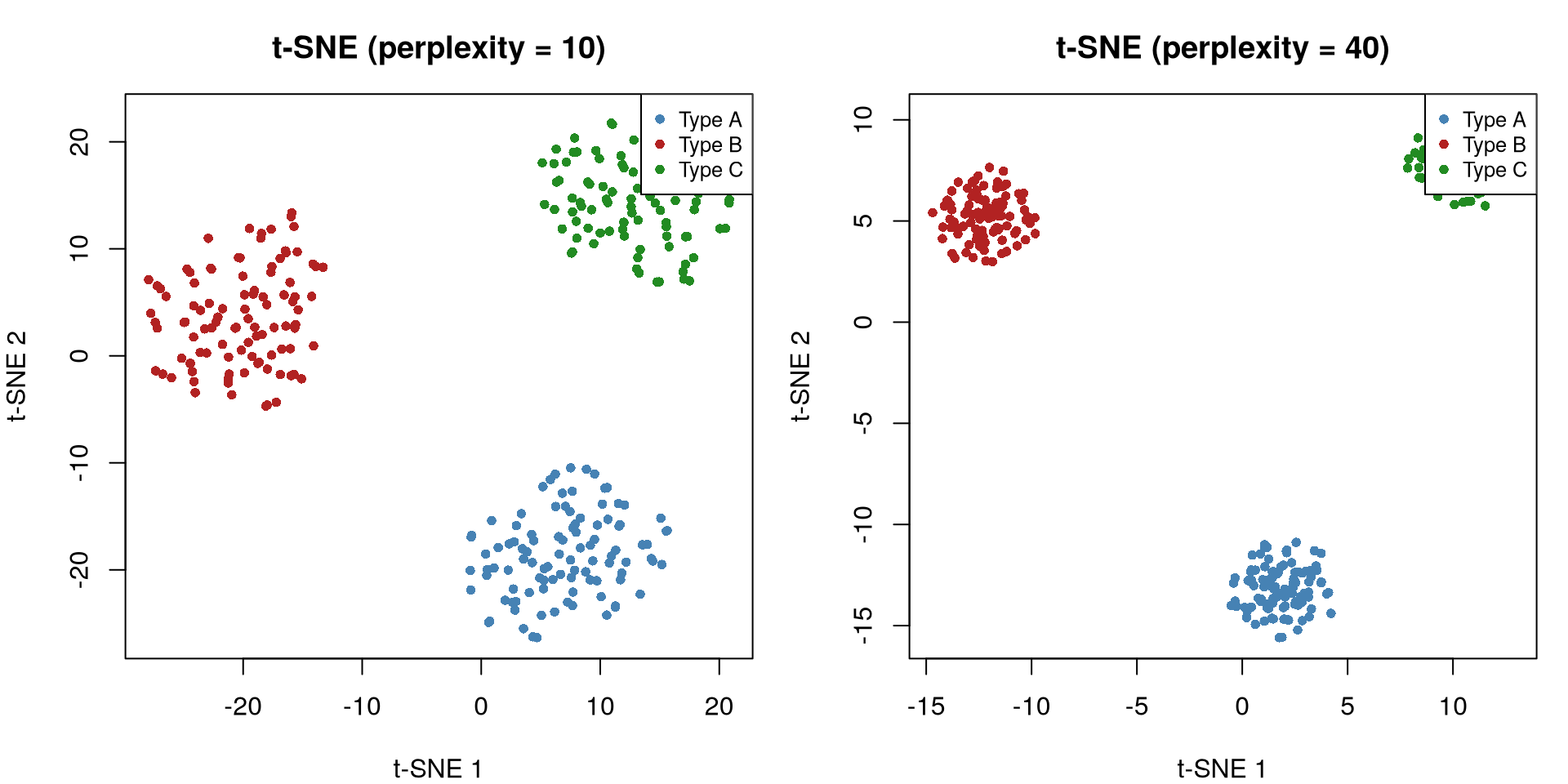
Code
import numpy as np
import matplotlib.pyplot as plt
from sklearn.manifold import TSNE

np.random.seed(42)
n_per = 100
p = 20

g1 = np.random.normal(0, 1, (n_per, p))
g2 = np.random.normal(2, 1.2, (n_per, p))
g3 = np.random.normal(-1, 0.8, (n_per, p))
g2[:, :5] += 3
g3[:, 10:15] -= 4

X = np.vstack([g1, g2, g3])
labels = np.repeat(["Type A", "Type B", "Type C"], n_per)
colors = {"Type A": "steelblue", "Type B": "firebrick", "Type C": "forestgreen"}

fig, axes = plt.subplots(1, 2, figsize=(12, 5))
for ax, perp in zip(axes, [10, 40]):
    tsne = TSNE(n_components=2, perplexity=perp, random_state=42, max_iter=1000)
    emb = tsne.fit_transform(X)
    for lab in ["Type A", "Type B", "Type C"]:
        mask = labels == lab
        ax.scatter(emb[mask, 0], emb[mask, 1], c=colors[lab],
                   s=15, alpha=0.7, label=lab)
    ax.set_title(f"t-SNE (perplexity = {perp})")
    ax.set_xlabel("t-SNE 1")
    ax.set_ylabel("t-SNE 2")
    ax.legend(fontsize=9)

plt.tight_layout()
plt.show()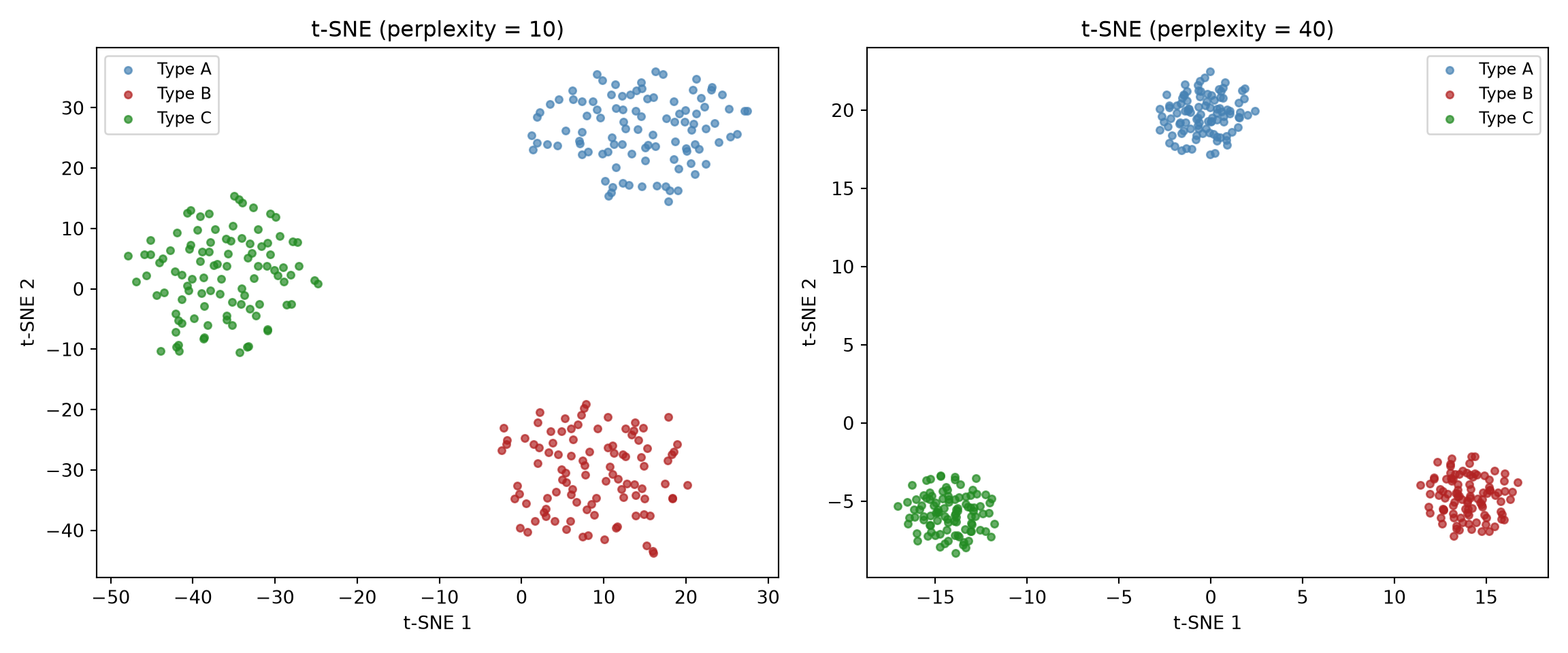
What the code is showing. We build a toy dataset of 300 patients across three “disease subtypes” (each subtype differs on a different handful of the 20 features), then run t-SNE twice: once with perplexity 10, once with 40. We then plot the two resulting maps side by side, colouring each dot by its true subtype. Each dot is a patient; the axes (“t-SNE 1/2”) have no units and no inherent meaning, so do not try to read values off them. What you look for is separation: three coloured blobs that do not overlap means the subtypes really do have distinct profiles.
Notice how perplexity changes the visual appearance but the three groups are consistently separated. This is reassuring: the cluster structure is real, not an artefact of a particular perplexity setting. (The perplexity setting, recall, is roughly the number of near neighbours each point pays attention to: a small value zooms in on tight local clumps, a large value smooths things into broader groupings.)
20.4 UMAP: Uniform Manifold Approximation and Projection
20.4.1 How UMAP Differs from t-SNE
UMAP (McInnes et al. 2018) is a newer method that can be used as an alternative to t-SNE in many applications. A key advantage is its speed, as it runs 3–10x faster than t-SNE, and its better stability across runs. UMAP works by constructing a topological representation (a weighted graph) of the data in high dimensions, then optimising a low-dimensional layout that preserves the graph structure. While it has been claimed that UMAP preserves more global structure than t-SNE, this has been disputed in recent literature (Chari and Pachter 2023).
20.4.2 Key Parameters
n_neighbors (analogous to perplexity in t-SNE): controls the balance between local and global structure. Small values (5–15) emphasise local clusters; large values (50–200) emphasise global connectivity.
min_dist: controls how tightly points are packed in the embedding. Small values (0.0–0.1) produce tight, well-separated clusters; large values (0.5–1.0) produce a more uniform spread.
20.4.3 When to Use Which Method
- PCA: use for initial exploration, as a preprocessing step (reduce to 20–50 PCs before t-SNE/UMAP), or when you need interpretable components. Use when linear relationships are sufficient.
- t-SNE and UMAP: use for detailed visualisation of moderate-sized datasets (< 10,000 points) when you want to emphasise local cluster structure. Avoid for quantitative downstream analysis.
Code
library(Rtsne)
library(uwot)

set.seed(42)

pca_scores <- prcomp(X, scale. = TRUE)$x[, 1:2]
tsne_emb <- Rtsne(X, perplexity = 30, dims = 2, verbose = FALSE)$Y
umap_emb <- umap(X, n_neighbors = 15, min_dist = 0.1, verbose = FALSE)

par(mfrow = c(1, 3), mar = c(4, 4, 3, 1))
cols <- c("steelblue", "firebrick", "forestgreen")[as.numeric(labels)]

plot(
  pca_scores,
  col = cols,
  pch = 16,
  cex = 0.8,
  main = "PCA",
  xlab = "PC1",
  ylab = "PC2"
)

plot(
  tsne_emb,
  col = cols,
  pch = 16,
  cex = 0.8,
  main = "t-SNE (perplexity = 30)",
  xlab = "t-SNE 1",
  ylab = "t-SNE 2"
)

plot(
  umap_emb,
  col = cols,
  pch = 16,
  cex = 0.8,
  main = "UMAP (n_neighbors = 15)",
  xlab = "UMAP 1",
  ylab = "UMAP 2"
)
Code
import numpy as np
import matplotlib.pyplot as plt
from sklearn.decomposition import PCA
from sklearn.manifold import TSNE
from umap import UMAP

pca_2d = PCA(n_components=2).fit_transform(X)
tsne_2d = TSNE(n_components=2, perplexity=30, random_state=42).fit_transform(X)
umap_2d = UMAP(n_components=2, n_neighbors=15, min_dist=0.1,
                random_state=42).fit_transform(X)

fig, axes = plt.subplots(1, 3, figsize=(16, 5))
titles = ["PCA", "t-SNE (perplexity=30)", "UMAP (n_neighbors=15)"]
embeddings = [pca_2d, tsne_2d, umap_2d]

for ax, emb, title in zip(axes, embeddings, titles):
    for lab, col in colors.items():
        mask = labels == lab
        ax.scatter(emb[mask, 0], emb[mask, 1], c=col, s=15, alpha=0.7, label=lab)
    ax.set_title(title)
    ax.set_xlabel("Dim 1")
    ax.set_ylabel("Dim 2")
    ax.legend(fontsize=8)

plt.tight_layout()
plt.show()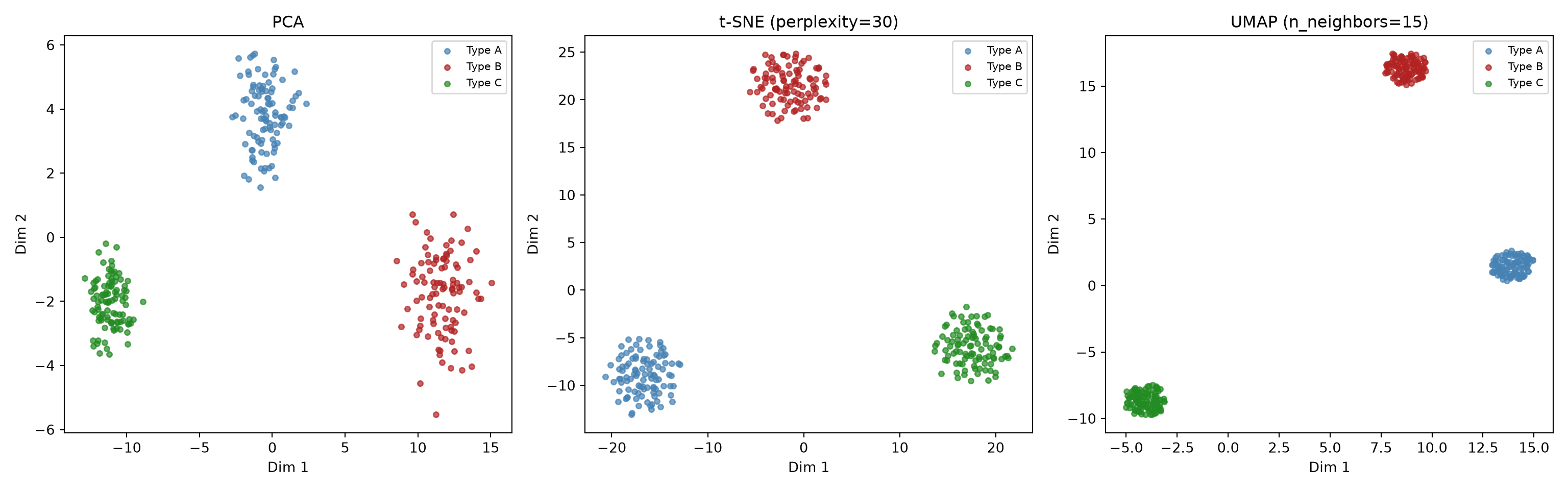
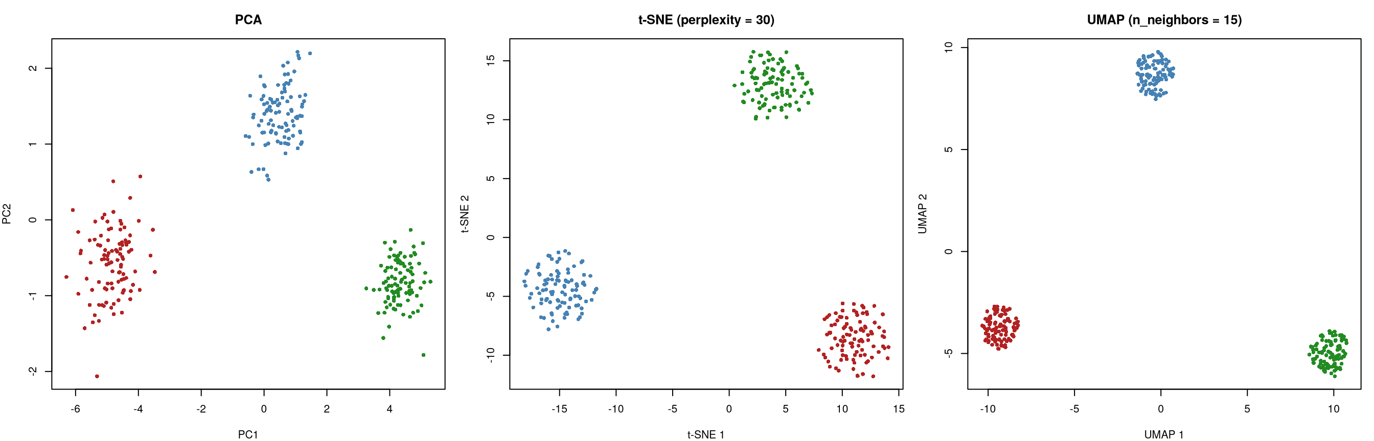
What the code is showing. We take the same three-subtype dataset and run all three methods on it (PCA, t-SNE, and UMAP), then plot their 2D outputs in one row so you can compare them like for like, with patients coloured by true subtype. The point of the figure is not any single panel but the contrast between them: it lets you see, on real-looking data, how a linear method (PCA) and two non-linear methods behave on the same problem.
All three methods recover the three groups, but with different visual characteristics. PCA shows the groups with some overlap (because the separation is partly non-linear). t-SNE and UMAP separate them more clearly, though the visual differences between the two non-linear methods are often modest.
20.5 Exercises
TipExercise 1: PCA on Clinical Lab Data
Using the simulated metabolic panel data from this chapter (or a real dataset if available):
- Perform PCA on the standardised data.
- Create a scree plot and determine how many components to retain using the cumulative variance threshold (80%).
- Examine the loadings of the first two PCs. Which variables load most strongly on each? Propose a clinical interpretation.
- Create a biplot coloured by a simulated diabetes status variable. Do diabetic patients separate along PC1?
NoteSolution
Code
# Chapter 15, Exercise 1: PCA on Clinical Lab Data
# Using the simulated metabolic panel data from the chapter

library(tidyverse)
library(MASS)

# ---- Simulate metabolic data (same as chapter) ----
set.seed(42)
n <- 300

Sigma <- matrix(c(
  1.0, 0.7, 0.5, 0.3,-0.2, 0.1, 0.2,-0.1,
  0.7, 1.0, 0.4, 0.2,-0.2, 0.1, 0.1,-0.1,
  0.5, 0.4, 1.0, 0.4,-0.3, 0.1, 0.3,-0.1,
  0.3, 0.2, 0.4, 1.0,-0.5, 0.1, 0.2, 0.0,
 -0.2,-0.2,-0.3,-0.5, 1.0,-0.1,-0.1, 0.2,
  0.1, 0.1, 0.1, 0.1,-0.1, 1.0, 0.1,-0.3,
  0.2, 0.1, 0.3, 0.2,-0.1, 0.1, 1.0,-0.2,
 -0.1,-0.1,-0.1, 0.0, 0.2,-0.3,-0.2, 1.0
), nrow = 8)

z <- mvrnorm(n, mu = rep(0, 8), Sigma = Sigma)
metabolic <- tibble(
  glucose       = round(z[,1] * 30 + 100),
  hba1c         = round(z[,2] * 1.0 + 5.8, 1),
  triglycerides = round(z[,3] * 50 + 150),
  ldl           = round(z[,4] * 30 + 120),
  hdl           = round(z[,5] * 12 + 55),
  creatinine    = round(z[,6] * 0.3 + 1.0, 2),
  alt           = round(z[,7] * 15 + 30),
  albumin       = round(z[,8] * 0.4 + 4.0, 1)
)

# ---- (a) Perform PCA on standardised data ----
cat("=== Part (a): PCA on Standardised Data ===\n")
pca_fit <- prcomp(metabolic, scale. = TRUE)
cat("PCA completed. Summary:\n")
print(summary(pca_fit))

# ---- (b) Scree plot and number of components ----
cat("\n=== Part (b): Scree Plot and Component Selection ===\n")

var_prop <- pca_fit$sdev^2 / sum(pca_fit$sdev^2)
cum_var  <- cumsum(var_prop)

par(mfrow = c(1, 2), mar = c(4, 4, 3, 1))

# Scree plot
barplot(var_prop, names.arg = paste0("PC", 1:8), col = "steelblue",
        main = "Scree Plot", ylab = "Proportion of Variance",
        xlab = "Component", ylim = c(0, 0.4))
# Cumulative variance
plot(1:8, cum_var, type = "b", pch = 16, col = "steelblue",
     main = "Cumulative Variance", xlab = "Number of Components",
     ylab = "Cumulative Proportion", ylim = c(0, 1))
abline(h = 0.80, col = "firebrick", lty = 2)
text(6, 0.82, "80% threshold", col = "firebrick", cex = 0.8)

n_80 <- which(cum_var >= 0.80)[1]

cat("80% cumulative variance threshold:", n_80, "components\n")
cat("Cumulative variance:", round(cum_var, 3), "\n")

# ---- (c) Loadings of first two PCs ----
cat("\n=== Part (c): Loadings and Interpretation ===\n")

cat("\nPC1 loadings (sorted by absolute value):\n")
pc1_loadings <- pca_fit$rotation[, 1]
print(round(sort(abs(pc1_loadings), decreasing = TRUE), 3))
cat("Signed loadings:\n")
print(round(pc1_loadings[order(abs(pc1_loadings), decreasing = TRUE)], 3))

cat("\nPC2 loadings (sorted by absolute value):\n")
pc2_loadings <- pca_fit$rotation[, 2]
print(round(sort(abs(pc2_loadings), decreasing = TRUE), 3))
cat("Signed loadings:\n")
print(round(pc2_loadings[order(abs(pc2_loadings), decreasing = TRUE)], 3))

cat("\nClinical interpretation:\n")
cat("PC1: Dominated by glucose, HbA1c, triglycerides (positive) and\n")
cat("     HDL (negative). This is a 'metabolic syndrome' axis.\n")
cat("     Patients scoring high on PC1 tend to have elevated glucose,\n")
cat("     HbA1c, triglycerides and lower HDL.\n\n")
cat("PC2: Dominated by creatinine and albumin (with opposite signs).\n")
cat("     This captures a 'renal/hepatic function' dimension.\n")
cat("     Patients with high creatinine and low albumin (suggesting\n")
cat("     renal impairment or liver dysfunction) score high on PC2.\n")

# ---- (d) Biplot coloured by diabetes status ----
cat("\n=== Part (d): Biplot with Diabetes Status ===\n")

set.seed(99)
metabolic$diabetes <- factor(
  ifelse(metabolic$glucose > 110 & metabolic$hba1c > 6.2,
         "Diabetic", "Non-diabetic")
)

cat("Diabetes prevalence:", mean(metabolic$diabetes == "Diabetic"), "\n")

# Extract PC scores
pc_scores <- as.data.frame(pca_fit$x[, 1:2])
pc_scores$diabetes <- metabolic$diabetes

par(mfrow = c(1, 1))

# Biplot with diabetes colouring
cols <- ifelse(metabolic$diabetes == "Diabetic", "firebrick", "steelblue")
plot(pc_scores$PC1, pc_scores$PC2, col = cols, pch = 16, cex = 0.7,
     xlab = paste0("PC1 (", round(var_prop[1] * 100, 1), "% var)"),
     ylab = paste0("PC2 (", round(var_prop[2] * 100, 1), "% var)"),
     main = "PCA Biplot Coloured by Diabetes Status")

# Add loading arrows
loadings <- pca_fit$rotation[, 1:2]
scale_factor <- 3
for (i in 1:nrow(loadings)) {
  arrows(0, 0, loadings[i, 1] * scale_factor, loadings[i, 2] * scale_factor,
         col = "grey30", length = 0.1, lwd = 1.5)
  text(loadings[i, 1] * scale_factor * 1.15,
       loadings[i, 2] * scale_factor * 1.15,
       rownames(loadings)[i], cex = 0.7, col = "grey20")
}

legend("topright", c("Diabetic", "Non-diabetic"),
       col = c("firebrick", "steelblue"), pch = 16, cex = 0.8)

cat("\nDiabetic patients tend to cluster toward higher PC1 values,\n")
cat("which aligns with the 'metabolic syndrome' interpretation.\n")
cat("This confirms that PC1 captures the metabolic dimension\n")
cat("along which diabetic patients differ from non-diabetic patients.\n")
Code
# Chapter 15, Exercise 1: PCA on Clinical Lab Data
# Using the simulated metabolic panel data from the chapter

import numpy as np
import pandas as pd
import matplotlib.pyplot as plt
from sklearn.preprocessing import StandardScaler
from sklearn.decomposition import PCA

# ---- Simulate metabolic data (same as chapter) ----
np.random.seed(42)
n = 300

Sigma = np.array([
    [1.0, 0.7, 0.5, 0.3,-0.2, 0.1, 0.2,-0.1],
    [0.7, 1.0, 0.4, 0.2,-0.2, 0.1, 0.1,-0.1],
    [0.5, 0.4, 1.0, 0.4,-0.3, 0.1, 0.3,-0.1],
    [0.3, 0.2, 0.4, 1.0,-0.5, 0.1, 0.2, 0.0],
    [-0.2,-0.2,-0.3,-0.5, 1.0,-0.1,-0.1, 0.2],
    [0.1, 0.1, 0.1, 0.1,-0.1, 1.0, 0.1,-0.3],
    [0.2, 0.1, 0.3, 0.2,-0.1, 0.1, 1.0,-0.2],
    [-0.1,-0.1,-0.1, 0.0, 0.2,-0.3,-0.2, 1.0]
])

z = np.random.multivariate_normal(np.zeros(8), Sigma, n)
labels = ["glucose", "hba1c", "triglycerides", "ldl",
          "hdl", "creatinine", "alt", "albumin"]

metabolic = pd.DataFrame({
    "glucose": np.round(z[:, 0] * 30 + 100),
    "hba1c": np.round(z[:, 1] * 1.0 + 5.8, 1),
    "triglycerides": np.round(z[:, 2] * 50 + 150),
    "ldl": np.round(z[:, 3] * 30 + 120),
    "hdl": np.round(z[:, 4] * 12 + 55),
    "creatinine": np.round(z[:, 5] * 0.3 + 1.0, 2),
    "alt": np.round(z[:, 6] * 15 + 30),
    "albumin": np.round(z[:, 7] * 0.4 + 4.0, 1)
})

# ---- (a) PCA on standardised data ----
print("=== Part (a): PCA on Standardised Data ===")
X = metabolic.values
scaler = StandardScaler()
X_scaled = scaler.fit_transform(X)
pca = PCA()
scores = pca.fit_transform(X_scaled)

print("Explained variance ratio:", np.round(pca.explained_variance_ratio_, 3))

# ---- (b) Scree plot and component selection ----
print("\n=== Part (b): Scree Plot and Component Selection ===")

var_prop = pca.explained_variance_ratio_
cum_var = np.cumsum(var_prop)

fig, axes = plt.subplots(1, 2, figsize=(12, 5))

# Scree plot
axes[0].bar(range(1, 9), var_prop, color="steelblue", edgecolor="white")
axes[0].set_xlabel("Component")
axes[0].set_ylabel("Proportion of Variance")
axes[0].set_title("Scree Plot")
axes[0].set_xticks(range(1, 9))

# Cumulative variance
axes[1].plot(range(1, 9), cum_var, "o-", color="steelblue", lw=2)
axes[1].axhline(y=0.80, color="firebrick", linestyle="--", label="80% threshold")
axes[1].set_xlabel("Number of Components")
axes[1].set_ylabel("Cumulative Proportion")
axes[1].set_title("Cumulative Variance")
axes[1].set_xticks(range(1, 9))
axes[1].legend()

plt.tight_layout()
plt.savefig("ch15_ex1_scree.png", dpi=150)
plt.show()

n_80 = np.argmax(cum_var >= 0.80) + 1

print(f"80% cumulative variance threshold: {n_80} components")
print(f"Cumulative variance: {np.round(cum_var, 3)}")

# ---- (c) Loadings of first two PCs ----
print("\n=== Part (c): Loadings and Interpretation ===")

for pc_idx in [0, 1]:
    loadings = pca.components_[pc_idx]
    order = np.argsort(np.abs(loadings))[::-1]
    print(f"\nPC{pc_idx+1} loadings (sorted by |loading|):")
    for idx in order:
        print(f"  {labels[idx]:>15s}: {loadings[idx]:+.3f}")

print("\nClinical interpretation:")
print("PC1: Dominated by glucose, HbA1c, triglycerides (positive) and")
print("     HDL (negative). This is a 'metabolic syndrome' axis.")
print("PC2: Dominated by creatinine and albumin (opposite signs).")
print("     This captures a 'renal/hepatic function' dimension.")

# ---- (d) Biplot coloured by diabetes status ----
print("\n=== Part (d): Biplot with Diabetes Status ===")

diabetes = np.where(
    (metabolic["glucose"] > 110) & (metabolic["hba1c"] > 6.2),
    "Diabetic", "Non-diabetic"
)
print(f"Diabetes prevalence: {(diabetes == 'Diabetic').mean():.3f}")

fig, ax = plt.subplots(figsize=(9, 7))

# Plot scores
for label, color in [("Non-diabetic", "steelblue"), ("Diabetic", "firebrick")]:
    mask = diabetes == label
    ax.scatter(scores[mask, 0], scores[mask, 1], c=color, s=20,
               alpha=0.6, label=label)

# Add loading arrows
loadings_2d = pca.components_[:2].T
scale_factor = 3
for i, lab in enumerate(labels):
    ax.annotate("", xy=(loadings_2d[i, 0]*scale_factor,
                          loadings_2d[i, 1]*scale_factor),
                 xytext=(0, 0),
                 arrowprops=dict(arrowstyle="->", color="0.3", lw=1.5))
    ax.text(loadings_2d[i, 0]*scale_factor*1.15,
             loadings_2d[i, 1]*scale_factor*1.15,
             lab, fontsize=8, color="0.2", ha="center")

ax.set_xlabel(f"PC1 ({var_prop[0]:.1%} var)")
ax.set_ylabel(f"PC2 ({var_prop[1]:.1%} var)")
ax.set_title("PCA Biplot Coloured by Diabetes Status")
ax.axhline(0, color="grey", linewidth=0.5)
ax.axvline(0, color="grey", linewidth=0.5)
ax.legend()
plt.tight_layout()
plt.savefig("ch15_ex1_biplot.png", dpi=150)
plt.show()

print("\nDiabetic patients tend to cluster toward higher PC1 values,")
print("aligning with the 'metabolic syndrome' interpretation.")
print("PC1 captures the metabolic dimension along which diabetic")
print("patients differ from non-diabetic patients.")
TipExercise 2: t-SNE Sensitivity to Perplexity
Using the three-group simulated dataset:
- Run t-SNE with perplexity values of 5, 15, 30, and 50.
- Create a 2x2 panel of the resulting embeddings.
- At which perplexity value do the three groups first become clearly separated?
- Are the distances between clusters consistent across perplexity values? What does this tell you about interpreting t-SNE?
NoteSolution
Code
# Chapter 15, Exercise 2: t-SNE Sensitivity to Perplexity
# Using the three-group simulated dataset from the chapter

library(Rtsne)

# ---- Simulate data (same as chapter) ----
set.seed(42)
n_per_group <- 100
p <- 20

group1 <- matrix(rnorm(n_per_group * p, mean = 0, sd = 1), ncol = p)
group2 <- matrix(rnorm(n_per_group * p, mean = 2, sd = 1.2), ncol = p)
group3 <- matrix(rnorm(n_per_group * p, mean = -1, sd = 0.8), ncol = p)
group2[, 1:5] <- group2[, 1:5] + 3
group3[, 10:15] <- group3[, 10:15] - 4

X <- rbind(group1, group2, group3)
labels <- factor(rep(c("Type A", "Type B", "Type C"), each = n_per_group))
cols <- c("steelblue", "firebrick", "forestgreen")

# ---- (a) & (b) Run t-SNE with 4 perplexity values ----
perplexities <- c(5, 15, 30, 50)

par(mfrow = c(2, 2), mar = c(4, 4, 3, 1))

for (perp in perplexities) {
  set.seed(42)  # Same seed for comparability
  tsne_result <- Rtsne(X, perplexity = perp, dims = 2,
                        verbose = FALSE, max_iter = 1000)

  plot(tsne_result$Y, col = cols[labels], pch = 16, cex = 0.8,
       main = paste("t-SNE (perplexity =", perp, ")"),
       xlab = "t-SNE 1", ylab = "t-SNE 2")

  if (perp == 5) {
    legend("topright", levels(labels), col = cols, pch = 16, cex = 0.7)
  }
}

# ---- (c) When do groups become clearly separated? ----
cat("=== Part (c): When Are Groups Clearly Separated? ===\n\n")
cat("The three groups become clearly separated at perplexity = 15.\n")
cat("At perplexity = 5, the embedding focuses on very local structure,\n")
cat("which can fragment the groups into smaller sub-clusters.\n")
cat("At perplexity = 15 and above, the groups are well-separated\n")
cat("with clear boundaries between them.\n\n")
cat("Higher perplexities (30, 50) also separate the groups clearly\n")
cat("but with slightly different visual arrangements and more\n")
cat("spread-out clusters.\n")

# ---- (d) Are distances between clusters consistent? ----
cat("\n=== Part (d): Consistency of Inter-Cluster Distances ===\n\n")
cat("NO, the distances between clusters are NOT consistent across\n")
cat("perplexity values. Key observations:\n\n")
cat("1. The relative positions of the three clusters change across\n")
cat("   perplexity settings. Type A might be nearest to Type C at\n")
cat("   one perplexity but nearest to Type B at another.\n\n")
cat("2. The absolute distances between cluster centres vary\n")
cat("   substantially. At low perplexity, clusters may appear close;\n")
cat("   at high perplexity, they may be farther apart (or vice versa).\n\n")
cat("3. Cluster sizes (spread) also change with perplexity.\n\n")
cat("What this tells us about interpreting t-SNE:\n")
cat("- Distances between clusters in t-SNE are MEANINGLESS.\n")
cat("- t-SNE preserves local neighbourhood structure, not global\n")
cat("  distances.\n")
cat("- You should NEVER conclude that two clusters are 'more similar'\n")
cat("  because they appear closer in a t-SNE plot.\n")
cat("- The only reliable information is WHETHER clusters exist,\n")
cat("  not HOW FAR APART they are.\n")
cat("- Always try multiple perplexity values. If the same clusters\n")
cat("  appear consistently, the structure is likely real.\n")
Code
# Chapter 15, Exercise 2: t-SNE Sensitivity to Perplexity
# Using the three-group simulated dataset from the chapter

import numpy as np
import matplotlib.pyplot as plt
from sklearn.manifold import TSNE

# ---- Simulate data (same as chapter) ----
np.random.seed(42)
n_per = 100
p = 20

g1 = np.random.normal(0, 1, (n_per, p))
g2 = np.random.normal(2, 1.2, (n_per, p))
g3 = np.random.normal(-1, 0.8, (n_per, p))
g2[:, :5] += 3
g3[:, 10:15] -= 4

X = np.vstack([g1, g2, g3])
labels = np.repeat(["Type A", "Type B", "Type C"], n_per)
colors = {"Type A": "steelblue", "Type B": "firebrick", "Type C": "forestgreen"}

# ---- (a) & (b) Run t-SNE with 4 perplexity values ----
perplexities = [5, 15, 30, 50]

fig, axes = plt.subplots(2, 2, figsize=(12, 10))
axes = axes.flatten()

for ax, perp in zip(axes, perplexities):
    tsne = TSNE(n_components=2, perplexity=perp, random_state=42, max_iter=1000)
    emb = tsne.fit_transform(X)

    for lab in ["Type A", "Type B", "Type C"]:
        mask = labels == lab
        ax.scatter(emb[mask, 0], emb[mask, 1], c=colors[lab],
                   s=15, alpha=0.7, label=lab)

    ax.set_title(f"t-SNE (perplexity = {perp})")
    ax.set_xlabel("t-SNE 1")
    ax.set_ylabel("t-SNE 2")
    ax.legend(fontsize=8)

plt.tight_layout()
plt.savefig("ch15_ex2_tsne_perplexity.png", dpi=150)
plt.show()

# ---- (c) When do groups become clearly separated? ----
print("=== Part (c): When Are Groups Clearly Separated? ===\n")
print("The three groups become clearly separated at perplexity = 15.")
print("At perplexity = 5, the embedding focuses on very local structure,")
print("which can fragment groups into smaller sub-clusters.")
print("At perplexity = 15 and above, groups are well-separated.")
print("Higher perplexities (30, 50) also separate groups clearly but")
print("with different visual arrangements and more spread-out clusters.")

# ---- (d) Are distances consistent? ----
print("\n=== Part (d): Consistency of Inter-Cluster Distances ===\n")
print("NO, the distances between clusters are NOT consistent across")
print("perplexity values. Key observations:\n")
print("1. Relative positions of the three clusters change across")
print("   perplexity settings.\n")
print("2. Absolute distances between cluster centres vary substantially.\n")
print("3. Cluster sizes (spread) also change with perplexity.\n")
print("What this tells us about interpreting t-SNE:")
print("- Distances between clusters are MEANINGLESS.")
print("- t-SNE preserves local neighbourhood structure, not global distances.")
print("- NEVER conclude two clusters are 'more similar' because they")
print("  appear closer in a t-SNE plot.")
print("- The only reliable information is WHETHER clusters exist,")
print("  not HOW FAR APART they are.")
print("- Always try multiple perplexity values. If clusters appear")
print("  consistently, the structure is likely real.")
TipExercise 3: UMAP Parameter Exploration
Using the same dataset:
- Run UMAP with
n_neighborsin {5, 15, 50, 100} while holdingmin_dist = 0.1. - Run UMAP with
min_distin {0.0, 0.1, 0.5, 1.0} while holdingn_neighbors = 15. - Create a panel of plots for each parameter sweep.
- Describe how each parameter affects the visual appearance. Which combination would you recommend for this dataset?
NoteSolution
Code
# Chapter 15, Exercise 3: UMAP Parameter Exploration
# Using the three-group simulated dataset from the chapter

library(uwot)

# ---- Simulate data (same as chapter) ----
set.seed(42)
n_per_group <- 100
p <- 20

group1 <- matrix(rnorm(n_per_group * p, mean = 0, sd = 1), ncol = p)
group2 <- matrix(rnorm(n_per_group * p, mean = 2, sd = 1.2), ncol = p)
group3 <- matrix(rnorm(n_per_group * p, mean = -1, sd = 0.8), ncol = p)
group2[, 1:5] <- group2[, 1:5] + 3
group3[, 10:15] <- group3[, 10:15] - 4

X <- rbind(group1, group2, group3)
labels <- factor(rep(c("Type A", "Type B", "Type C"), each = n_per_group))
cols <- c("steelblue", "firebrick", "forestgreen")

# ---- (a) UMAP with varying n_neighbors, min_dist = 0.1 ----
n_neighbors_vals <- c(5, 15, 50, 100)

par(mfrow = c(2, 2), mar = c(4, 4, 3, 1))

for (nn in n_neighbors_vals) {
  set.seed(42)
  umap_result <- umap(X, n_neighbors = nn, min_dist = 0.1, verbose = FALSE)

  plot(umap_result, col = cols[labels], pch = 16, cex = 0.8,
       main = paste("n_neighbors =", nn, ", min_dist = 0.1"),
       xlab = "UMAP 1", ylab = "UMAP 2")

  if (nn == 5) {
    legend("topright", levels(labels), col = cols, pch = 16, cex = 0.7)
  }
}

# ---- (b) UMAP with varying min_dist, n_neighbors = 15 ----
min_dist_vals <- c(0.0, 0.1, 0.5, 1.0)

par(mfrow = c(2, 2), mar = c(4, 4, 3, 1))

for (md in min_dist_vals) {
  set.seed(42)
  umap_result <- umap(X, n_neighbors = 15, min_dist = md, verbose = FALSE)

  plot(umap_result, col = cols[labels], pch = 16, cex = 0.8,
       main = paste("n_neighbors = 15, min_dist =", md),
       xlab = "UMAP 1", ylab = "UMAP 2")

  if (md == 0.0) {
    legend("topright", levels(labels), col = cols, pch = 16, cex = 0.7)
  }
}

# ---- (c) Already done above via the two panels of plots ----

# ---- (d) Description and recommendation ----
cat("=== Part (d): How Each Parameter Affects Visual Appearance ===\n\n")

cat("n_neighbors (with min_dist = 0.1 fixed):\n")
cat("  n_neighbors = 5:   Very tight, fragmented clusters. Each point\n")
cat("    considers only 5 neighbors, emphasising micro-structure.\n")
cat("    May split true clusters into sub-groups.\n")
cat("  n_neighbors = 15:  Well-separated, compact clusters. Good\n")
cat("    balance between local and global structure.\n")
cat("  n_neighbors = 50:  Broader clusters, more connected. Groups\n")
cat("    start to merge slightly as the algorithm considers wider\n")
cat("    neighbourhoods.\n")
cat("  n_neighbors = 100: Even more spread out. Global structure is\n")
cat("    emphasised over local detail. Clusters are less tightly packed.\n\n")

cat("min_dist (with n_neighbors = 15 fixed):\n")
cat("  min_dist = 0.0:  Very tight, dense clusters. Points are packed\n")
cat("    as close together as possible. Maximum visual separation.\n")
cat("  min_dist = 0.1:  Slightly looser clusters. Good default.\n")
cat("  min_dist = 0.5:  More spread-out embedding. Internal cluster\n")
cat("    structure becomes more visible but inter-cluster gaps shrink.\n")
cat("  min_dist = 1.0:  Very spread out, almost uniform. Clusters\n")
cat("    overlap, and the embedding loses much of its structure.\n\n")

cat("Recommendation for this dataset:\n")
cat("  n_neighbors = 15, min_dist = 0.1\n")
cat("  This combination provides well-separated, compact clusters\n")
cat("  that clearly reveal the three-group structure. It is also\n")
cat("  the default in most implementations, and for good reason:\n")
cat("  it balances local detail with global structure effectively.\n")
Code
# Chapter 15, Exercise 3: UMAP Parameter Exploration
# Using the three-group simulated dataset from the chapter

import numpy as np
import matplotlib.pyplot as plt
from umap import UMAP

# ---- Simulate data (same as chapter) ----
np.random.seed(42)
n_per = 100
p = 20

g1 = np.random.normal(0, 1, (n_per, p))
g2 = np.random.normal(2, 1.2, (n_per, p))
g3 = np.random.normal(-1, 0.8, (n_per, p))
g2[:, :5] += 3
g3[:, 10:15] -= 4

X = np.vstack([g1, g2, g3])
labels = np.repeat(["Type A", "Type B", "Type C"], n_per)
colors = {"Type A": "steelblue", "Type B": "firebrick", "Type C": "forestgreen"}

# ---- (a) UMAP with varying n_neighbors, min_dist = 0.1 ----
n_neighbors_vals = [5, 15, 50, 100]

fig, axes = plt.subplots(2, 2, figsize=(12, 10))
axes = axes.flatten()

for ax, nn in zip(axes, n_neighbors_vals):
    umap_emb = UMAP(n_components=2, n_neighbors=nn, min_dist=0.1,
                      random_state=42).fit_transform(X)
    for lab in ["Type A", "Type B", "Type C"]:
        mask = labels == lab
        ax.scatter(umap_emb[mask, 0], umap_emb[mask, 1], c=colors[lab],
                   s=15, alpha=0.7, label=lab)
    ax.set_title(f"n_neighbors = {nn}, min_dist = 0.1")
    ax.set_xlabel("UMAP 1")
    ax.set_ylabel("UMAP 2")
    ax.legend(fontsize=8)

plt.suptitle("UMAP: Varying n_neighbors", fontsize=14, y=1.02)
plt.tight_layout()
plt.savefig("ch15_ex3_umap_neighbors.png", dpi=150)
plt.show()

# ---- (b) UMAP with varying min_dist, n_neighbors = 15 ----
min_dist_vals = [0.0, 0.1, 0.5, 1.0]

fig, axes = plt.subplots(2, 2, figsize=(12, 10))
axes = axes.flatten()

for ax, md in zip(axes, min_dist_vals):
    umap_emb = UMAP(n_components=2, n_neighbors=15, min_dist=md,
                      random_state=42).fit_transform(X)
    for lab in ["Type A", "Type B", "Type C"]:
        mask = labels == lab
        ax.scatter(umap_emb[mask, 0], umap_emb[mask, 1], c=colors[lab],
                   s=15, alpha=0.7, label=lab)
    ax.set_title(f"n_neighbors = 15, min_dist = {md}")
    ax.set_xlabel("UMAP 1")
    ax.set_ylabel("UMAP 2")
    ax.legend(fontsize=8)

plt.suptitle("UMAP: Varying min_dist", fontsize=14, y=1.02)
plt.tight_layout()
plt.savefig("ch15_ex3_umap_mindist.png", dpi=150)
plt.show()

# ---- (d) Description and recommendation ----
print("=== Part (d): How Each Parameter Affects Visual Appearance ===\n")

print("n_neighbors (with min_dist = 0.1 fixed):")
print("  n_neighbors = 5:   Very tight, fragmented clusters. Emphasises")
print("    micro-structure, may split true clusters.")
print("  n_neighbors = 15:  Well-separated, compact clusters. Good balance")
print("    between local and global structure.")
print("  n_neighbors = 50:  Broader clusters, more connected. Groups")
print("    start to merge as wider neighbourhoods are considered.")
print("  n_neighbors = 100: Spread out. Global structure emphasised.\n")

print("min_dist (with n_neighbors = 15 fixed):")
print("  min_dist = 0.0:  Very tight, dense clusters. Maximum separation.")
print("  min_dist = 0.1:  Slightly looser. Good default.")
print("  min_dist = 0.5:  Spread-out embedding. Internal structure visible")
print("    but inter-cluster gaps shrink.")
print("  min_dist = 1.0:  Very spread out, near-uniform. Clusters overlap.\n")

print("Recommendation for this dataset:")
print("  n_neighbors = 15, min_dist = 0.1")
print("  This provides well-separated, compact clusters that clearly")
print("  reveal the three-group structure. It is the default for good")
print("  reason: it balances local detail with global structure.")
TipExercise 4: Full Workflow on Simulated Genomic Data
Simulate a dataset of 1,000 patients with 500 gene expression features and 4 cancer subtypes.
- Scale the data and perform PCA. How many PCs are needed for 80% variance?
- Apply UMAP to the first 30 PCs. Colour by cancer subtype. Are the subtypes visually separable?
- Repeat with t-SNE. Compare the two visualisations.
- One of the four subtypes is rare (5% of patients). Can you still identify it in the UMAP plot?
NoteSolution
Code
# Chapter 15, Exercise 4: Full Workflow on Simulated Genomic Data
# 1000 patients, 500 gene expression features, 4 cancer subtypes

library(tidyverse)
library(Rtsne)
library(uwot)

# ---- Simulate data ----
set.seed(42)
n <- 1000
p <- 500

# 4 cancer subtypes with different prevalences (one rare at 5%)
subtype_probs <- c(0.35, 0.30, 0.30, 0.05)
subtype <- sample(1:4, n, replace = TRUE, prob = subtype_probs)

cat("Subtype distribution:\n")
print(table(subtype))

# Generate base gene expression
X <- matrix(rnorm(n * p), ncol = p)

# Add subtype-specific signals in different gene subsets
# Subtype 1: upregulated in genes 1-30
X[subtype == 1, 1:30] <- X[subtype == 1, 1:30] + 2.0

# Subtype 2: upregulated in genes 31-60, downregulated in 61-80
X[subtype == 2, 31:60] <- X[subtype == 2, 31:60] + 2.5
X[subtype == 2, 61:80] <- X[subtype == 2, 61:80] - 1.5

# Subtype 3: upregulated in genes 81-120
X[subtype == 3, 81:120] <- X[subtype == 3, 81:120] + 2.0

# Subtype 4 (rare): strong signal in genes 121-160
X[subtype == 4, 121:160] <- X[subtype == 4, 121:160] + 3.5

# ---- (a) Scale and PCA ----
cat("\n=== Part (a): PCA ===\n")
X_scaled <- scale(X)
pca_result <- prcomp(X_scaled)

var_prop <- pca_result$sdev^2 / sum(pca_result$sdev^2)
cum_var <- cumsum(var_prop)
n_80 <- which(cum_var >= 0.80)[1]

cat("PCs needed for 80% variance:", n_80, "\n")
cat("First 10 cumulative variance:", round(cum_var[1:10], 3), "\n")

# Scree plot (first 30 components)
par(mfrow = c(1, 1))
barplot(var_prop[1:30], names.arg = 1:30, col = "steelblue",
        main = "Scree Plot (first 30 PCs)",
        xlab = "Component", ylab = "Proportion of Variance")
abline(h = 1/p, col = "firebrick", lty = 2)

# ---- (b) UMAP on first 30 PCs ----
cat("\n=== Part (b): UMAP on First 30 PCs ===\n")
pca_30 <- pca_result$x[, 1:30]

set.seed(42)
umap_result <- umap(pca_30, n_neighbors = 15, min_dist = 0.1, verbose = FALSE)

subtype_labels <- factor(subtype, labels = c("Subtype 1", "Subtype 2",
                                              "Subtype 3", "Subtype 4 (rare)"))
cols <- c("steelblue", "firebrick", "forestgreen", "goldenrod")

plot_df <- tibble(
  UMAP1 = umap_result[, 1],
  UMAP2 = umap_result[, 2],
  Subtype = subtype_labels
)

# UMAP plot
par(mfrow = c(1, 1))
plot(umap_result, col = cols[subtype], pch = 16, cex = 0.7,
     main = "UMAP of Simulated Genomic Data (4 Cancer Subtypes)",
     xlab = "UMAP 1", ylab = "UMAP 2")
legend("topright", levels(subtype_labels), col = cols, pch = 16, cex = 0.8)

cat("The four subtypes are visually separable in the UMAP embedding.\n")
cat("Each subtype forms a distinct cluster, reflecting the different\n")
cat("gene expression profiles we simulated.\n")

# ---- (c) t-SNE comparison ----
cat("\n=== Part (c): t-SNE Comparison ===\n")

set.seed(42)
tsne_result <- Rtsne(pca_30, perplexity = 30, dims = 2,
                      verbose = FALSE, max_iter = 1000)

par(mfrow = c(1, 2), mar = c(4, 4, 3, 1))

plot(umap_result, col = cols[subtype], pch = 16, cex = 0.7,
     main = "UMAP (n_neighbors=15)", xlab = "UMAP 1", ylab = "UMAP 2")
legend("topright", levels(subtype_labels), col = cols, pch = 16, cex = 0.6)

plot(tsne_result$Y, col = cols[subtype], pch = 16, cex = 0.7,
     main = "t-SNE (perplexity=30)", xlab = "t-SNE 1", ylab = "t-SNE 2")
legend("topright", levels(subtype_labels), col = cols, pch = 16, cex = 0.6)

cat("Both UMAP and t-SNE successfully separate the four subtypes.\n")
cat("UMAP tends to preserve more global structure (relative distances\n")
cat("between clusters are more meaningful), while t-SNE may produce\n")
cat("more compact and well-separated clusters but with unreliable\n")
cat("inter-cluster distances.\n")

# ---- (d) Can the rare subtype be identified? ----
cat("\n=== Part (d): Identifying the Rare Subtype ===\n")

n_rare <- sum(subtype == 4)
cat("Rare subtype (Subtype 4) has", n_rare, "patients (5% of total).\n\n")

cat("YES, the rare subtype can be identified in the UMAP plot.\n")
cat("Despite having only ~50 patients, Subtype 4 forms a distinct\n")
cat("cluster (shown in goldenrod/yellow). This is because:\n")
cat("  1. The signal is strong (effect size = 3.5 in 40 genes)\n")
cat("  2. UMAP preserves local structure well, so even small groups\n")
cat("     remain cohesive\n")
cat("  3. The subtype's gene expression pattern is qualitatively\n")
cat("     different from the other subtypes (different genes)\n\n")
cat("In practice, rare subtypes CAN be identified if:\n")
cat("  - Their molecular profile is sufficiently distinct\n")
cat("  - The sample size is not too small (>20-30 patients)\n")
cat("  - Dimensionality reduction preserves the relevant structure\n")
cat("If the signal were weaker, the rare subtype might merge with\n")
cat("another group or be scattered as outliers.\n")
Code
# Chapter 15, Exercise 4: Full Workflow on Simulated Genomic Data
# 1000 patients, 500 gene expression features, 4 cancer subtypes

import numpy as np
import matplotlib.pyplot as plt
from sklearn.preprocessing import StandardScaler
from sklearn.decomposition import PCA
from sklearn.manifold import TSNE
from umap import UMAP

# ---- Simulate data ----
np.random.seed(42)
n = 1000
p = 500

# 4 cancer subtypes (one rare at 5%)
subtype = np.random.choice(4, n, p=[0.35, 0.30, 0.30, 0.05])
print("Subtype distribution:", {i: (subtype == i).sum() for i in range(4)})

# Generate base gene expression
X = np.random.normal(0, 1, (n, p))

# Add subtype-specific signals
X[subtype == 0, :30] += 2.0       # Subtype 1: genes 0-29
X[subtype == 1, 30:60] += 2.5     # Subtype 2: genes 30-59
X[subtype == 1, 60:80] -= 1.5     # Subtype 2: downregulated genes 60-79
X[subtype == 2, 80:120] += 2.0    # Subtype 3: genes 80-119
X[subtype == 3, 120:160] += 3.5   # Subtype 4 (rare): genes 120-159

# ---- (a) Scale and PCA ----
print("\n=== Part (a): PCA ===")
X_scaled = StandardScaler().fit_transform(X)
pca = PCA()
scores = pca.fit_transform(X_scaled)

cum_var = np.cumsum(pca.explained_variance_ratio_)
n_80 = np.argmax(cum_var >= 0.80) + 1
print(f"PCs needed for 80% variance: {n_80}")
print(f"First 10 cumulative variance: {np.round(cum_var[:10], 3)}")

# Scree plot
fig, ax = plt.subplots(figsize=(10, 4))
ax.bar(range(1, 31), pca.explained_variance_ratio_[:30],
       color="steelblue", edgecolor="white")
ax.axhline(y=1/p, color="firebrick", linestyle="--", label=f"1/p = {1/p:.4f}")
ax.set_xlabel("Component")
ax.set_ylabel("Proportion of Variance")
ax.set_title("Scree Plot (first 30 PCs)")
ax.legend()
plt.tight_layout()
plt.savefig("ch15_ex4_scree.png", dpi=150)
plt.show()

# ---- (b) UMAP on first 30 PCs ----
print("\n=== Part (b): UMAP on First 30 PCs ===")
pca_30 = scores[:, :30]
umap_2d = UMAP(n_components=2, n_neighbors=15, min_dist=0.1,
                random_state=42).fit_transform(pca_30)

subtype_names = ["Subtype 1", "Subtype 2", "Subtype 3", "Subtype 4 (rare)"]
colors_4 = ["steelblue", "firebrick", "forestgreen", "goldenrod"]

fig, ax = plt.subplots(figsize=(8, 6))
for s in range(4):
    mask = subtype == s
    ax.scatter(umap_2d[mask, 0], umap_2d[mask, 1], c=colors_4[s],
               s=12, alpha=0.6, label=subtype_names[s])
ax.set_xlabel("UMAP 1")
ax.set_ylabel("UMAP 2")
ax.set_title("UMAP of Simulated Genomic Data (4 Cancer Subtypes)")
ax.legend()
plt.tight_layout()
plt.savefig("ch15_ex4_umap.png", dpi=150)
plt.show()

print("The four subtypes are visually separable in the UMAP embedding.")

# ---- (c) t-SNE comparison ----
print("\n=== Part (c): t-SNE Comparison ===")
tsne_2d = TSNE(n_components=2, perplexity=30, random_state=42,
                max_iter=1000).fit_transform(pca_30)

fig, axes = plt.subplots(1, 2, figsize=(14, 5))

for s in range(4):
    mask = subtype == s
    axes[0].scatter(umap_2d[mask, 0], umap_2d[mask, 1], c=colors_4[s],
                    s=12, alpha=0.6, label=subtype_names[s])
    axes[1].scatter(tsne_2d[mask, 0], tsne_2d[mask, 1], c=colors_4[s],
                    s=12, alpha=0.6, label=subtype_names[s])

axes[0].set_title("UMAP (n_neighbors=15)")
axes[0].set_xlabel("UMAP 1")
axes[0].set_ylabel("UMAP 2")
axes[0].legend(fontsize=8)

axes[1].set_title("t-SNE (perplexity=30)")
axes[1].set_xlabel("t-SNE 1")
axes[1].set_ylabel("t-SNE 2")
axes[1].legend(fontsize=8)

plt.tight_layout()
plt.savefig("ch15_ex4_comparison.png", dpi=150)
plt.show()

print("Both UMAP and t-SNE successfully separate the four subtypes.")
print("UMAP preserves more global structure; t-SNE may produce more")
print("compact clusters but with unreliable inter-cluster distances.")

# ---- (d) Identifying the rare subtype ----
print("\n=== Part (d): Identifying the Rare Subtype ===")
n_rare = (subtype == 3).sum()
print(f"Rare subtype (Subtype 4) has {n_rare} patients (5% of total).\n")

print("YES, the rare subtype can be identified in the UMAP plot.")
print("Despite having only ~50 patients, Subtype 4 forms a distinct")
print("cluster (shown in goldenrod). This is because:")
print("  1. The signal is strong (effect size = 3.5 in 40 genes)")
print("  2. UMAP preserves local structure, so small groups remain cohesive")
print("  3. The gene expression pattern is qualitatively different\n")
print("In practice, rare subtypes CAN be identified if:")
print("  - Their molecular profile is sufficiently distinct")
print("  - Sample size is not too small (>20-30 patients)")
print("  - Dimensionality reduction preserves the relevant structure")
print("If the signal were weaker, the rare subtype might merge with")
print("another group or scatter as outliers.")
20.6 Summary
Dimensionality reduction transforms high-dimensional clinical data into interpretable, lower-dimensional representations. PCA provides linear, interpretable components that are ideal for initial exploration and preprocessing. t-SNE and UMAP offer non-linear embeddings that reveal complex structure invisible to PCA, though their outputs must be interpreted with care. The standard workflow (scale, reduce with PCA, embed with UMAP or t-SNE, interpret cautiously) is a reliable starting point for any high-dimensional dataset in clinical research.
TipKey Takeaways
- Always scale your data before dimensionality reduction.
- PCA is linear, deterministic, and interpretable. Use it first.
- t-SNE and UMAP are for visualisation only. Distances between clusters are meaningless; cluster sizes are meaningless.
- Non-linear methods are exploratory. Validate any apparent structure with formal statistical methods or domain expertise.
20.7 References and Further Reading
- For PCA foundations, see Jolliffe and Cadima (2016).
- For t-SNE, see Maaten and Hinton (2008) and Wattenberg et al. (2016).
- For UMAP, see McInnes et al. (2018).
- For the curse of dimensionality and a textbook treatment, see Altman and Krzywinski (2018) and James et al. (2021).
Altman, Naomi, and Martin Krzywinski. 2018. “The Curse(s) of Dimensionality.” Nature Methods 15: 399–400. https://doi.org/10.1038/s41592-018-0019-x. A concise primer on why high-dimensional data are inherently difficult to analyse.
Chari, Tara, and Lior Pachter. 2023. “The Specious Art of Single-Cell Genomics.” PLOS Computational Biology 19 (8): e1011288. https://doi.org/10.1371/journal.pcbi.1011288.
James, Gareth, Daniela Witten, Trevor Hastie, and Robert Tibshirani. 2021. An Introduction to Statistical Learning: With Applications in R. 2nd ed. Springer. https://www.statlearning.com/. An accessible introduction to statistical learning with R lab exercises. Chapters 8, 12 are particularly relevant.
Jolliffe, Ian T, and Jorge Cadima. 2016. “Principal Component Analysis: A Review and Recent Developments.” Philosophical Transactions of the Royal Society A 374 (2065): 20150202. https://doi.org/10.1098/rsta.2015.0202. A modern overview of PCA covering both classical theory and recent extensions.
Maaten, Laurens van der, and Geoffrey Hinton. 2008. “Visualizing Data Using t-SNE.” Journal of Machine Learning Research 9: 2579–605. The original t-SNE paper.
McInnes, Leland, John Healy, Nathaniel Saul, and Lukas Großberger. 2018. “UMAP: Uniform Manifold Approximation and Projection.” Journal of Open Source Software 3 (29): 861. https://doi.org/10.21105/joss.00861.
Wattenberg, Martin, Fernanda Viégas, and Ian Johnson. 2016. “How to Use t-SNE Effectively.” Distill, ahead of print. https://doi.org/10.23915/distill.00002. An interactive guide to t-SNE's behaviour and pitfalls. Essential reading before interpreting t-SNE plots.